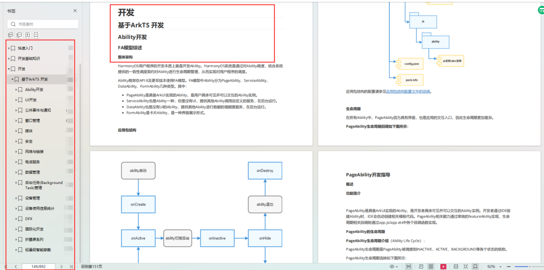
HarmonyOS鸿蒙开发常用4种布局详细说明 |
您所在的位置:网站首页 › 鸿蒙生态链开发方法是什么 › HarmonyOS鸿蒙开发常用4种布局详细说明 |
HarmonyOS鸿蒙开发常用4种布局详细说明
|
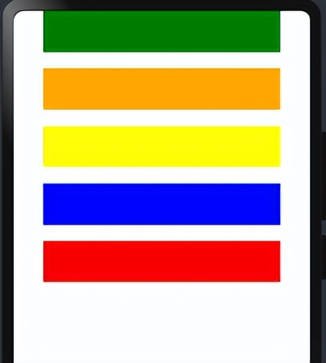
介绍一下鸿蒙开发常用4种布局 1、线性布局 2、层叠布局 3、网格布局 4、列表布局 1. 线性布局(Column/Row)线性布局(LinearLayout)是开发中最常用的布局,通过线性容器Row(行)和Column(列)构建,它是其他布局的基础,其子元素在线性方向上(水平或垂直)依次排列,基本形式如下: Column(列) @Entry @Component struct Index { build() { Column({space:20}) { //一行 Row() { }.width('80%').height(50).backgroundColor(Color.Green) Row() { }.width('80%').height(50).backgroundColor(Color.Orange) Row() { }.width('80%').height(50).backgroundColor(Color.Yellow) Row() { }.width('80%').height(50).backgroundColor(Color.Blue) Row() { }.width('80%').height(50).backgroundColor(Color.Red) }.width('100%').alignItems(HorizontalAlign.Center) } }效果:
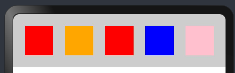
Row(行) @Entry @Component struct Index { build() { Row({space:20}) { Column() { }.width('15%').height(50).backgroundColor(Color.Red); Column() { }.width('15%').height(50).backgroundColor(Color.Orange); Column() { }.width('15%').height(50).backgroundColor(Color.Red); Column() { }.width('15%').height(50).backgroundColor(Color.Blue); Column() { }.width('15%').height(50).backgroundColor(Color.Pink); }.width('100%').padding(20).backgroundColor('#ccc') } }
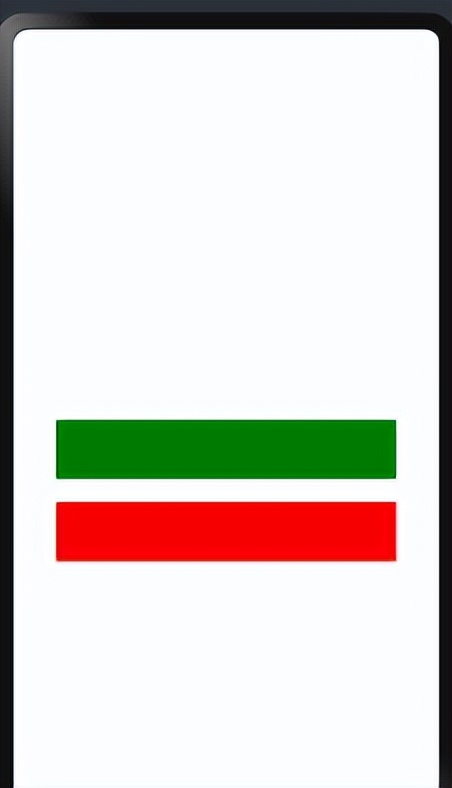
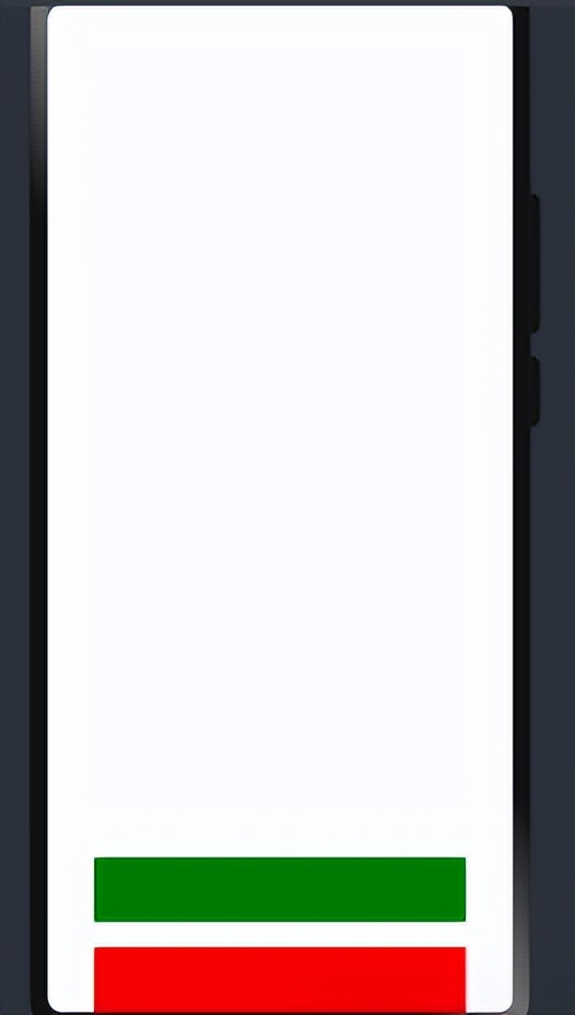
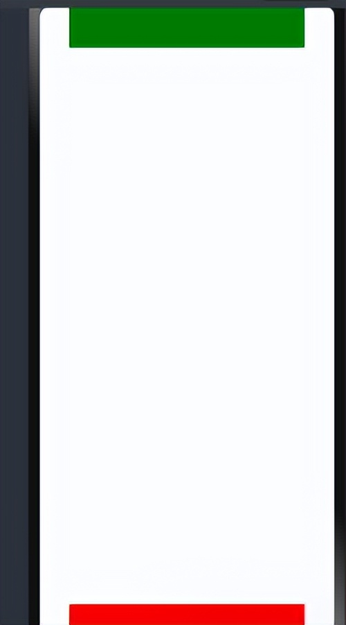
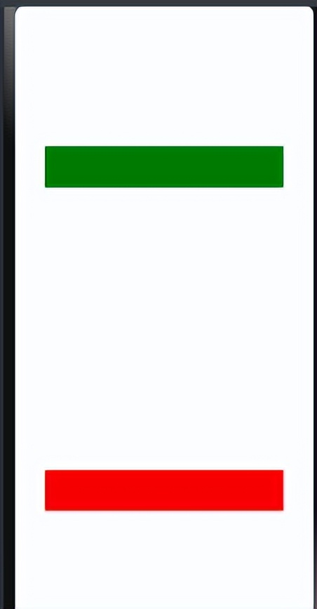
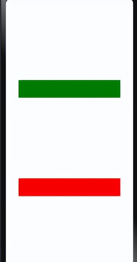
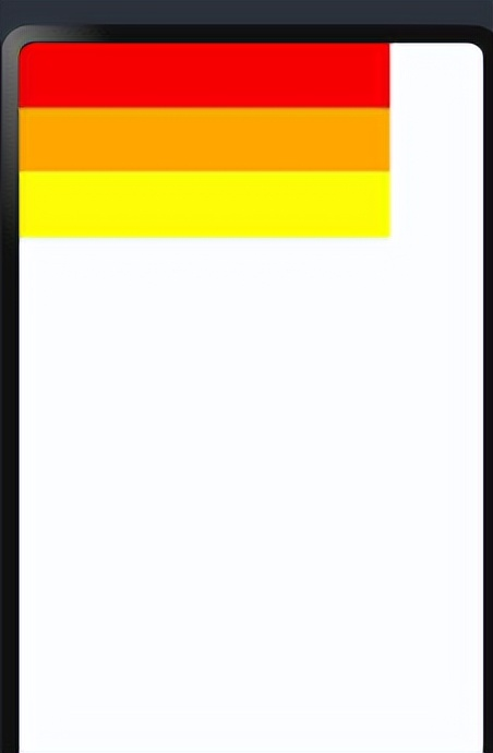
子元素排列与对齐 ● 主轴:线性布局容器在布局方向上的轴线,Row容器主轴为横向,Column容器主轴为纵向。 ● 交叉轴:垂直于主轴方向的轴线。Row容器交叉轴为纵向,Column容器交叉轴为横向。 子元素沿主轴方向的排列方式 可以通过justifyContent 属性进行控制,可选值如下: @Entry @Component struct Index { build() { Column({space:20}) { //一行 Row() { }.width('80%').height(50).backgroundColor(Color.Green) Row() { }.width('80%').height(50).backgroundColor(Color.Red) }.width('100%').height('100%').justifyContent(FlexAlign.Center) } }.justifyContent(FlexAlign.Center)
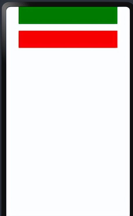
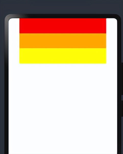
.justifyContent(FlexAlign.Start)
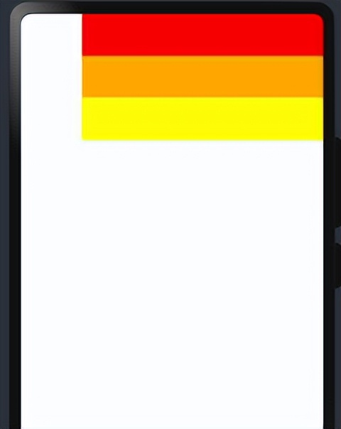
.justifyContent(FlexAlign.End)
.justifyContent(FlexAlign.SpaceBetween)
.justifyContent(FlexAlign.SpaceAround)
.justifyContent(FlexAlign.SpaceEvenly)
子元素沿交叉轴方向的对齐方式 可以通过alignItems 属性进行控制,可选值如下: @Entry @Component struct Index { build() { Column() { Row() { }.width('80%').height(50).backgroundColor(Color.Red) Row() { }.width('80%').height(50).backgroundColor(Color.Orange) Row() { }.width('80%').height(50).backgroundColor(Color.Yellow) }.width('100%').height('100%').alignItems(HorizontalAlign.Start) } }.alignItems(HorizontalAlign.Start)
.alignItems(HorizontalAlign.Center)
.alignItems(HorizontalAlign.End)
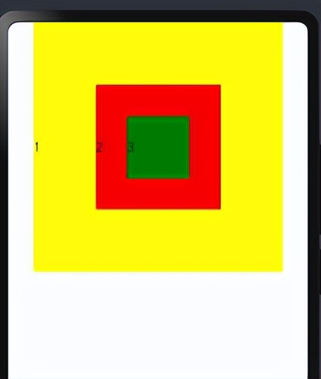
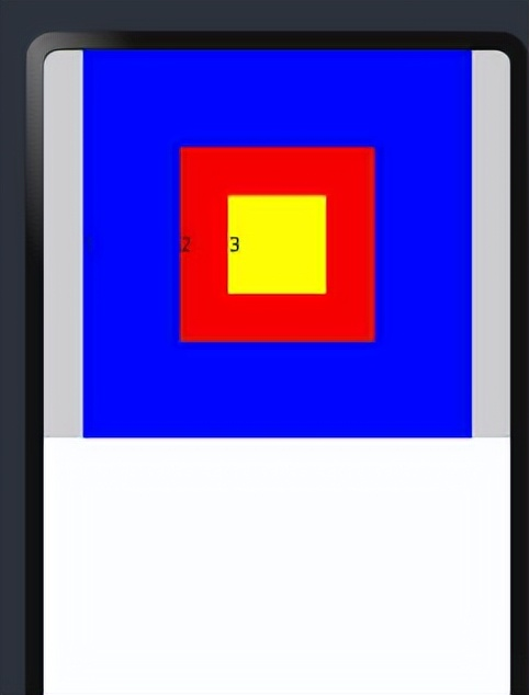
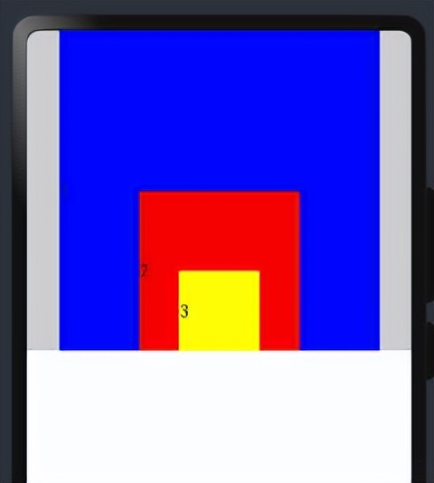
Stack布局是一种常用的布局方式,它允许将子元素沿垂直于屏幕的方向堆叠在一起,类似于图层的叠加。子元素可以按照其添加顺序依次叠加在一起,后添加的子元素会覆盖之前添加的子元素,层叠布局具有较强的页面层叠、位置定位能力,其使用场景有广告、卡片层叠效果等。Stack容器中的子组件可通过zIndex属性设置其所在的层级,zIndex值越大,层级越高,即zIndex值大的组件会覆盖在zIndex值小的组件上方 Stack 布局通常会和 position绝对定位配合使用,设置元素左上角相对于父容器左上角偏移位置配合使用,position语法示例:.position({ x: 180, y: 130 }) @Entry @Component struct StackAlign { @State alignment: Alignment = Alignment.Center; build() { Column() { Stack() { Row() { Text('1') } .width(300).height(300).backgroundColor(Color.Yellow) Row() { Text('2') } .width(150).height(150).backgroundColor(Color.Red) Row() { Text('3') } .width(75).height(75).backgroundColor(Color.Green) } } .width('100%') } }
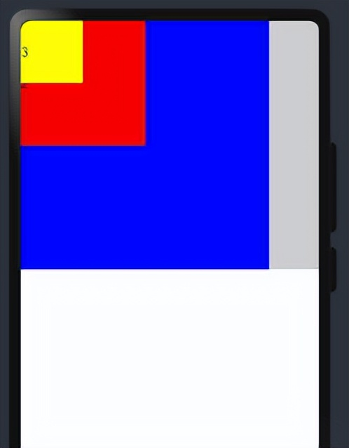
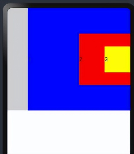
.alignContent(Alignment.TopStart) @Entry @Component struct StackAlign { @State alignment: Alignment = Alignment.Center; build() { Column() { Stack() { Row() { Text('1') } .width(300).height(300).backgroundColor(Color.Blue) Row() { Text('2') } .width(150).height(150).backgroundColor(Color.Red) Row() { Text('3') } .width(75).height(75).backgroundColor(Color.Yellow) } .width('100%').backgroundColor('#ccc').alignContent(Alignment.TopStart) } .width('100%') } }Fl.alignContent(Alignment.TopStart)
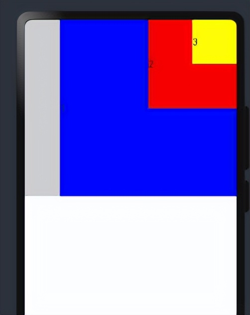
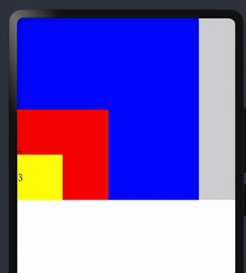
.alignContent(Alignment.TopEnd)
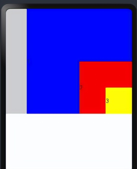
.alignContent(Alignment.Top)
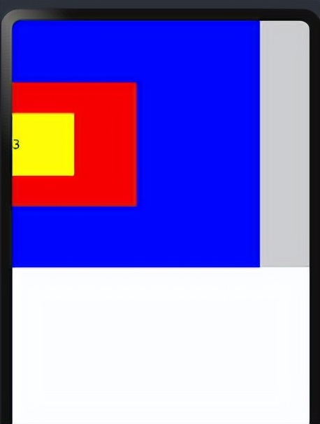
.alignContent(Alignment.Start)
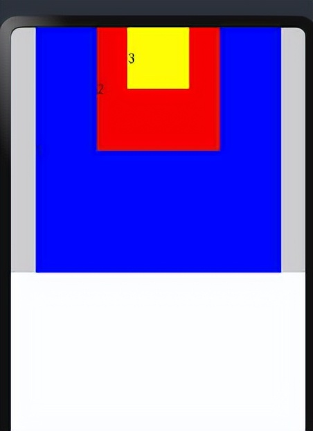
.alignContent(Alignment.Center)
.alignContent(Alignment.End)
.alignContent(Alignment.BottomStart)
.alignContent(Alignment.BottomEnd)
.alignContent(Alignment.Bottom)
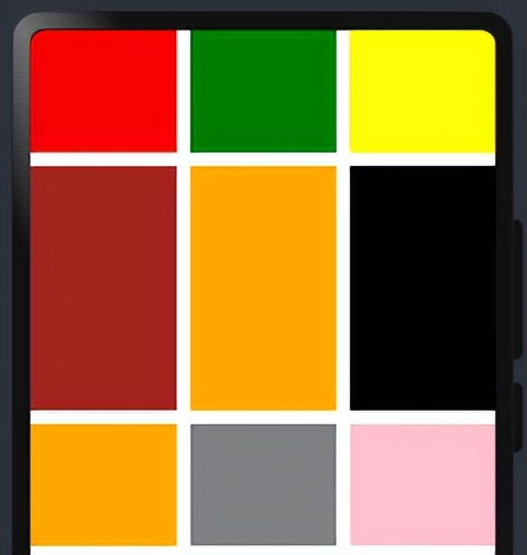
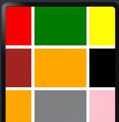
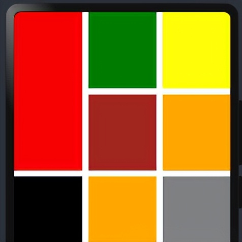
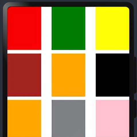
3、 网格布局(Grid) 网格布局(Grid)是一种强大的页面排版方式,通过将页面划分为行和列组成的网格,使得子组件可以在这个二维网格中自由定位。网格布局的容器组件为Grid,子组件为GridItem,如下图所示。 1fr表示占一个“单位” @Entry @Component struct Index { build() { Grid(){ GridItem(){}.backgroundColor(Color.Red) GridItem(){}.backgroundColor(Color.Green) GridItem(){}.backgroundColor(Color.Yellow) GridItem(){}.backgroundColor(Color.Brown) GridItem(){}.backgroundColor(Color.Orange) GridItem(){}.backgroundColor(Color.Black) GridItem(){}.backgroundColor(Color.Orange) GridItem(){}.backgroundColor(Color.Gray) GridItem(){}.backgroundColor(Color.Pink) }.width('100%').height(400).rowsTemplate('1fr 2fr 1fr').columnsTemplate('1fr 1fr 1fr').rowsGap(10).columnsGap(10) } } .rowsTemplate('1fr 2fr 1fr')
.columnsTemplate('1fr 2fr 1fr')
.rowStart(1).rowEnd(2)
.rowsGap(10).columnsGap(30)
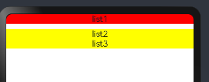
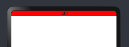
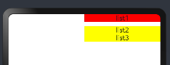
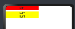
当显示内容超出显示区域时,有滚动效果 4、 列表布局(List)列表(List)是一种复杂的容器组件,使用列表可以轻松高效地显示结构化、可滚动的列表信息。列表布局的容器组件为List,子组件为ListItem或者ListItemGroup,其中,ListItem表示单个列表项,ListItemGroup用于列表数据的分组展示,其子组件也是ListItem,如下图所示 .listDirection(Axis.Vertical) @Entry @Component struct Index { build() { List({space:10}) { ListItem() { Text('list1') }.width('100%').backgroundColor(Color.Red) ListItemGroup() { ListItem() { Text('list2') }.width('100%') ListItem() { Text('list3') }.width('100%') }.width('100%').backgroundColor(Color.Yellow) }.width('100%').listDirection(Axis.Vertical) } }
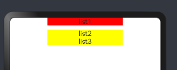
.listDirection(Axis.Horizontal)
.alignListItem(ListItemAlign.End)
.alignListItem(ListItemAlign.Start)
.alignListItem(ListItemAlign.Center)
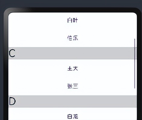
scrollBar属性可控制滚动条样式 @Entry @Component struct Index { @State contactsGroups: object[] = [ { title: 'A', contacts: [ '赵云', '李白', '王思' ], }, { title: 'B', contacts: [ '白叶', '伯乐' ], }, { title: 'C', contacts: [ '王大', '张三' ], }, { title: 'D', contacts: [ '白龙', '小明' ], }, { title: 'E', contacts: [ '盖伦', '石头', '光辉' ], } ] @Builder Header(item){ Text(item.title).fontSize(30).backgroundColor('#ccc').width('100%') } build() { List(){ ForEach(this.contactsGroups,(item)=>{ ListItemGroup({header:this.Header(item)}){ ForEach(item.contacts,(user)=>{ ListItem(){ Text(user) }.width('100%').height(50) }) } },item=>JSON.stringify(item)); }.width('100%').height(300).scrollBar(BarState.On) } }
以上就是鸿蒙开发相关布局 为了帮助大家更深入有效的学习到鸿蒙开发知识点,小编特意给大家准备了一份全套最新版的HarmonyOS NEXT学习资源,获取完整版方式请点击→《HarmonyOS教学视频》 HarmonyOS教学视频:语法ArkTS、TypeScript、ArkUI等.....视频教程
获取完整版白皮书方式请点击《鸿蒙生态应用开发白皮书V2.0PDF》
一、入门必看 应用开发导读(ArkTS)……
二、HarmonyOS 概念 系统定义技术架构技术特性系统安全........
更多了解更多鸿蒙开发的相关知识可以参考:《鸿蒙 (Harmony OS)开发学习手册》 |


【本文地址】
今日新闻 |
推荐新闻 |