一文搞懂CSS 3D动画效果 |
您所在的位置:网站首页 › css按钮立体效果 › 一文搞懂CSS 3D动画效果 |
一文搞懂CSS 3D动画效果
|
文章目录
前言一、先来看几个动画案例①旋转飞人②翻转纽扣③立体导航栏④立体轮播图
二、3D动画效果简述1.转换类型: transform-style: preserve-3d;2.透视 perspective: 400px;(拉进我们眼睛与图像的距离)
三、项目案例代码1.立体导航栏2.旋转木马
总结
前言
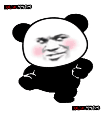
3D动画效果使页面看起来更加立体,图形更下加生动,实现原理是通过透视的视距,改变图像在人眼内成像的类型,从而达到图像立体的展示在人的眼前。 一、先来看几个动画案例 这几个动画案例均是由CSS 3D动画技术制成。大家知道javascript可以很轻松的实现动画效果 今天带大家不用js也实现一些简单的动画效果。 ①旋转飞人 实现图片的翻转,可以自己制定旋转轴
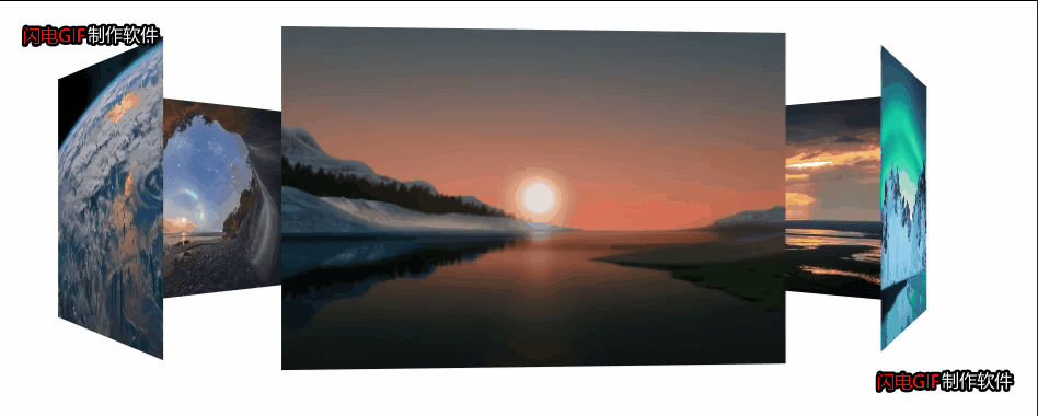
代码如下: DOCTYPE html> Document body { /*可以修改该属性,达到纽扣的不同效果的展示。*/ perspective: 400px; } .root { position: relative; width: 300px; height: 300px; margin: 100px auto; } .root:hover .box { transform: rotateY(180deg); } .box { position: relative; width: 100%; height: 100%; transition: all 2s; transform-style: preserve-3d; } .nav, .qwe { position: absolute; top: 0; left: 0; width: 100%; height: 100%; border-radius: 50%; text-align: center; line-height: 300px; font-size: 45px; font-family: '幼圆'; font-weight: 700; color: #fff; transition: all 2s; } .nav { background-color: cadetblue; z-index: 1; } .qwe { background-color: cornflowerblue; transform: rotateY(180deg); } Hello World 2.透视 perspective: 400px;(拉进我们眼睛与图像的距离) 这里指物理距离不变,改变的是展示的效果(就像在平时观察真实的物 体走近了几步,观察的角度改变了) 这个属性一般加在需要变换盒子的父盒子上。 以下使用翻转飞人案例进行代码展示 修改透视距离为100px会看到飞人踢你。(嘿嘿)代码如下: DOCTYPE html> Document body { perspective: 400px; /* 保持三D效果 */ transform-style: preserve-3d; } div { margin: 200px auto; width: 300px; height: 300px; background: url(../3.gif); background-size: 100% 100%; transition: all 2s; } div:hover { transform: rotate3d(1, 1, 1, 360deg); } 三、项目案例代码 1.立体导航栏 这个的实现过程就是将盒子通过x轴进行旋转,直到与电脑屏幕垂直,然后添加一个新的 盒子,与第一个盒子垂直,在鼠标聚焦在第二个盒子上的时候盒子进行90度旋转 DOCTYPE html> Document .navrootr { float: left; position: relative; width: 100px; height: 40px; margin: 100px 10px; perspective: 400px; } .navrootr:hover .navroot { transform: rotateX(90deg); } .navroot { position: relative; width: 100%; height: 100%; /* perspective: 400px; */ transform-style: preserve-3d; transition: all .4s; } .box1, .box2 { color: #fff; position: absolute; width: 100%; height: 100%; text-align: center; line-height: 40px; } .box1 { transform: translateZ(50%); background-color: teal; transform: translateZ(20px); } .box2 { background-color: cornflowerblue; transform: translateY(20px) rotateX(-90deg); } 哔哩哔哩 百度知道 哔哩哔哩 百度知道 哔哩哔哩 百度知道 哔哩哔哩 百度知道 哔哩哔哩 百度知道 哔哩哔哩 百度知道 2.旋转木马 添加了6个盒子,中间一个,将每一个图片按照第一个图片先旋转,再平移 【例如translateZ(350px),沿z轴平移350px】,可以在纸上先画一个俯视图, 看看每一个图片具体旋转多少度,移动多少可以达到固定的位置。 DOCTYPE html> Document @keyframes run { 0% { transform: rotateY(0); } 100% { transform: rotateY(360deg); } } .bodyroot { perspective: 1000px; } section { position: relative; width: 350px; height: 200px; background: url(../IMG_1770\(20210111-231055\).JPG) no-repeat; background-size: 100% 100%; margin: 200px auto; transform-style: preserve-3d; animation: run 6s linear infinite; } section:hover { animation-play-state: paused; } section div { position: absolute; top: 0px; left: 0px; width: 300px; height: 200px; background: url(../dog.jpg) no-repeat; } /* 前 */ section div:nth-child(1) { transform: translateZ(350px); background: url(../q.jpg) no-repeat; background-size: 100% 100%; } /* 后 */ section div:nth-child(2) { transform: rotateY(60deg) translateZ(350px); background: url(../w.jpg) no-repeat; background-size: 100% 100%; } /* 前左 */ section div:nth-child(3) { transform: rotateY(120deg) translateZ(350px); background: url(../e.jpg) no-repeat; background-size: 100% 100%; } /* 前右 */ section div:nth-child(4) { transform: rotateY(180deg) translateZ(350px); background: url(../r.jpg) no-repeat; background-size: 100% 100%; } /* 后左 */ section div:nth-child(5) { transform: rotateY(240deg) translateZ(350px); background: url(../t.jpg) no-repeat; background-size: 100% 100%; } /* 后右 */ section div:nth-child(6) { transform: rotateY(300deg) translateZ(350px); background: url(../y.jpg) no-repeat; background-size: 100% 100%; } 总结以上的案例将图片路径替换成你的图片所在的路径就可以直接运行,对于3D动画效果,整不清楚就画图,可以先局部后整体。 |


【本文地址】