怎么利用python根据已知的三列数据绘制三维图? |
您所在的位置:网站首页 › 用python画图表 › 怎么利用python根据已知的三列数据绘制三维图? |
怎么利用python根据已知的三列数据绘制三维图?
|
很多方法都可以话3D图,这里介绍两种方法,分别用matplotlib 和plotly 实现 1、使用matplotlib 工具包中的Axes3D 可以做3D图 创建Axes3D主要有两种方式,一种是利用关键字projection='3d'l来实现,另一种则是通过从mpl_toolkits.mplot3d导入对象Axes3D来实现,目的都是生成具有三维格式的对象Axes3D. import numpy as np import matplotlib.pyplot as plt ax = plt.figure().add_subplot(projection='3d') # Plot a sin curve using the x and y axes. x = np.linspace(0, 1, 100) y = np.sin(x * 2 * np.pi) / 2 + 0.5 ax.plot(x, y, zs=0, zdir='z', label='curve in (x, y)') # Plot scatterplot data (20 2D points per colour) on the x and z axes. colors = ('r', 'g', 'b', 'k') # Fixing random state for reproducibility np.random.seed(19680801) x = np.random.sample(20 * len(colors)) y = np.random.sample(20 * len(colors)) c_list = [] for c in colors: c_list.extend([c] * 20) # By using zdir='y', the y value of these points is fixed to the zs value 0 # and the (x, y) points are plotted on the x and z axes. ax.scatter(x, y, zs=0, zdir='y', c=c_list, label='points in (x, z)') # Make legend, set axes limits and labels ax.legend() ax.set_xlim(0, 1) ax.set_ylim(0, 1) ax.set_zlim(0, 1) ax.set_xlabel('X') ax.set_ylabel('Y') ax.set_zlabel('Z') # Customize the view angle so it's easier to see that the scatter points lie # on the plane y=0 ax.view_init(elev=20., azim=-35) plt.show() 上面的链接是matplotlib官网,里面有很多3d 图的例子 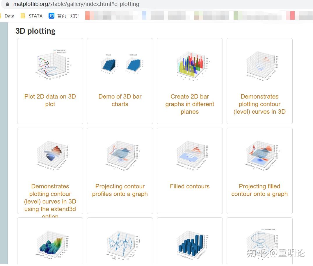 2、plotly plotly基于js,被称为史上最好的画图工具之一,特点是图形可交互,高大上,下面是个三维散点图的例子 import plotly.express as px df = px.data.iris() fig = px.scatter_3d(df, x='sepal_length', y='sepal_width', z='petal_width', color='species') fig.show() 再给个官网教程传送门 |
【本文地址】
今日新闻 |
推荐新闻 |