|
文章目录
一、前言二、准备工作1、新建文件夹2、准备素材对于图片的处理对于音乐的处理
三、代码工作1、python处理6张图片1.1代码运行1.2 放入背景图片
2、写html文件2.1 更换音乐素材
3、运行main.html
四、推荐阅读
一、前言
帮助好哥们整的一个小相册,给他写个教程帖  大致效果如下(动图超图片上传上限了): 大致效果如下(动图超图片上传上限了): 
二、准备工作
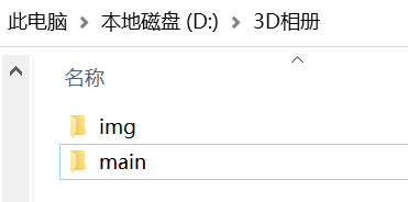
1、新建文件夹
如:我在D盘中新建一个 3D相册 文件夹,然后在 3D文件夹 中 新建2个文件夹:img , main
其中:
img:放素材图片main:放html文件
2、准备素材
素材包括以下:
6张需要放到相册中的图片,放到img文件夹中1张相册背景图片,需要重名名为background.jpg,放到img文件夹中,背景图片要到python程序执行完再放入1首喜欢的音乐
对于图片的处理
我选择用python来处理。
对于音乐的处理
首先先搜索网易云网页版,找到一首自己喜欢的音乐,进入到详情页,点击生成外链播放器,复制蓝色区域代码,放到记事本,备用。  
三、代码工作
1、python处理6张图片
需要安装PIL库:
pip install pillow
图片处理代码如下:
import os
from PIL import Image
def get_file(path):
file_list = os.listdir(path)
file_list.sort() # 对列表内容进行排序,默认为升序
return file_list
def image_resize(path, files):
i = 1
for file_name in files:
# 待处理图片路径
image_path = path + '/' + file_name
img = Image.open(image_path)
# 当处理第二张图片的时候,需要将图片旋转180°,方便相册的观看体验
if i == 2:
img = img.transpose(Image.ROTATE_180)
# resize图片大小,入口参数为一个tuple,新的图片的大小
img_size_1 = img.resize((400, 400))
img_size_2 = img.resize((100, 100))
# # 处理图片后存储路径,以及存储格式
img_size_1.save(path+'/' + str(i) + '.png')
img_size_2.save(path+'/0' + str(i) + '.png')
i = i+1
def main():
path = input('请输入你想更改的文件的路径:').replace('\\', '/')
files = get_file(path)
image_resize(path, files)
print("所有图片处理完毕")
if __name__ == '__main__':
main()
1.1代码运行
首先,在img文件夹里,复制路径 
其次,开始运行,需要将复制的内容粘贴上去,并按Enter键 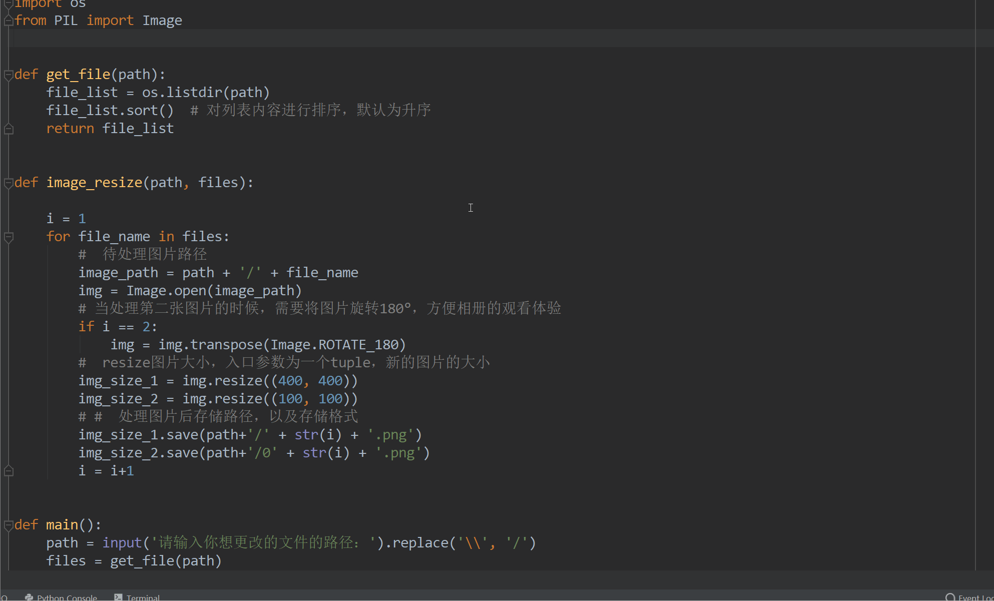 结果如下: 结果如下: 
1.2 放入背景图片
将背景图片放入img文件夹,并重命名为background.jpg
2、写html文件
可以先在main文件夹中,新建txt文件,然后更改后缀名,之后的弹窗点击确定即可。 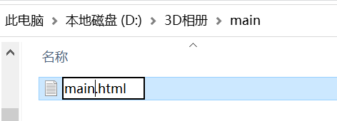 右键打开main.html文件,进行编辑 右键打开main.html文件,进行编辑
DOCTYPE html>
3D相册
@charset "utf-8";
*{
margin:0;
padding:0;
}
body{
background-image: url("../img/background.jpg");
background-size: 100% 100%;
background-attachment: fixed;
}
li{
list-style: none;
}
.box{
width:200px;
height:200px;
background-size: cover;
background-repeat: no-repeat;
background-attachment: fixed;
background-size:100% 100%;
position: absolute;
margin-left: 42%;
margin-top: 22%;
-webkit-transform-style:preserve-3d;
-webkit-transform:rotateX(13deg);
-webkit-animation:move 5s linear infinite;
}
.minbox{
width:100px;
height:100px;
position: absolute;
left:50px;
top:30px;
-webkit-transform-style:preserve-3d;
}
.minbox li{
width:100px;
height:100px;
position: absolute;
left:0;
top:0;
}
.minbox li:nth-child(1){
background: url(../img/01.png) no-repeat 0 0;
-webkit-transform:translateZ(50px);
}
.minbox li:nth-child(2){
background: url(../img/02.png) no-repeat 0 0;
-webkit-transform:rotateX(180deg) translateZ(50px);
}
.minbox li:nth-child(3){
background: url(../img/03.png) no-repeat 0 0;
-webkit-transform:rotateX(-90deg) translateZ(50px);
}
.minbox li:nth-child(4){
background: url(../img/04.png) no-repeat 0 0;
-webkit-transform:rotateX(90deg) translateZ(50px);
}
.minbox li:nth-child(5){
background: url(../img/05.png) no-repeat 0 0;
-webkit-transform:rotateY(-90deg) translateZ(50px);
}
.minbox li:nth-child(6){
background: url(../img/06.png) no-repeat 0 0;
-webkit-transform:rotateY(90deg) translateZ(50px);
}
.maxbox li:nth-child(1){
background: url(../img/1.png) no-repeat 0 0;
-webkit-transform:translateZ(50px);
}
.maxbox li:nth-child(2){
background: url(../img/2.png) no-repeat 0 0;
-webkit-transform:rotateX(180deg) translateZ(50px);
}
.maxbox li:nth-child(3){
background: url(../img/3.png) no-repeat 0 0;
-webkit-transform:rotateX(-90deg) translateZ(50px);
}
.maxbox li:nth-child(4){
background: url(../img/4.png) no-repeat 0 0;
-webkit-transform:rotateX(90deg) translateZ(50px);
}
.maxbox li:nth-child(5){
background: url(../img/5.png) no-repeat 0 0;
-webkit-transform:rotateY(-90deg) translateZ(50px);
}
.maxbox li:nth-child(6){
background: url(../img/6.png) no-repeat 0 0;
-webkit-transform:rotateY(90deg) translateZ(50px);
}
.maxbox{
width: 800px;
height: 400px;
position: absolute;
left: 0;
top: -20px;
-webkit-transform-style: preserve-3d;
}
.maxbox li{
width: 200px;
height: 200px;
background: #fff;
border:1px solid #ccc;
position: absolute;
left: 0;
top: 0;
opacity: 0.2;
-webkit-transition:all 1s ease;
}
.maxbox li:nth-child(1){
-webkit-transform:translateZ(100px);
}
.maxbox li:nth-child(2){
-webkit-transform:rotateX(180deg) translateZ(100px);
}
.maxbox li:nth-child(3){
-webkit-transform:rotateX(-90deg) translateZ(100px);
}
.maxbox li:nth-child(4){
-webkit-transform:rotateX(90deg) translateZ(100px);
}
.maxbox li:nth-child(5){
-webkit-transform:rotateY(-90deg) translateZ(100px);
}
.maxbox li:nth-child(6){
-webkit-transform:rotateY(90deg) translateZ(100px);
}
.box:hover ol li:nth-child(1){
-webkit-transform:translateZ(300px);
width: 400px;
height: 400px;
opacity: 0.8;
left: -100px;
top: -100px;
}
.box:hover ol li:nth-child(2){
-webkit-transform:rotateX(180deg) translateZ(300px);
width: 400px;
height: 400px;
opacity: 0.8;
left: -100px;
top: -100px;
}
.box:hover ol li:nth-child(3){
-webkit-transform:rotateX(-90deg) translateZ(300px);
width: 400px;
height: 400px;
opacity: 0.8;
left: -100px;
top: -100px;
}
.box:hover ol li:nth-child(4){
-webkit-transform:rotateX(90deg) translateZ(300px);
width: 400px;
height: 400px;
opacity: 0.8;
left: -100px;
top: -100px;
}
.box:hover ol li:nth-child(5){
-webkit-transform:rotateY(-90deg) translateZ(300px);
width: 400px;
height: 400px;
opacity: 0.8;
left: -100px;
top: -100px;
}
.box:hover ol li:nth-child(6){
-webkit-transform:rotateY(90deg) translateZ(300px);
width: 400px;
height: 400px;
opacity: 0.8;
left: -100px;
top: -100px;
}
@keyframes move{
0%{
-webkit-transform: rotateX(13deg) rotateY(0deg);
}
100%{
-webkit-transform:rotateX(13deg) rotateY(360deg);
}
}
2.1 更换音乐素材
在代码的第213行,替换音乐的链接即可。 
3、运行main.html

四、推荐阅读
《解决audio自动播放无效问题》
|