|
平常业务里有许多的特效,自己虽然磨洋工能写出,但奈何自己菜,时间成本太大,哎~~所以我这里就偷摸的总结一波。管他兼容不兼容,花里胡哨就完事了!😏
本文全退指南🙃
css 变量在JS中的使用一些边框划入特效css部分属性应用,例如 filter, counter, mix-blend-mode, clip-path
如果上面几点你都不关心,可以离开了 (点个赞再走),老铁🐶。
成果预览 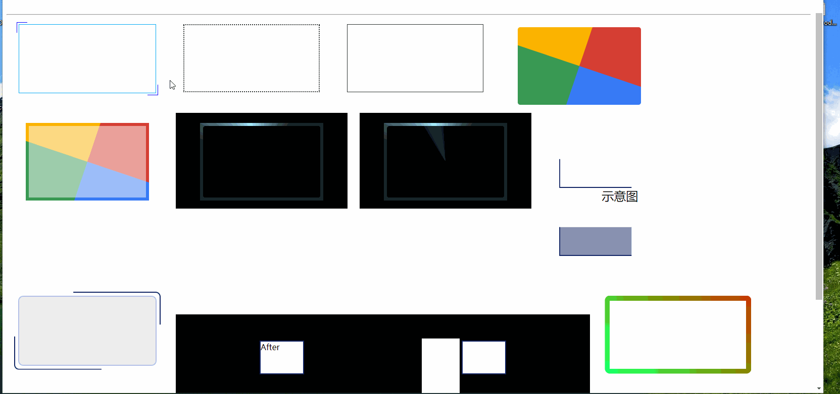
全部代码已上传 至压缩包(scdn资源包)。需要的可以 下载 | css-border-effects.zip⇲。 不建议大家下载,文中已给出了支持效果的代码。也建议去实操一下。
先介绍中文变量。
中文变量
意思就是利用中文作为变量在css 中使用。
主要是安利两个库
chinese-gradient⇲ | 背景渐变chinese-layout⇲ | 布局
渐变,代码就只需要一行   布局 布局
ul {
/* 这个是固定写法,必须先指定display为grid */
display: grid;
/* grid属性需要指定哪种布局 */
grid: var(--九宫格);
/* 加入一点间距,让九个元素相互之间有一定的距离 */
gap: 10px;
}
ul {
/* 这个是固定写法,必须先指定display为grid */
display: grid;
/* grid属性需要指定哪种布局 */
grid: var(--九宫格);
/* 加入一点间距,让九个元素相互之间有一定的距离 */
gap: 10px;
}
 挺好玩的吧 挺好玩的吧
使用方式
body {
/* 变量必须有作用域,放于{}内部 */
--boder——width: 5px
}
body .item {
display: inline-block;
margin: 10px;
width: 300px;
height: 150px;
}
ul {
display: grid;
grid: var(--九宫格);
gap: 1px;
}
li {
height: 30px;
background: var(--极光绿);
border: var(--boder——width) solid black;
}
本节内容主要来自于 掘金 | Vue超好玩的新特性:在CSS中引入JS变量
主要利用的就是 css in js
边框特效
案例我用的 scss(后面样式为了节省篇幅也用的scss); 推荐大家一个 vscode 插件
Live Sass Compiler
作用就如名字一样,实时遍历sass文件 
特效的基础布局文件
body .item {
display: inline-block;
margin: 10px;
width: 300px;
height: 150px;
}
.item > div {
margin: auto;
width: 90%;
height: 90%;
}
特效—边框长度变化
// scss
.item div{
position: relative;
border: 1px solid #03A9F3;
&::before,
&::after {
content: "";
position: absolute;
width: 20px;
height: 20px;
transition: .3s ease-in-out;
}
&::before {
top: -5px;
left: -5px;
border-top: 1px solid var(--borderColor);
border-left: 1px solid var(--borderColor);
}
&::after {
right: -5px;
bottom: -5px;
border-bottom: 1px solid var(--borderColor);
border-right: 1px solid var(--borderColor);
}
&:hover::before,
&:hover::after {
width: calc(100% + 9px);
height: calc(100% + 9px);
}
}
特效—虚线边框动画
无变换
/* 方式1 */
.item div{
background:
linear-gradient(90deg, #333 50%, transparent 0) repeat-x,
linear-gradient(90deg, #333 50%, transparent 0) repeat-x,
linear-gradient(0deg, #333 50%, transparent 0) repeat-y,
linear-gradient(0deg, #333 50%, transparent 0) repeat-y;
background-size: 4px 2px, 4px 2px, 2px 4px, 2px 4px;
background-position: 0 0, 0 100%, 0 0, 100% 0;
&:hover {
animation: linearGradientMove .3s infinite linear;
}
@keyframes linearGradientMove {
100% {
background-position: 4px 0, -4px 100%, 0 -4px, 100% 4px;
}
}
}
实线变虚线
div.item:nth-child(5) div{
outline: 1px solid #333;
outline-offset: -1px;
transition: all .3s linear;
&:hover {
border: none;
background:
linear-gradient(90deg, #333 50%, transparent 0) repeat-x,
linear-gradient(90deg, #333 50%, transparent 0) repeat-x,
linear-gradient(0deg, #333 50%, transparent 0) repeat-y,
linear-gradient(0deg, #333 50%, transparent 0) repeat-y;
background-size: 4px 2px, 4px 2px, 2px 4px, 2px 4px;
background-position: 0 0, 0 100%, 0 0, 100% 0;
animation: linearGradientMove .3s infinite linear;
outline: none;
}
@keyframes linearGradientMove {
100% {
background-position: 4px 0, -4px 100%, 0 -4px, 100% 4px;
}
}
}
特效—彩虹边框
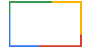 其实是四个色块再转,然后把中间部分遮挡。 其实是四个色块再转,然后把中间部分遮挡。 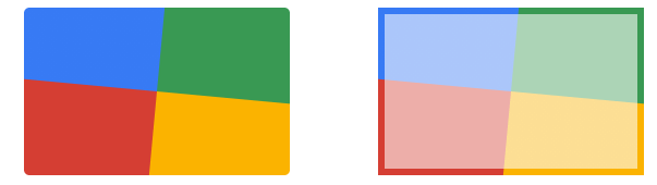 注意,这个色块已经偏离原来大的位置,看到的边框不再是原来元素的边框,纯粹是为了秀而秀。你懂我意思吧😀 注意,这个色块已经偏离原来大的位置,看到的边框不再是原来元素的边框,纯粹是为了秀而秀。你懂我意思吧😀
div.item div{
--borderWidth: 12px;
--bRadius: 5px;
width: 60%;
height: 60%;
position: relative;
z-index: 0;
overflow: hidden;
padding: 2rem;
z-index: 0;
border-radius: --bRadius;
&::after, &::before {
box-sizing: border-box;
}
&::before {
content: '';
position: absolute;
left: -50%;
top: -50%;
width: 200%;
height: 200%;
z-index: -2;
background-repeat: no-repeat;
background-size: 50% 50%, 50% 50%;
background-position: 0 0, 100% 0, 100% 100%, 0 100%;
background-image: linear-gradient(#399953, #399953), linear-gradient(#fbb300, #fbb300), linear-gradient(#d53e33, #d53e33), linear-gradient(#377af5, #377af5);
animation: rotate 4s linear infinite;
@keyframes rotate {
100% {
transform: rotate(1turn);
}
}
}
&::after {
content: '';
position: absolute;
z-index: -1;
left: calc(var(--borderWidth) / 2);
top: calc(var(--borderWidth) / 2);
width: calc(100% - var(--borderWidth));
height: calc(100% - var(--borderWidth));
background: white;
border-radius: --bRadius;
/* 这一行是为了方便查看原来的样子的 */
animation: opacityChange 3s infinite alternate;
}
@keyframes opacityChange {
50% {
opacity:1;
}
100% {
opacity: .5;
}
}
}
特效—黑白质感特效边框
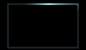 利用的 conic-gradient⇲ | MDN, 思路和上面差不多,坏处也是一样。实用性不强,我就问你,帅不帅吧? 利用的 conic-gradient⇲ | MDN, 思路和上面差不多,坏处也是一样。实用性不强,我就问你,帅不帅吧? 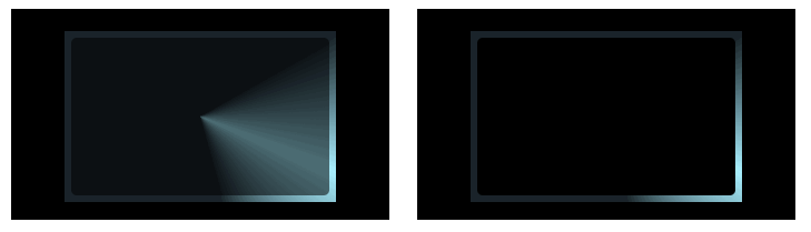
@keyframes opacityChange {
50% {
opacity:.5;
}
100% {
opacity: 1;
}
}
@keyframes rotate {
100% {
transform: rotate(1turn);
}
}
div.item {
background-color: #000;
padding: 20px;
div{
--borderWidth: 12px;
--bRadius: 10px;
width: 60%;
height: 60%;
position: relative;
z-index: 0;
overflow: hidden;
padding: 2rem;
z-index: 0;
border-radius: --bRadius;
&::after, &::before {
box-sizing: border-box;
}
&::before {
content: '';
position: absolute;
z-index: -2;
left: -50%;
top: -50%;
width: 200%;
height: 200%;
background-color: #1a232a;
background-repeat: no-repeat;
background-position: 0 0;
background-image: conic-gradient(transparent, rgba(168, 239, 255, 1), transparent 30%);
animation: rotate 4s linear infinite;
}
&::after {
content: '';
position: absolute;
z-index: -1;
left: calc(var(--borderWidth) / 2);
top: calc(var(--borderWidth) / 2);
width: calc(100% - var(--borderWidth));
height: calc(100% - var(--borderWidth));
background: #000;
border-radius: 5px;
/* 这句效果打开有助于理解动画 */
/*animation: opacityChange 5s infinite linear;*/
}
}
}
div.item:nth-child(9) div::after {
animation: opacityChange 5s infinite linear;
}
特效—转动的边框线(单条)
利用的是 clip-path ⇲ | MDN , 放个对比图 
div.item {
div{
width: 80%;
position: relative;
text-align: center;
font-size: 24px;
&::before {
content: "";
position: absolute;
top: 0;
left: 0;
right: 0;
bottom: 0;
border: 2px solid rgb(17, 36, 100);
transition: all .5s;
animation: clippath 3s infinite linear;
}
@keyframes clippath {
0%, 100% { clip-path: inset(0 0 95% 0); }
25% { clip-path: inset(0 95% 0 0); }
50% { clip-path: inset(95% 0 0 0); }
75% { clip-path: inset(0 0 0 95%); }
}
}
}
特效—转动的边框线(两条)
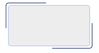 原理和上面一样,只是弄了两条,加了圆角。 原理和上面一样,只是弄了两条,加了圆角。
// 转动的边框线(两条)
div.item {
--bRadius: 10px;
div{
position: relative;
text-align: center;
font-size: 24px;
border: 2px solid rgb(179, 191, 231);
border-radius: var(--bRadius);
transition: all .3s;
background-color: #eee;
&::before, &::after {
content: "";
position: absolute;
top: -10px;
left: -10px;
right: -10px;
bottom: -10px;
border: 2px solid rgb(17, 36, 100);
transition: all .5s;
border-radius: var(--bRadius);
animation: clippath 3s infinite linear;
}
&::after {
animation: clippath 3s infinite -1.5s linear;
}
@keyframes clippath {
0%, 100% { clip-path: inset(0 0 98% 0); }
25% { clip-path: inset(0 98% 0 0); }
50% { clip-path: inset(98% 0 0 0); }
75% { clip-path: inset(0 0 0 98%); }
}
}
}
特效—扩散的边框
主要是利用 overflow (隐藏其它元素用)实现, 用另外一个元素盖过来。 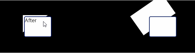
div.item {
margin-top: 200px;
padding: 10px;
--bColor: rgb(17, 36, 100);
background-color: #000;
display: inline-flex;
div{
position: relative;
overflow: hidden;
width: 12%;
height: 50%;
&::after {
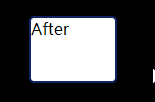
content: "After";
position: absolute;
top: 4px;
bottom: 4px;
right: 4px;
left: 4px;
border-radius: 5px;
background: #fff;
border: 2px solid var(--bColor);
}
// 旋转块
&::before {
content: "";
position: absolute;
top: 0px;
bottom: 0px;
right: -30%;
left: 0px;
background: #fff;
//border-radius: 50%;
transform: rotateZ(-90deg) translate(-100%, -100%);
transform-origin: top left;
transition: transform .3s;
transition-timing-function: linear;
}
&:hover {
filter: contrast(1.2);
}
&:hover::before {
transform: rotateZ(0deg) translate(0%, -0%);
}
}
}
特效—颜色渐变边框
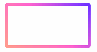
这和前面那彩虹边框一样(只是为了帅),主要利用的是 filter: hue-rotate(360deg) ,之前我也不知道🤣,建议大家去了解一下css-filter⇲。
filter CSS属性将模糊或颜色偏移等图形效果应用于元素。滤镜通常用于调整图像,背景和边框的渲染。 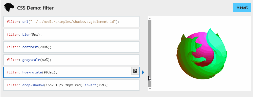
div.item {
div{
border: 10px solid;
border-image: linear-gradient(45deg, gold, deeppink) 1;
clip-path: inset(0px round 10px);
animation: huerotate 6s infinite linear;
/*
hue-rotate() (en-US) 函数在输入图像上应用色相旋转。
angle 一值设定图像会被调整的色环角度值。值为 0deg,则图像无变化。
若值未设置值,默认为 0deg。该值虽然没有最大值,超过 360deg 的值相当于又绕一圈。
svg 元素 失效!!
*/
filter: hue-rotate(360deg);
}
@keyframes huerotate {
0% {
filter: hue-rotate(0deg);
}
100% {
filter: hue-rorate(360deg);
}
}
}
后面再补充吧。。。。
本节主要参考 CSS 奇思妙想边框动画⇲, 原文我看了应该来自 掘金⇲,还是💥爆💥文💥
Css in Js
主要介绍 css 与 js 如何 结合
实现一个进度条
基础 JS,后面都要用的。
document.addEventListener('mousedown', function (event) {
var target = event.target;
var body = document.body;
var html = document.documentElement;
// 设置自定义属性值 是在 :root下设置的,
body.style.setProperty('--pagex', event.pageX);
body.style.setProperty('--pagey', event.pageY);
html.style.setProperty('--clientx', event.clientX);
html.style.setProperty('--clienty', event.clientY);
html.style.setProperty('--scrolly', window.pageYOffset);
target.style.setProperty('--offsetx', event.offsetX);
target.style.setProperty('--offsety', event.offsetY);
target.parentElement.style.setProperty('--target-width', target.clientWidth);
target.parentElement.style.setProperty('--target-height', target.clientHeight);
target.parentElement.style.setProperty('--target-left', target.offsetLeft);
target.parentElement.style.setProperty('--target-top', target.offsetTop);
});
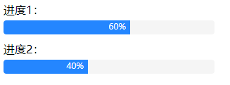
进度1:
进度2:
.process {
.bar {
margin: 5px 0 10px;
height: 20px; width: 300px;
background-color: #f5f5f5;
border-radius: 4px;
overflow: hidden;
}
.bar::before {
counter-reset: progress var(--percent);
content: counter(progress) '%\2002';
display: block;
height: 100%;
width: calc(300px * var(--percent) / 100);
font-size: 12px;
color: #fff;
background-color: #2486ff;
text-align: right;
white-space: nowrap;
overflow: hidden;
}
}
进度条中间的数字比例 用到了 counter 与 counter-reset 。
想要理解更多 推荐阅读张鑫旭 14年🤣 的文章 CSS counter计数器(content目录序号自动递增)详解⇲
tab方向切换
 (点击文字下一小节会讲) (点击文字下一小节会讲)
需要 上节说过需要的基础 JS 另外
// 利用的就是css 变量 ,每次切换left 都保存着上一次的值
.yw-tab-tab {
position: relative;
display: flex;
max-width: 414px;
justify-content: space-between;
border-bottom: 1px solid #717678;
background-color: #fff;
margin: 30px auto;
&::before,
&::after {
position: absolute;
width: calc(var(--target-width, 0) * 1px);
// 因为第一次始终是左边第一个菜单,所以left初始值为负数
left: calc(var(--target-left, -299) * 1px);
color: #2a80eb;
}
&[style]::before,
&[style]::after {
content: '';
}
&::before { // 字体变色
background-color: currentColor;
height: calc(var(--target-height) * 1px);
// mix-blend-mode 属性描述了元素的内容需要与父元素的背景颜色进行混合 (overlay 覆盖)
// https://www.runoob.com/try/try.php?filename=trycss_mix-blend-mode-all
// svg 不支持
mix-blend-mode: overlay;
}
&::after {// 下划线
border-bottom: solid;
bottom: -2px;
transition: left .2s, width .2s;
}
.yw-tab-a {
color: #717678;
padding: 10px 0;
}
}
主要利用变量,另外还有css属性 mix-blend-mode ,
mix-blend-mode: CSS 属性描述了元素的内容应该与元素的直系父元素的内容和元素的背景如何混合 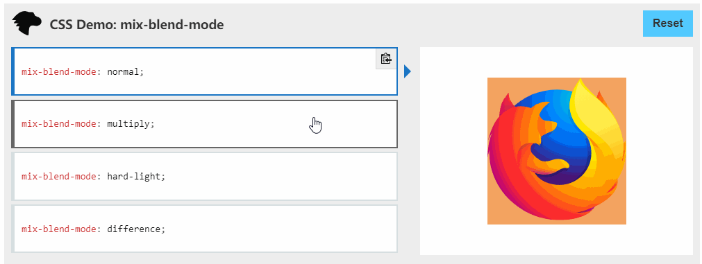
挺有意思的建议了解一下。
点击出现文字特效
需要 上节说过需要的基础 JS 另外
body{
&:active::after {
transform: scale(.8) translate(-50%, -100%);
opacity: 0.5;
transition: 0s;
left: -999px;
}
&::after {
content: '💥💥 💖💖💖 💥💥';
position:fixed;
z-index: 999;
left: calc(var(--clientx, -999) * 1px);
top: calc(var(--clienty, -999) * 1px);
transform: scale(1.1) translate(-50%, calc(-100% - 20px));
opacity: 0;
transition: transform 2.3s, opacity 4.5s;
}
}
本节主要参考 张鑫旭大神 ⇲ 的文章 CSS变量对JS交互组件开发带来的提升与变革⇲
最后
好啦,文章终于水完了啦😜😜😜,哈哈哈~~~
参考
其实文章中基本都贴了,再贴一遍吧
掘金 | Vue超好玩的新特性:在CSS中引入JS变量 公众号 | CSS 奇思妙想边框动画⇲ 个人博客 | CSS变量对JS交互组件开发带来的提升与变革⇲
|