用css设置水平居中,垂直居中和垂直水平居中 |
您所在的位置:网站首页 › 水平居中,垂直居中怎样设置 › 用css设置水平居中,垂直居中和垂直水平居中 |
用css设置水平居中,垂直居中和垂直水平居中
|
水平居中
行内元素
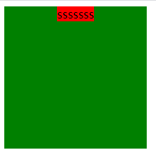
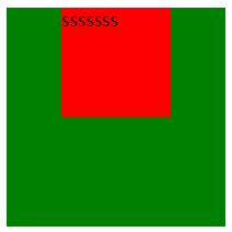
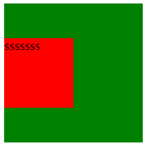
给父元素设置text-align:center。 若父元素不是块元素,则给父元素设置display:block即可 .father { width: 200px; height: 200px; background-color: green; text-align: center; } .son { background-color: red; } sssssss效果图: 效果图: 3、同第二条,先给父元素设置相对定位,子元素设置绝对定位,通过left:50%将子元素的左上角水平居中,然后通过transform:translateX(-50%)将其整体水平居中。 .father { width: 200px; height: 200px; background-color: green; position: relative; } .son { width: 100px; height: 100px; background-color: red; position: absolute; left: 50%; transform: translateX(-50%); } sssssss4、给父元素设置display:flex,采用flex布局的元素相当于一个容器,它的所有子元素自动成为容器成员。 该容器默认存在两根轴:水平方向的主轴以及垂直方向的交叉轴。 然后通过justify-content:center将其子元素在主轴方向上居中。 .father { width: 200px; height: 200px; background-color: green; display: flex; justify-content: center; } .son { width: 100px; height: 100px; background-color: red; } sssssss 垂直居中 行内元素 给行内元素添加line-hight:200px(该值为父元素的高度) .father { width: 200px; height: 200px; background-color: green; } .son { background-color: red; line-height: 200px; } sssssss效果图: 效果图: 3、同水平居中,给父元素设置display:flex,采用flex布局的元素相当于一个容器,它的所有子元素自动成为容器成员。 该容器默认存在两根轴:水平方向的主轴以及垂直方向的交叉轴。 然后通过align-items:center将其子元素在交叉轴方向上居中。 .father { width: 200px; height: 200px; background-color: green; display: flex; align-items: center; } .son { width: 100px; height: 100px; background-color: red; } sssssss 垂直水平居中1、垂直水平居中理所当然的是将水平居中和垂直居中合起来就行了。 先给父元素设置相对定位,子元素设置绝对定位,通过top:50%和left:50%将子元素的左上角垂直水平居中,然后通过transform:translate(-50%,-50%)将其整体垂直水平居中(translate中第一个参数即translateX,第二个参数即translateY)。 .father { width: 200px; height: 200px; background-color: green; position: relative; } .son { width: 100px; height: 100px; background-color: red; position: absolute; top: 50%; left: 50%; transform: translate(-50%, -50%); } sssssss效果图: 3、先给父元素设置相对定位,子元素设置绝对定位,通过top:0,left:0,right:0和bottom:0将子元素的左上角定于父元素的左上角,然后通过margin:auto将其整体垂直水平居中。 .father { width: 200px; height: 200px; background-color: green; position: relative; } .son { width: 100px; height: 100px; background-color: red; position: absolute; top: 0; left: 0; right: 0; bottom: 0; margin: auto; } sssssss4、给父元素设置display:flex,采用flex布局的元素相当于一个容器,它的所有子元素自动成为容器成员。 该容器默认存在两根轴:水平方向的主轴以及垂直方向的交叉轴。 然后通过justify-content:center和align-items:center将其子元素在主轴方向和交叉轴方向上居中。 .father { width: 200px; height: 200px; background-color: green; display: flex; justify-content: center; align-items: center; } .son { width: 100px; height: 100px; background-color: red; } sssssss |
 2、给父元素设置相对定位,子元素设置绝对定位,通过left:50%将子元素的左上角水平居中,然后通过margin-left:-50px(该值为子元素宽度的一半)将其整体水平居中。
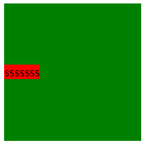
 2、同水平居中,先给父元素设置相对定位,子元素设置绝对定位,通过top:50%将子元素的左上角垂直居中,然后通过transform:translateY(-50%)将其整体垂直居中。
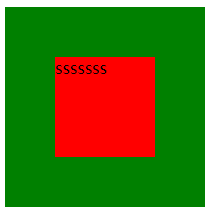 2、先给父元素设置相对定位,子元素设置绝对定位,通过top:50%和left:50%将子元素的左上角垂直水平居中,然后通过margin-top:-50px(该值为子元素高度的一半)和margin-left:-50px(该值为子元素宽度的一半)将其整体垂直水平居中。
【本文地址】
今日新闻 |
推荐新闻 |