制作好看的3D动态旋转正方体 |
您所在的位置:网站首页 › 正方体旋转动图 › 制作好看的3D动态旋转正方体 |
制作好看的3D动态旋转正方体
|
制作好看的3D动态旋转正方体
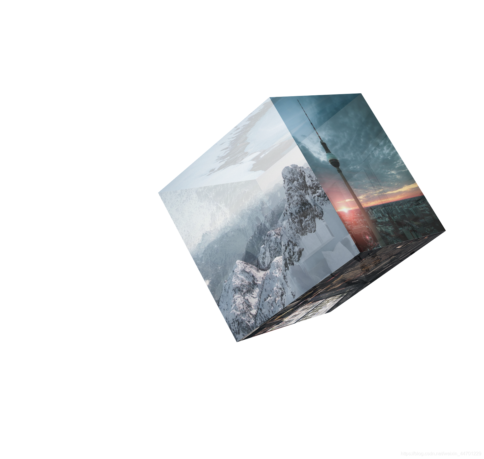
效果展示入口
1. 先在html中创建出大div(正方体整体),并在其中创建出6个小div(正方体6个面)。 2. 然后在css中先将基本位置和大小确定,并确定视角视距: perspective: 2000px; perspective-origin: center 200px;3. 将正方形6个面运用定位全部叠压在父元素div上,给每个设置移动的原点,旋转以及增加Z轴坐标的大小(注意旋转后轴也会跟着改变)具体看css下面代码。 4. 最后写一个动画效果让它旋转animation: go 5s linear infinite循环匀速的旋转。 源码: html css :root,body{ height: 100%; } body{ margin: 0; padding: 0; perspective: 2000px; perspective-origin: center 200px; transform-style: preserve-3d; } .big{ position: absolute; left: calc(50% - 150px); top: calc(50% - 150px); width: 300px; height: 300px; transform-origin: center center; transform-style: preserve-3d; animation: go 5s linear infinite; } .big div{ position: absolute; width: 300px; height: 300px; opacity: 0.8; background-repeat: no-repeat; background-size: cover; } .div1{ transform-origin:0 150px; transform: rotateY(90deg); background-image: url(img/picture1.jpeg); } .div2{ transform-origin:300px 150px; transform: rotateY(-90deg); background-image: url(img/picture8.jpeg); } .div3{ transform: translateZ(-300px); background-image: url(img/picture3.jpeg); } .div4{ transform-origin:150px 0; transform: rotateX(-90deg); background-image: url(img/picture9.jpeg); } .div5{ transform-origin:150px 300px; transform: rotateX(90deg); background-image: url(img/picture5.jpeg); } .div6{ background-image: url(img/picture6.jpeg); } @keyframes go { 0%{ transform: rotateY(0deg) rotateZ(0deg); } 50%{ transform: rotateY(180deg) rotateZ(180deg); } 100%{ transform: rotateY(360deg) rotateZ(360deg); } } ~~~~~~~~ end ~~~~~~~~ |
 制作方法主要运用css3中的animation 和 transform.
【本文地址】
今日新闻 |
推荐新闻 |