R |
您所在的位置:网站首页 › 核密度估计曲线图 › R |
R
|
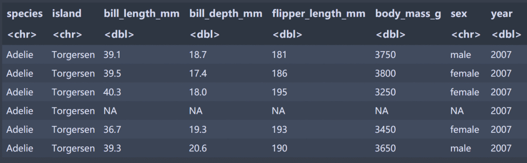
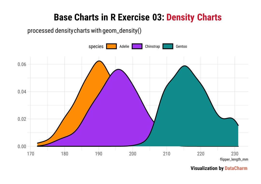
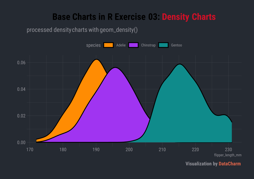
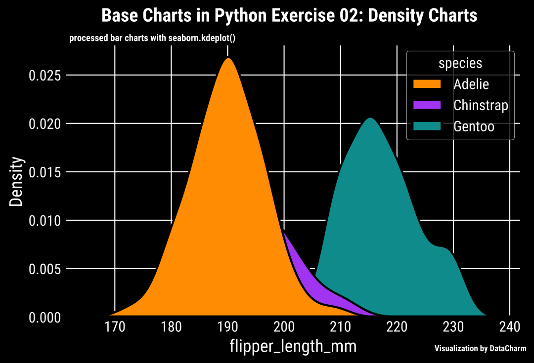
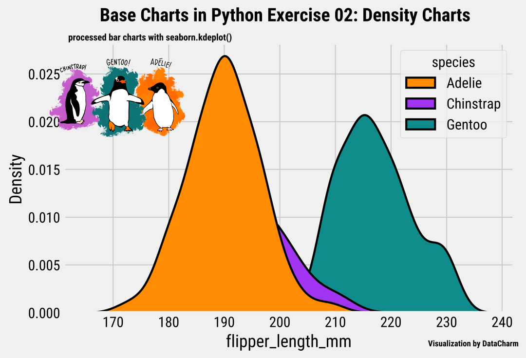
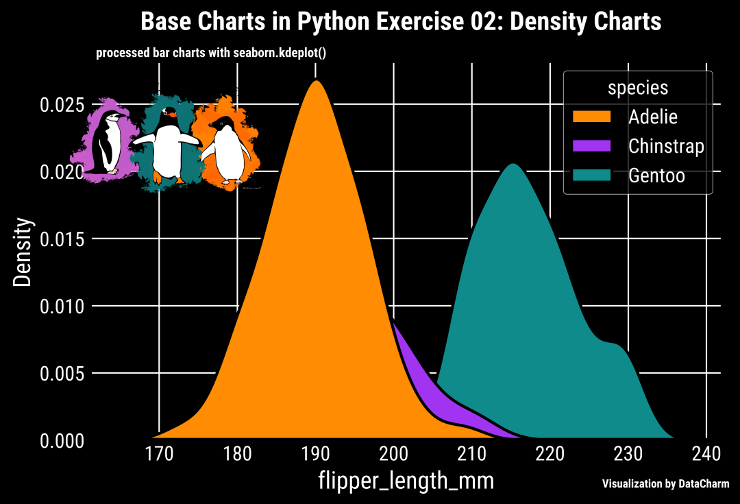
作者:宁海涛 来源:DataCharm 前面介绍了基础直方图的绘制教程,接下来,同样分享一篇关于数据分布的基础图表绘制-核密度估计图。具体含义我们这里就不作多解释,大家可以自行百度啊,这里我们主要讲解R-python绘制该图的方法。本期知识点主要如下: R-ggplot2.geom_density()绘制方法Python-seaborn.kdeplot()绘制方法各自方法的图片元素添加R-ggplot2.geom_density()绘制方法我们还是使用前几期绘制的数据,关注公众号DataCharm,后台回复柱形图 ,即可获取练习数据啦。这里给出部分数据的预览,如下: 这里直接给出绘图代码: library(ggtext)library(hrbrthemes)flipper_density geom_density(aes(fill=species),colour="black",size=1)+ scale_fill_manual(values = c('#FF8C03',"#A034F1","#0F8B8B")) + guides(fill = guide_legend(nrow = 1)) + labs(y="", title = "Base Charts in R Exercise 03: Density Charts", subtitle = "processed density charts with geom_density()", caption = "Visualization by DataCharm") + theme_ipsum(base_family = "Roboto Condensed") + theme( plot.title = element_markdown(hjust = 0.5,vjust = .5,color = "black", size = 22, margin = margin(t = 1, b = 12)), plot.subtitle = element_markdown(hjust = 0,vjust = .5,size=15), plot.caption = element_markdown(face = 'bold',size = 12), #legend.position = c(.1, .1), legend.position = "top", legend.direction = "horizontal", #legend.justification = "right", legend.key.width = unit(1.8, "lines"), legend.key.height = unit(1, "lines"), ) 可视化结果如下: 通过如下代码,更换成“暗黑主题”: theme_ft_rc() +注意: theme_ft_rc() 和* theme_ipsum()* 都来自功能强大的hrbrthemes 绘图主题包哦,大家可以重点掌握哦。结果如下: 该方法前几篇推文呢都有介绍,这里不再累赘,直接给出代码: #读取图片library(png)library(grid)img_file "lter_penguins.png"img i1flipper_density_img annotation_custom(i1, ymin = .045, ymax = .065, xmin = 220, xmax = 235) 效果如下: 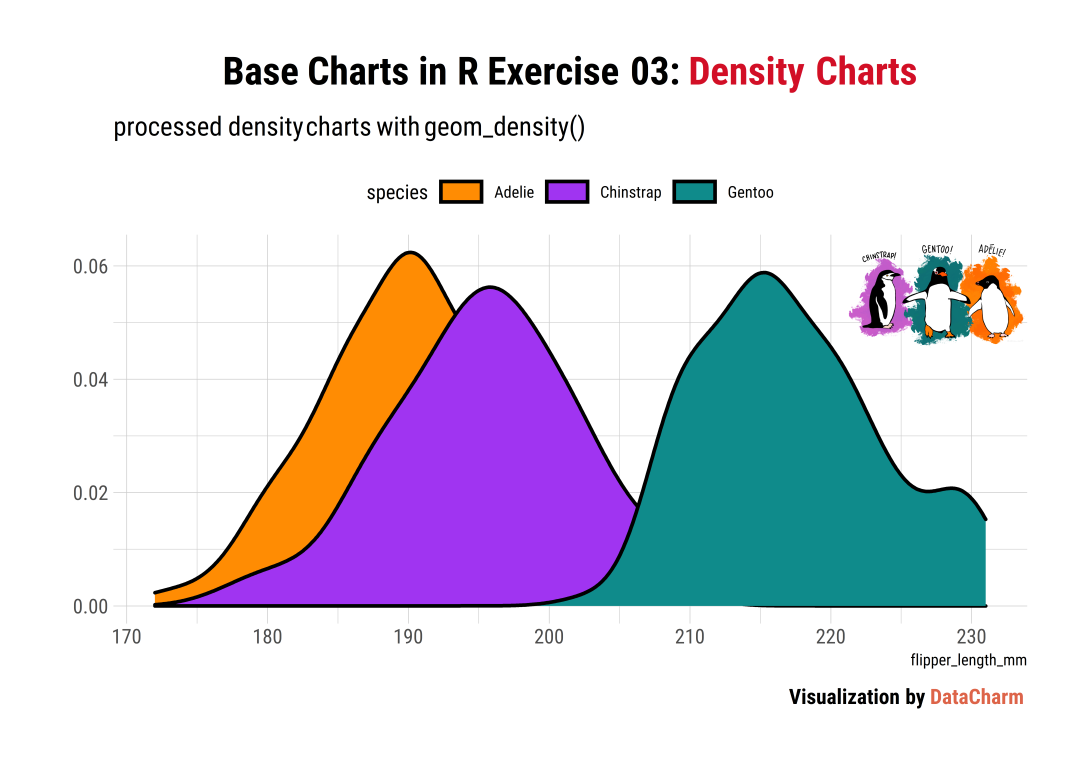 暗黑主题的图片添加,效果如下: 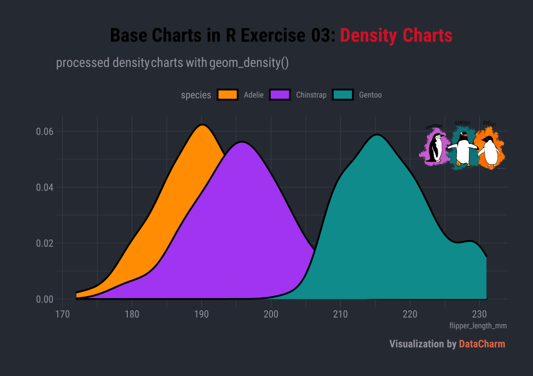 Python-seaborn 绘制 Python-seaborn 绘制还是使用集成功能强大的seaborn绘图包,我们直接给出代码: import pandas as pdimport numpy as npimport matplotlib.pyplot as pltimport seaborn as snsfig,ax = plt.subplots(figsize=(7,4.5),dpi=200) palette = ['#FF8C03',"#A034F1","#0F8B8B"]sns.kdeplot(data=data,x="flipper_length_mm",hue="species",palette=palette,alpha=1, hue_order=["Adelie","Chinstrap","Gentoo"],fill=True,edgecolor="black", linewidth=2,ax=ax) #titleax.text(.08,1.1,"Base Charts in Python Exercise 02: Density Charts", transform = ax.transAxes,color='k',ha='left',va='center',size=18,fontweight='extra bold')#subtitleax.text(.01,1.02,"processed bar charts with seaborn.kdeplot()", transform = ax.transAxes,color='k',ha='left',va='center',size=9,fontweight='bold')#captionax.text(.91,-.1,'\nVisualization by DataCharm',transform = ax.transAxes, ha='center', va='center',fontsize = 8,color='black',fontweight='bold') 结果如下: 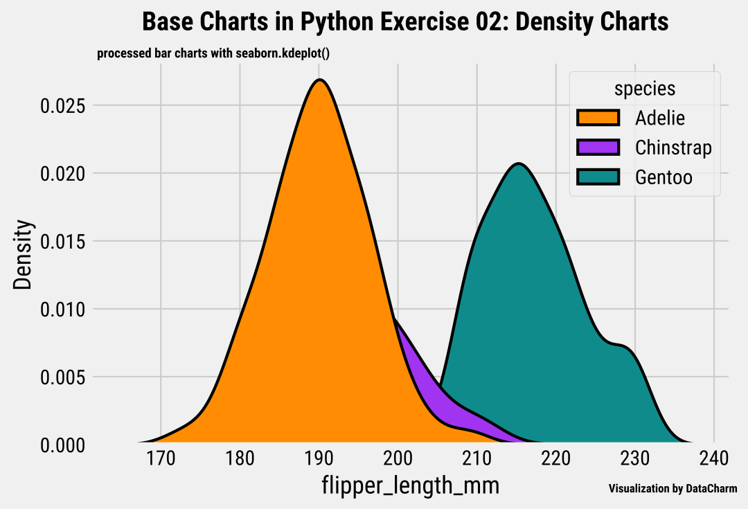 更换主题 更换主题通过添加如下代码完成: plt.style.use('dark_background')可视化效果如下: 这部分是对绘图结果进行美化操作,大家可以尝试一下。直接给出添加图片的代码: from mpl_toolkits.axes_grid1.inset_locator import inset_axes#添加图片aximins = inset_axes(ax,width=2,height=2, bbox_to_anchor=(.1, .55, .2, .6), #[left, bottom, width, height], bbox_transform=ax.transAxes)im = aximins.imshow(image,zorder=0)aximins.axis('off') 将以上代码加入之前的代码即可。最终的效果如下: 暗黑风格的图片添加效果如下: 本期将R-ggplot2绘图和Python-seaborn 进行了汇总整理,一方面因为内容较为基础,另一方面,大家也可以对比下R-ggplot2系列 和Python-matplotlib系列绘图。大家可以根据自己喜好选择适合自己的绘图工具。 ◆ ◆ ◆ ◆ ◆ 麟哥新书已经在京东上架了,我写了本书:《拿下Offer-数据分析师求职面试指南》,目前京东正在举行100-50活动,大家可以用相当于原价5折的预购价格购买,还是非常划算的:
数据森麟公众号的交流群已经建立,许多小伙伴已经加入其中,感谢大家的支持。大家可以在群里交流关于数据分析&数据挖掘的相关内容,还没有加入的小伙伴可以扫描下方管理员二维码,进群前一定要关注公众号奥,关注后让管理员帮忙拉进群,期待大家的加入。 管理员二维码:
● 卧槽!原来爬取B站弹幕这么简单 ● 厉害了!麟哥新书登顶京东销量排行榜! ● 笑死人不偿命的知乎沙雕问题排行榜 ● 用Python扒出B站那些“惊为天人”的阿婆主! ● 你相信逛B站也能学编程吗 |


【本文地址】
今日新闻 |
推荐新闻 |