CSS的20种对齐代码!左对齐、右对齐、中间对齐、底部对齐、两端对齐等,代码简单(最全) |
您所在的位置:网站首页 › 文本框的对齐方式 › CSS的20种对齐代码!左对齐、右对齐、中间对齐、底部对齐、两端对齐等,代码简单(最全) |
CSS的20种对齐代码!左对齐、右对齐、中间对齐、底部对齐、两端对齐等,代码简单(最全)
|
你好,我是云桃桃。 一个希望帮助更多朋友快速入门 WEB 前端的程序媛。 云桃桃-大专生,一枚程序媛,感谢关注。回复 “前端基础题”,可免费获得前端基础 100 题汇总,回复 “前端工具”,可获取 Web 开发工具合集 282篇原创内容-更多前端系列内容可以go公众.h:云桃桃 后台回复“前端工具”可获取开发工具,持续更新中 后台回复“前端基础题”可得到前端基础100题汇总,持续更新中 后台回复“前端电子书”可获取20+本精选电子书 前言CSS 中的右很多对齐的方式,今天主要来分享 20 个常用的对齐方式。 来一起看看吧。 1. 水平居中1.1 水平居中对齐块元素 .box { width: 1180px; height: 100px; border: 1px solid #0f0; margin: 10px auto; }比如,tb的这个顶部导航和中间内容区块,都是居中的:
1.2 水平居中对齐图像 img { display: block; width: 50%; margin: 10px auto; }1.3 水平居中对齐文本 .box { width: 600px; height: 100px; text-align: center; border: 1px solid #333; } 2. 垂直居中2.1 垂直居中对齐块元素 .box { width: 400px; height: 100px; background: #0f0; padding: 20px 0px; }比如,wyy右侧这块,上下都居中,可以用 padding 或者相同的 margin,都能实现。
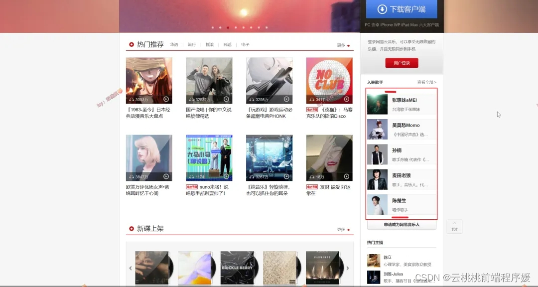
2.2 垂直居中对齐文本 .box { width: 400px; height: 100px; background: #0f0; line-height: 100px; }比如,wyy音乐导航这里,文字就是垂直居中。
2.3 垂直居中对齐元素之flexbox(CSS3) .box { width: 400px; height: 100px; background: #0f0; display: flex; align-items: center; } 3. 水平垂直居中3.2 使用 padding .box { padding: 20px; }3.2 使用 position 和 transform .box { width: 400px; height: 100px; background: #0f0; position: absolute; left: 50%; top: 50%; transform: translate(-50%, -50%); }比如dy的登录弹窗。
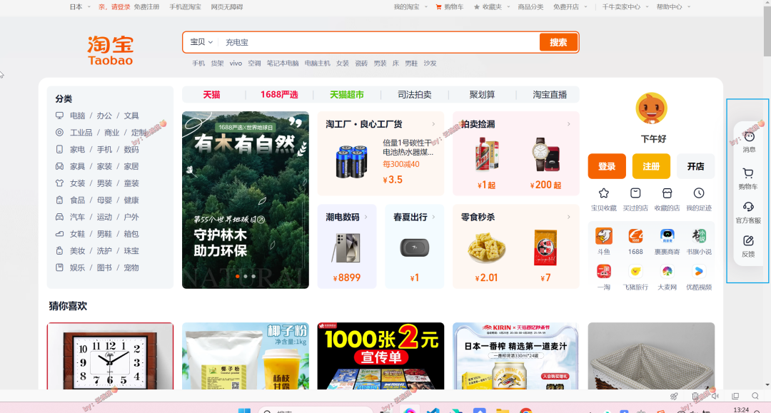
3.3 使用 flexbox .box { width: 400px; height: 100px; background: #0f0; display: flex; justify-content: center; align-items: center; } 4. 居左/居右对齐4.1 float 左对齐 .box { width: 400px; background: #0f0; float: left; }注意:使用时候,记得给父级增加 clearfix,防止浮动导致父级高度塌陷。 /* 清除浮动样式 */ .clearfix::after { content: ''; display: table; clear: both; }4.2 float 右对齐 .box { width: 400px; background: #0f0; float: right; }注意:使用时候,记得给父级增加 clearfix,防止浮动导致父级高度塌陷。 /* 清除浮动样式 */ .clearfix::after { content: ''; display: table; clear: both; }4.3 让文本居左 .box { text-align: left; }4.4 让文本居右 .box { text-align: right; }4.5 使用定位让元素居左 .box { width: 400px; background: pink; position: absolute; left: 0; }4.6 使用定位让元素居右 .box { width: 400px; background: #00f; position: absolute; right: 10px; }比如,tb右侧客服这块。
5.1 两端对齐多个元素之 float .box-left { width: 800px; background: #00f; float: left; } .box-right { width: 300px; background: #0f0; float: right; }注意:使用时候,记得给父级增加 clearfix,防止浮动导致父级高度塌陷。 /* 清除浮动样式 */ .clearfix::after { content: ''; display: table; clear: both; }比如,淘宝这块。
5.2 两端对齐多个元素之 flexbox(CSS3) .box { width: 400px; background: #0f0; display: flex; justify-content: space-between; }5.3 两端对齐文本 .box { width: 400px; background: #0f0; text-align: justify; } 6. 底部对齐6.1 底部对齐元素 .box { width: 400px; height: 400px; background: #0f0; display: flex; align-items: flex-end; justify-content: flex-start; } 7. 顶部对齐7.1 顶部对齐元素 .box { width: 400px; height: 400px; background: #0f0; display: flex; align-items: flex-start; /* 不让子元素拉伸至整个父级高度 */ justify-content: flex-start; /* 水平顶端对齐 */ }OK,本文完。 |


【本文地址】
今日新闻 |
推荐新闻 |