如何使用Matplotlib模块的text()函数给柱形图添加美丽的标签数据? |
您所在的位置:网站首页 › 数据标签添加 › 如何使用Matplotlib模块的text()函数给柱形图添加美丽的标签数据? |
如何使用Matplotlib模块的text()函数给柱形图添加美丽的标签数据?
|
1 简单引入
在进行数据分析时,当一些图表数据,比如柱形图我们想让它更直观的显示一些内容,有时候会给柱形图添加标签, 那如何实现这样的效果呢?还有比如我们把某手机品牌1-12月每月的销量制作成柱形图,那如何在柱形图上显示具体的每月销量的标签?带着这个问题,我们来研究下这个功能吧;本文使用的是Python的Matplotlib模块的text()函数,它能给图表的指定位置添加标签、注释或标注。
2 关于text()函数
2.1 Matplotlib安装
text()函数是Python的Matplotlib模块一个函数;具体引入的话,需要先安装Matplotlib模块:
pip install matplotlib
 要解决中文乱码,我们加一行代码:
plt.rcParams['font.sans-serif'] = ['SimHei']
之后显示如下: 要解决中文乱码,我们加一行代码:
plt.rcParams['font.sans-serif'] = ['SimHei']
之后显示如下:  示例2:我们添加几个点数据,并设置文本数据:
# -*- coding:utf-8 -*-
# 作者:虫无涯
# 日期:2023/11/17
# 文件名称:test_plt_text().py
# 作用:Matplotlib模块的text()函数的应用
# 联系:VX(NoamaNelson)
# 博客:https://blog.csdn.net/NoamaNelson
import matplotlib.pyplot as plt
plt.figure(figsize=(5, 5))
x = [1, 2, 6]
x_pos = 1
y_pos = 1.5
plt.text(x_pos, y_pos, "这是一个标签")
plt.plot(x)
plt.rcParams['font.sans-serif'] = ['SimHei']
plt.show()
结果显示如下: 示例2:我们添加几个点数据,并设置文本数据:
# -*- coding:utf-8 -*-
# 作者:虫无涯
# 日期:2023/11/17
# 文件名称:test_plt_text().py
# 作用:Matplotlib模块的text()函数的应用
# 联系:VX(NoamaNelson)
# 博客:https://blog.csdn.net/NoamaNelson
import matplotlib.pyplot as plt
plt.figure(figsize=(5, 5))
x = [1, 2, 6]
x_pos = 1
y_pos = 1.5
plt.text(x_pos, y_pos, "这是一个标签")
plt.plot(x)
plt.rcParams['font.sans-serif'] = ['SimHei']
plt.show()
结果显示如下:  3 柱形图绘制并添加标签
3.1 目标数据
我们先创建一个产品0-12月份的每月销量数据表plt_text.xlsx:
月份 销量
1月 1200
2月 2400
3月 112
4月 125
5月 555
6月 135
7月 136
8月 269
9月 627
10月 876
11月 350
12月 233
3.2 读取excel数据
class TestPltText():
def __init__(self):
super(TestPltText, self).__init__()
# 读取excel数据
self.data = "./plt_text.xlsx"
self.data_excel = pd.DataFrame(pd.read_excel(self.data))
# 获取相关内容
self.data_content = self.data_excel[["月份", "销量"]]
self.data_content01 = self.data_content.sort_values("销量", ascending=True)
3.3 设置窗口大小和xy轴坐标
def test_plt_text(self):
# 设置窗口大小
plt.figure(figsize=(5, 4))
# 构造x,y轴坐标
y = np.array(list(self.data_content01["销量"]))
x_ticks = list(self.data_content01["月份"])
x = range(len(x_ticks))
3.4 绘制柱形图
# 绘制柱形图
plt.bar(x, y, width=0.5, align="center", color="b", alpha=0.6)
plt.xticks(range(len(x_ticks)), x_ticks, fontsize=6, rotation=90)
3.5 设置标签
# x、y轴标签
plt.xlabel('月份')
plt.ylabel('销量')
plt.title('月销量(万)')
# 设置标签
for label1, label2 in zip(x, y):
plt.text(label1, label2+10,
'%.0f' % label2,
ha='center',
va='bottom',
fontsize=9)
3.6 解决乱码和结果显示
# 设置y轴的范围
plt.ylim(0, 2600)
plt.rcParams['font.sans-serif'] = ['SimHei']
plt.show()
4 完整源码
# -*- coding:utf-8 -*-
# 作者:虫无涯
# 日期:2023/11/17
# 文件名称:test_plt_text().py
# 作用:Matplotlib模块的text()函数的应用
# 联系:VX(NoamaNelson)
# 博客:https://blog.csdn.net/NoamaNelson
import pandas as pd
import numpy as np
import matplotlib.pyplot as plt
import random
class TestPltText():
def __init__(self):
super(TestPltText, self).__init__()
# 读取excel数据
self.data = "./plt_text.xlsx"
self.data_excel = pd.DataFrame(pd.read_excel(self.data))
# 获取相关内容
self.data_content = self.data_excel[["月份", "销量"]]
self.data_content01 = self.data_content.sort_values("销量", ascending=True)
def test_plt_text(self):
# 设置窗口大小
plt.figure(figsize=(5, 4))
# 构造x,y轴坐标
y = np.array(list(self.data_content01["销量"]))
x_ticks = list(self.data_content01["月份"])
x = range(len(x_ticks))
# 绘制柱形图
plt.bar(x, y, width=0.5, align="center", color="b", alpha=0.6)
plt.xticks(range(len(x_ticks)), x_ticks, fontsize=6, rotation=90)
# x、y轴标签
plt.xlabel('月份')
plt.ylabel('销量')
plt.title('月销量(万)')
# 设置标签
for label1, label2 in zip(x, y):
plt.text(label1, label2+10,
'%.0f' % label2,
ha='center',
va='bottom',
fontsize=9)
# 设置y轴的范围
plt.ylim(0, 2600)
plt.rcParams['font.sans-serif'] = ['SimHei']
plt.show()
if __name__ == "__main__":
plt_text = TestPltText()
plt_text.test_plt_text()
5 结果显示
5.1 从小到大排序
设置如下:
self.data_content01 = self.data_content.sort_values("销量", ascending=True)
结果显示:
3 柱形图绘制并添加标签
3.1 目标数据
我们先创建一个产品0-12月份的每月销量数据表plt_text.xlsx:
月份 销量
1月 1200
2月 2400
3月 112
4月 125
5月 555
6月 135
7月 136
8月 269
9月 627
10月 876
11月 350
12月 233
3.2 读取excel数据
class TestPltText():
def __init__(self):
super(TestPltText, self).__init__()
# 读取excel数据
self.data = "./plt_text.xlsx"
self.data_excel = pd.DataFrame(pd.read_excel(self.data))
# 获取相关内容
self.data_content = self.data_excel[["月份", "销量"]]
self.data_content01 = self.data_content.sort_values("销量", ascending=True)
3.3 设置窗口大小和xy轴坐标
def test_plt_text(self):
# 设置窗口大小
plt.figure(figsize=(5, 4))
# 构造x,y轴坐标
y = np.array(list(self.data_content01["销量"]))
x_ticks = list(self.data_content01["月份"])
x = range(len(x_ticks))
3.4 绘制柱形图
# 绘制柱形图
plt.bar(x, y, width=0.5, align="center", color="b", alpha=0.6)
plt.xticks(range(len(x_ticks)), x_ticks, fontsize=6, rotation=90)
3.5 设置标签
# x、y轴标签
plt.xlabel('月份')
plt.ylabel('销量')
plt.title('月销量(万)')
# 设置标签
for label1, label2 in zip(x, y):
plt.text(label1, label2+10,
'%.0f' % label2,
ha='center',
va='bottom',
fontsize=9)
3.6 解决乱码和结果显示
# 设置y轴的范围
plt.ylim(0, 2600)
plt.rcParams['font.sans-serif'] = ['SimHei']
plt.show()
4 完整源码
# -*- coding:utf-8 -*-
# 作者:虫无涯
# 日期:2023/11/17
# 文件名称:test_plt_text().py
# 作用:Matplotlib模块的text()函数的应用
# 联系:VX(NoamaNelson)
# 博客:https://blog.csdn.net/NoamaNelson
import pandas as pd
import numpy as np
import matplotlib.pyplot as plt
import random
class TestPltText():
def __init__(self):
super(TestPltText, self).__init__()
# 读取excel数据
self.data = "./plt_text.xlsx"
self.data_excel = pd.DataFrame(pd.read_excel(self.data))
# 获取相关内容
self.data_content = self.data_excel[["月份", "销量"]]
self.data_content01 = self.data_content.sort_values("销量", ascending=True)
def test_plt_text(self):
# 设置窗口大小
plt.figure(figsize=(5, 4))
# 构造x,y轴坐标
y = np.array(list(self.data_content01["销量"]))
x_ticks = list(self.data_content01["月份"])
x = range(len(x_ticks))
# 绘制柱形图
plt.bar(x, y, width=0.5, align="center", color="b", alpha=0.6)
plt.xticks(range(len(x_ticks)), x_ticks, fontsize=6, rotation=90)
# x、y轴标签
plt.xlabel('月份')
plt.ylabel('销量')
plt.title('月销量(万)')
# 设置标签
for label1, label2 in zip(x, y):
plt.text(label1, label2+10,
'%.0f' % label2,
ha='center',
va='bottom',
fontsize=9)
# 设置y轴的范围
plt.ylim(0, 2600)
plt.rcParams['font.sans-serif'] = ['SimHei']
plt.show()
if __name__ == "__main__":
plt_text = TestPltText()
plt_text.test_plt_text()
5 结果显示
5.1 从小到大排序
设置如下:
self.data_content01 = self.data_content.sort_values("销量", ascending=True)
结果显示:  5.2 从大到小排序
设置如下:
self.data_content01 = self.data_content.sort_values("销量", ascending=True)
plt.bar(x, y, width=0.5, align="center", color="c", alpha=0.6)
结果显示:
5.2 从大到小排序
设置如下:
self.data_content01 = self.data_content.sort_values("销量", ascending=True)
plt.bar(x, y, width=0.5, align="center", color="c", alpha=0.6)
结果显示:  5.3 原序列输出显示
不进行排序,直接进行输出原图:
# 构造x,y轴坐标
y = np.array(list(self.data_content["销量"]))
x_ticks = list(self.data_content["月份"])
x = range(len(x_ticks))
plt.bar(x, y, width=0.5, align="center", color="k", alpha=0.6)
结果显示:
5.3 原序列输出显示
不进行排序,直接进行输出原图:
# 构造x,y轴坐标
y = np.array(list(self.data_content["销量"]))
x_ticks = list(self.data_content["月份"])
x = range(len(x_ticks))
plt.bar(x, y, width=0.5, align="center", color="k", alpha=0.6)
结果显示:  ---------------------------END---------------------------
题外话
---------------------------END---------------------------
题外话
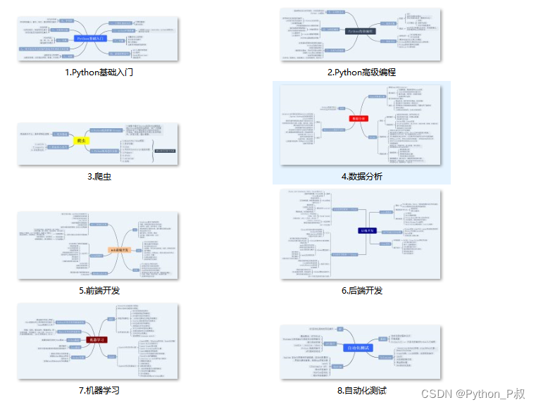
感兴趣的小伙伴,赠送全套Python学习资料,包含面试题、简历资料等具体看下方。 👉CSDN大礼包🎁:全网最全《Python学习资料》免费赠送🆓!(安全链接,放心点击) 一、Python所有方向的学习路线 Python所有方向的技术点做的整理,形成各个领域的知识点汇总,它的用处就在于,你可以按照下面的知识点去找对应的学习资源,保证自己学得较为全面。
二、Python兼职渠道推荐* 学的同时助你创收,每天花1-2小时兼职,轻松稿定生活费. 三、最新Python学习笔记 当我学到一定基础,有自己的理解能力的时候,会去阅读一些前辈整理的书籍或者手写的笔记资料,这些笔记详细记载了他们对一些技术点的理解,这些理解是比较独到,可以学到不一样的思路。
四、实战案例 纸上得来终觉浅,要学会跟着视频一起敲,要动手实操,才能将自己的所学运用到实际当中去,这时候可以搞点实战案例来学习。
|


【本文地址】
今日新闻 |
推荐新闻 |