CSS居中的方式15种(水平垂直) |
您所在的位置:网站首页 › 居中div方式 › CSS居中的方式15种(水平垂直) |
CSS居中的方式15种(水平垂直)
|
1水平居中
1.1、内联元素水平居中
利用 text-align: center 可以实现在块级元素内部的内联元素水平居中。此方法对内联元素(inline), 内联块(inline-block), 内联表(inline-table), inline-flex元素水平居中都有效。 核心代码: .center-text { text-align: center; }   DOCTYPE HTML>
内联元素水平居中-测试1
div {
height:60px;
border: 2px dashed #f69c55;
}
.center-text {
text-align: center;
}
简单是稳定的前提。
View Code
DOCTYPE HTML>
内联元素水平居中-测试1
div {
height:60px;
border: 2px dashed #f69c55;
}
.center-text {
text-align: center;
}
简单是稳定的前提。
View Code
运行结果:
通过把固定宽度块级元素的margin-left和margin-right设成auto,就可以使块级元素水平居中。 核心代码: .center-block { margin: 0 auto; }
DOCTYPE HTML>
块级元素水平居中
div {
height:100px;
border: 2px dashed #f69c55;
}
.center-block {
margin: 0 auto;
width: 8rem;
padding:1rem;
color:#fff;
background:#000;
}
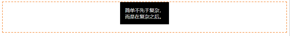
简单不先于复杂,而是在复杂之后。
View Code
运行结果:
如果一行中有两个或两个以上的块级元素,通过设置块级元素的显示类型为inline-block和父容器的text-align属性从而使多块级元素水平居中。 核心代码: .container { text-align: center; } .inline-block { display: inline-block; }
DOCTYPE HTML>
多块级元素水平居中-inline-block
.container {
height:100px;
padding: 8px;
text-align: center;
border: 2px dashed #f69c55;
}
.inline-block {
padding: 8px;
width: 4rem;
margin: 0 8px;
color: #fff;
background: #000;
display: inline-block;
}
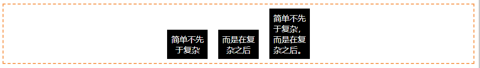
简单不先于复杂
而是在复杂之后
简单不先于复杂,而是在复杂之后。
View Code
运行结果:
利用弹性布局(flex),实现水平居中,其中justify-content 用于设置弹性盒子元素在主轴(横轴)方向上的对齐方式,本例中设置子元素水平居中显示。 核心代码: .flex-center { display: flex; justify-content: center; }
DOCTYPE HTML>
多块级元素水平居中-弹性布局
.flex-center {
padding: 8px;
display: flex;
justify-content: center;
border: 2px dashed #f69c55;
}
.flex-center >div {
padding: 8px;
width: 4rem;
margin: 0 8px;
color: #fff;
background: #000;
}
简单不先于复杂。
简单不先于复杂,而是在复杂之后。
而是在复杂之后。
View Code
运行结果: 通过设置内联元素的高度(height)和行高(line-height)相等,从而使元素垂直居中。 核心代码: #v-box { height: 120px; line-height: 120px; }
DOCTYPE HTML>
单行内联元素垂直居中-line-height
#box {
height: 120px;
line-height: 120px;
border: 2px dashed #f69c55;
}
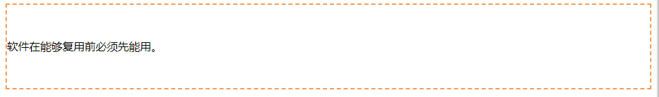
软件在能够复用前必须先能用。
View Code
运行结果:
利用表布局的vertical-align: middle可以实现子元素的垂直居中。 核心代码: .center-table { display: table; } .v-cell { display: table-cell; vertical-align: middle; }
DOCTYPE HTML>
多行内联元素垂直居中-table
.center-table {
display: table;
height: 140px;
border: 2px dashed #f69c55;
}
.v-cell {
display: table-cell;
vertical-align: middle;
}
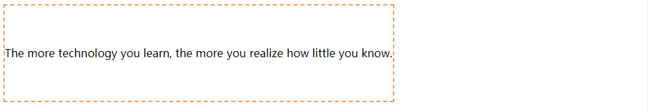
The more technology you learn, the more you realize how little you know.
View Code
运行结果:
利用flex布局实现垂直居中,其中flex-direction: column定义主轴方向为纵向。因为flex布局是CSS3中定义,在较老的浏览器存在兼容性问题。 核心代码: .center-flex { display: flex; flex-direction: column; justify-content: center; }
DOCTYPE HTML>
多行内联元素垂直居中-flex
.center-flex {
height: 140px;
display: flex;
flex-direction: column;
justify-content: center;
border: 2px dashed #f69c55;
}
Dance like nobody is watching, code like everybody is.
View Code
运行结果:
利用“精灵元素”(ghost element)技术实现垂直居中,即在父容器内放一个100%高度的伪元素,让文本和伪元素垂直对齐,从而达到垂直居中的目的。 核心代码: .ghost-center { position: relative; } .ghost-center::before { content: " "; display: inline-block; height: 100%; width: 1%; vertical-align: middle; } .ghost-center p { display: inline-block; vertical-align: middle; width: 20rem; }
DOCTYPE HTML>
多行内联元素垂直居中-伪元素
.ghost-center {
position: relative;
border: 2px dashed #f69c55;
padding: 10px 0;
}
.ghost-center::before {
content: " ";
display: inline-block;
height: 100%;
width: 1%;
vertical-align: middle;
}
.ghost-center p {
display: inline-block;
vertical-align: middle;
width: 12rem;
padding:1rem;
color:#fff;
background:#000;
}
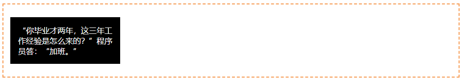
“你毕业才两年,这三年工作经验是怎么来的?”程序员答:“加班。”
View Code
运行结果:
我们知道居中元素的高度和宽度,垂直居中问题就很简单。通过绝对定位元素距离顶部50%,并设置margin-top向上偏移元素高度的一半,就可以实现垂直居中了。 核心代码: .parent { position: relative; } .child { position: absolute; top: 50%; height: 100px; margin-top: -50px; }
DOCTYPE HTML>
固定高度的块元素垂直居中
.parent {
height: 140px;
position: relative;
border: 2px dashed #f69c55;
}
.child {
position: absolute;
top: 50%;
height: 100px;
margin-top: -50px;
color:#fff;
background: #000;
}
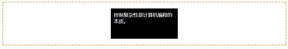
控制复杂性是计算机编程的本质。
View Code
运行结果:
当垂直居中的元素的高度和宽度未知时,我们可以借助CSS3中的transform属性向Y轴反向偏移50%的方法实现垂直居中。但是部分浏览器存在兼容性的问题。 核心代码: .parent { position: relative; } .child { position: absolute; top: 50%; transform: translateY(-50%); }
DOCTYPE HTML>
未知高度的块元素垂直居中
.parent {
height: 140px;
position: relative;
border: 2px dashed #f69c55;
}
.child {
position: absolute;
top: 50%;
transform: translateY(-50%);
background: black;
color: #fff;
padding: 1rem;
width: 12rem;
}
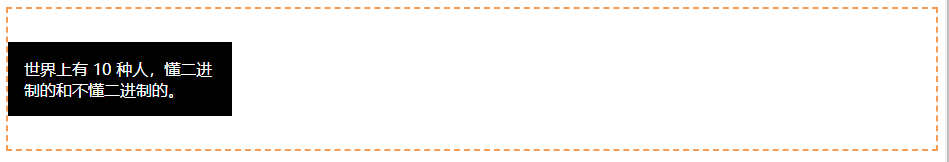
世界上有 10 种人,懂二进制的和不懂二进制的。
View Code
运行结果:
3 水平垂直居中 3.1 固定宽高元素水平垂直居中 通过margin平移元素整体宽度的一半,使元素水平垂直居中。 核心代码: .parent { position: relative; } .child { width: 300px; height: 100px; padding: 20px; position: absolute; top: 50%; left: 50%; margin: -70px 0 0 -170px; }
DOCTYPE HTML>
固定宽高元素水平垂直居中
.parent {
height: 140px;
position: relative;
border: 2px dashed #f69c55;
}
.child {
width: 200px;
height: 80px;
padding: 10px;
position: absolute;
top: 50%;
left: 50%;
margin: -50px 0 0 -110px;
background: black;
color: #fff;
}
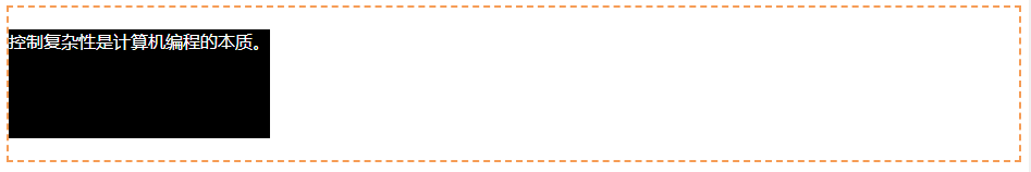
控制复杂性是计算机编程的本质。
View Code
运行结果:
利用2D变换,在水平和垂直两个方向都向反向平移宽高的一半,从而使元素水平垂直居中。 核心代码: .parent { position: relative; } .child { position: absolute; top: 50%; left: 50%; transform: translate(-50%, -50%); }
DOCTYPE HTML>
未知宽高元素水平垂直居中
.parent {
height: 140px;
position: relative;
border: 2px dashed #f69c55;
}
.child {
padding: 10px;
position: absolute;
top: 50%;
left: 50%;
transform: translate(-50%, -50%);
color: #fff;
background: black;
}
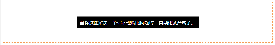
当你试图解决一个你不理解的问题时,复杂化就产成了。
View Code
运行结果:
利用flex布局,其中justify-content 用于设置或检索弹性盒子元素在主轴(横轴)方向上的对齐方式;而align-items属性定义flex子项在flex容器的当前行的侧轴(纵轴)方向上的对齐方式。 核心代码: .parent { display: flex; justify-content: center; align-items: center; }
DOCTYPE HTML>
利用flex布局实现元素水平垂直居中
.parent {
height: 140px;
display: flex;
justify-content: center;
align-items: center;
border: 2px dashed #f69c55;
}
.child {
padding: 20px;
background: black;
color: #fff;
}
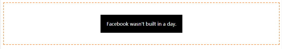
Facebook wasn't built in a day.
View Code
运行结果:
利用grid实现水平垂直居中,兼容性较差,不推荐。 核心代码: .parent { height: 140px; display: grid; } .child { margin: auto; }
DOCTYPE HTML>
利用grid布局实现元素水平垂直居中
.parent {
height: 140px;
display: grid;
align-items:center;
border: 2px dashed #f69c55;
}
.child {
margin:auto;
padding: 20px;
width:10rem;
color: #fff;
background: black;
}
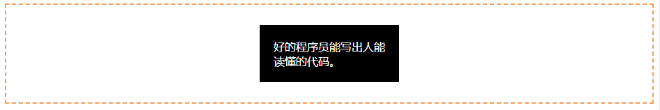
好的程序员能写出人能读懂的代码。
View Code
运行结果:
屏幕上水平垂直居中十分常用,常规的登录及注册页面都需要用到。要保证较好的兼容性,还需要用到表布局。 核心代码: .outer { display: table; position: absolute; height: 100%; width: 100%; } .middle { display: table-cell; vertical-align: middle; } .inner { margin-left: auto; margin-right: auto; width: 400px; }
DOCTYPE HTML>
如何使DIV在屏幕上水平垂直居中显示?兼容性要好
.outer {
display: table;
position: absolute;
height: 100%;
width: 100%;
}
.middle {
display: table-cell;
vertical-align: middle;
}
.inner {
margin-left: auto;
margin-right: auto;
background: #2b2b2b;
color:#fff;
padding: 2rem;
max-width: 320px;
}
一个好的程序员应该是那种过单行线都要往两边看的人。
增加内容
$(document).ready(function () {
$("#add").click(function () {
$("p").after("解决问题大多数都很容易;找到问题出在哪里却很难。 "); }); }); View Code运行结果:
自己学习,参考原文地址:这15种CSS居中的方式,你都用过哪几种? |


【本文地址】