用Python绘制超酷的gif动图,惊艳了所有人 |
您所在的位置:网站首页 › 如何用python画数据图 › 用Python绘制超酷的gif动图,惊艳了所有人 |
用Python绘制超酷的gif动图,惊艳了所有人
|
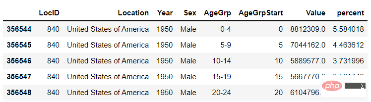
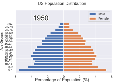
在之前的一篇文章当中,小编当时分享了如何用Python当中的gif模块来制作gif格式的图表, 厉害了,用Python绘制动态可视化图表,并保存成gif格式今天小编再给大家来介绍一种制作gif格式图表的新方法,调用的是matplotlib的相关模块,其中的步骤与方法也是相当地简单易懂。 下载和导入数据库我们这次用到的数据集是bokeh模块自带的数据集,通过下面这一行代码直接就可以下载 import bokeh bokeh.sampledata.download() 登录后复制然后导入后面要用到的数据集,我们挑选的是指定国家的1950年至今不同年龄阶段的人口所占比重的数据 from bokeh.sampledata.population import data import numpy as np data = filter_loc('United States of America') data.head() 登录后复制output
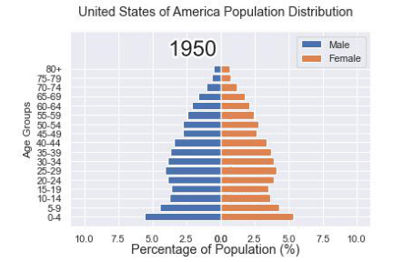
我们可以先绘制若干张静态的图表,然后将这几张图表合成一张gif格式的动图即可,代码如下 import seaborn as sns import matplotlib.pyplot as plt import matplotlib.patheffects as fx # 绘制图表的函数 def make_plot(year): # 根据年份来筛选出数据 df = data[data.Year == year] # 制作图表 fig, (ax1, ax2) = plt.subplots(1, 2, sharey = True) ax1.invert_xaxis() fig.subplots_adjust(wspace = 0) ax1.barh(df[df.Sex == 'Male'].AgeGrp, df[df.Sex == 'Male'].percent, label = 'Male') ax2.barh(df[df.Sex == 'Female'].AgeGrp, df[df.Sex == 'Female'].percent, label = 'Female', color = 'C1') country = df.Location.iloc[0] if country == 'United States of America': country == 'US' fig.suptitle(f'......') fig.supxlabel('......') fig.legend(bbox_to_anchor = (0.9, 0.88), loc = 'upper right') ax1.set_ylabel('Age Groups') return fig 登录后复制我们自定义了一个绘制图表的函数,其中的参数是年份,逻辑很简单,我们是想根据年份来筛选出数据,然后根据筛选出的数据来绘制图表,每一年的图表不尽相同 years = [i for i in set(data.Year) if i 登录后复制output
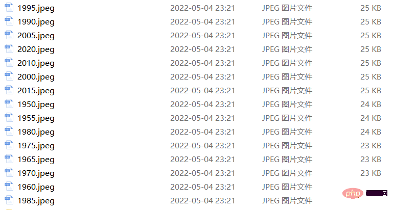
这样我们就生成了若干张静态的图表,然后集合成gif格式的图表几个,代码如下 import matplotlib.animation as animation fig, ax = plt.subplots() ims = [] for year in years: im = ax.imshow(plt.imread(f'{year}.jpeg'), animated = True) ims.append([im]) ani = animation.ArtistAnimation(fig, ims, interval=600) ani.save('us_population.gif') 登录后复制output
可能看到这儿,有人会觉得上面提到的方法稍显麻烦,毕竟我们需要先生成数十张静态的图表,要是电脑的磁盘空间有点紧张的话,或者还没有这样的一个地方来存放这数十张的图表。于是乎就会疑问道,是不是可以一步到位的来。当然也是可以的,例如我们打算绘制1950年到2020年不同年龄阶段的人口比例分布图,首先第一步在于我们先要绘制1950年,也就是起始年,该年不同年龄阶段的人口比例分布图,代码如下 fig, (ax1, ax2) = plt.subplots(1, 2, sharey = True) df = data[data.Year == 1955] y_pos = [i for i in range(len(df[df.Sex == 'Male']))] male = ax1.barh(y_pos, df[df.Sex == 'Male'].percent, label = 'Male', tick_label = df[df.Sex == 'Male'].AgeGrp) female = ax2.barh(y_pos, df[df.Sex == 'Female'].percent, label = 'Female', color = 'C1', tick_label = df[df.Sex == 'Male'].AgeGrp) ax1.invert_xaxis() fig.suptitle('.......') fig.supxlabel('....... (%)') fig.legend(bbox_to_anchor = (0.9, 0.88), loc = 'upper right') ax1.set_ylabel('Age Groups') 登录后复制output
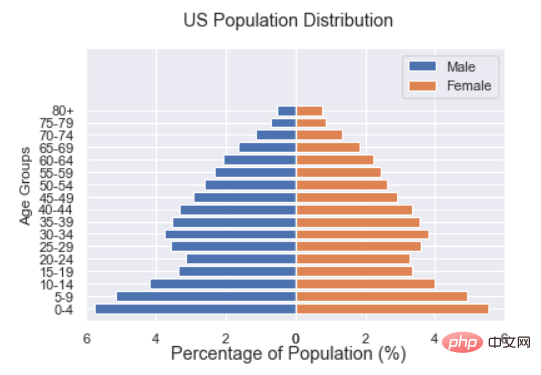
然后我们自定义一个绘制图表的函数,其中参数为年份,目的在于通过年份来筛选出相对应的数据并且绘制出相对应的图表 def run(year): # 通过年份来筛选出数据 df = data[data.Year == year] # 针对不同地性别来绘制 total_pop = df.Value.sum() df['percent'] = df.Value / total_pop * 100 male.remove() y_pos = [i for i in range(len(df[df.Sex == 'Male']))] male.patches = ax1.barh(y_pos, df[df.Sex == 'Male'].percent, label = 'Male', color = 'C0', tick_label = df[df.Sex == 'Male'].AgeGrp) female.remove() female.patches = ax2.barh(y_pos, df[df.Sex == 'Female'].percent, label = 'Female', color = 'C1', tick_label = df[df.Sex == 'Female'].AgeGrp) text.set_text(year) return male#, female 登录后复制然后我们调用animation.FuncAnimation()方法, ani = animation.FuncAnimation(fig, run, years, blit = True, repeat = True, interval = 600) ani.save('文件名.gif') 登录后复制output
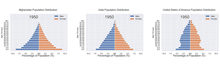
这样就可以一步到位生成gif格式的图表,避免生成数十张繁多地静态图片了。 将若干张gif动图放置在一张大图当中最后我们可以将若干张gif动图放置在一张大的图表当中,代码如下 import matplotlib.animation as animation # 创建一个新的画布 fig, (ax, ax2, ax3) = plt.subplots(1, 3, figsize = (10, 3)) ims = [] for year in years: im = ax.imshow(plt.imread(f'文件1{year}.jpeg'), animated = True) im2 = ax2.imshow(plt.imread(f'文件2{year}.jpeg'), animated = True) im3 = ax3.imshow(plt.imread(f'文件3{year}.jpeg'), animated = True) ims.append([im, im2, im3]) ani = animation.ArtistAnimation(fig, ims, interval=600) ani.save('comparison.gif') 登录后复制output
以上就是用Python绘制超酷的gif动图,惊艳了所有人的详细内容,更多请关注php中文网其它相关文章! |


【本文地址】
今日新闻 |
推荐新闻 |