|
前言
这是我这几十年间从世界各地寻觅到的 Loading特效,合计117个(本文贴出第1-39个),而且是 纯CSS 制作的。
因为特效数量太多,所以我分成上、中、下三篇(每篇39个特效)。
《纯css实现117个Loading效果(上)》
《纯css实现117个Loading效果(中)》
《纯css实现117个Loading效果(下)》
本文不讲解原理(以后可能会开新篇讲),只贴代码,大家来感受一下复制粘贴的快感吧。
❤️❤️喜欢的给本文点个赞呗~
🐱💻在线展示
🐱👓仓库代码 Star一下吧
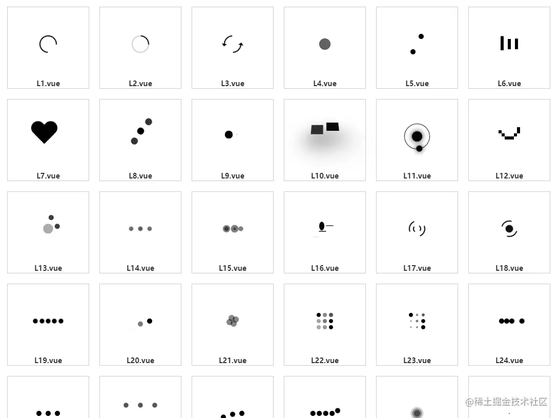
1
.loading {
width: 30px;
height: 30px;
border: 2px solid #000;
border-top-color: transparent;
border-radius: 100%;
animation: circle infinite 0.75s linear;
}
// 转转转动画
@keyframes circle {
0% {
transform: rotate(0);
}
100% {
transform: rotate(360deg);
}
}
2

.loading {
position: relative;
width: 30px;
height: 30px;
border: 2px solid #000;
border-top-color: rgba(0, 0, 0, 0.2);
border-right-color: rgba(0, 0, 0, 0.2);
border-bottom-color: rgba(0, 0, 0, 0.2);
border-radius: 100%;
animation: circle infinite 0.75s linear;
}
@keyframes circle {
0% {
transform: rotate(0);
}
100% {
transform: rotate(360deg);
}
}
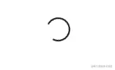
3
.loading {
position: relative;
width: 30px;
height: 30px;
border: 2px solid #000;
border-top-color: transparent;
border-bottom-color: transparent;
border-radius: 100%;
animation: arrow-circle infinite 0.75s linear;
}
.loading:before,
.loading:after {
position: absolute;
top: 24px;
left: -2px;
border-top: 5px solid #000;
border-right: 5px solid transparent;
border-left: 5px solid transparent;
content: "";
transform: rotate(-30deg);
}
.loading:after {
top: 0;
left: 20.5px;
transform: rotate(150deg);
}
@keyframes arrow-circle {
0% {
transform: rotate(360deg);
}
100% {
transform: rotate(0);
}
}
4

.loading {
width: 50px;
height: 50px;
border-radius: 100%;
background-color: #000;
animation: ball-scale infinite linear 0.75s;
}
@keyframes ball-scale {
0% {
transform: scale(0.1);
opacity: 1;
}
100% {
transform: scale(1);
opacity: 0;
}
}
5

.loading {
position: relative;
width: 40px;
height: 40px;
}
.loading:before,
.loading:after {
position: absolute;
width: 10px;
height: 10px;
content: "";
border-radius: 100%;
background-color: #000;
}
.loading:before {
transform: translate(0, 0);
animation: ball-circle-before infinite 1.5s linear;
}
.loading:after {
transform: translate(30px, 30px);
animation: ball-circle-after infinite 1.5s linear;
}
@keyframes ball-circle-after {
0% {
transform: translate(30px, 30px);
}
25% {
transform: translate(0, 30px);
}
50% {
transform: translate(0, 0);
}
75% {
transform: translate(30px, 0);
}
100% {
transform: translate(30px, 30px);
}
}
@keyframes ball-circle-before {
0% {
transform: translate(0, 0);
}
25% {
transform: translate(30px, 0);
}
50% {
transform: translate(30px, 30px);
}
75% {
transform: translate(0, 30px);
}
100% {
transform: translate(0, 0);
}
}
6

.loading {
display: block;
position: relative;
width: 6px;
height: 10px;
animation: rectangle infinite 1s ease-in-out -0.2s;
background-color: #000;
}
.loading:before,
.loading:after {
position: absolute;
width: 6px;
height: 10px;
content: "";
background-color: #000;
}
.loading:before {
left: -14px;
animation: rectangle infinite 1s ease-in-out -0.4s;
}
.loading:after {
right: -14px;
animation: rectangle infinite 1s ease-in-out;
}
@keyframes rectangle {
0%,
80%,
100% {
height: 20px;
box-shadow: 0 0 #000;
}
40% {
height: 30px;
box-shadow: 0 -20px #000;
}
}
7

.loading {
position: relative;
width: 100px;
height: 90px;
left: 10px;
top: 10px;
animation: heart infinite 0.85s linear;
}
.loading:before,
.loading:after {
position: absolute;
top: 0;
left: 30px;
width: 30px;
height: 50px;
content: "";
transform: rotate(-45deg);
transform-origin: 0 100%;
border-radius: 30px 30px 0 0;
background: #000;
}
.loading:after {
left: 0;
transform: rotate(45deg);
transform-origin: 100% 100%;
}
@keyframes heart {
0% {
transform: scale(0.8);
}
50% {
transform: scale(1);
}
100% {
transform: scale(0.8);
}
}
8
.loading {
margin: 20px;
position: relative;
width: 15px;
height: 15px;
border-radius: 100%;
background-color: #000;
animation: ball-rotate 1s 0s cubic-bezier(0.7, -0.13, 0.22, 0.86) infinite;
animation-fill-mode: both;
}
.loading:before,
.loading:after {
position: absolute;
width: 15px;
height: 15px;
margin: 2px;
content: "";
opacity: 0.8;
border-radius: 100%;
background-color: #000;
}
.loading:before {
top: 0;
left: -28px;
}
.loading:after {
top: 0;
left: 25px;
}
@keyframes ball-rotate {
0% {
transform: rotate(0deg) scale(1);
}
50% {
transform: rotate(180deg) scale(0.6);
}
100% {
transform: rotate(360deg) scale(1);
}
}
9
.loading {
margin: 20px;
position: relative;
width: 1px;
height: 1px;
}
.loading:before,
.loading:after {
position: absolute;
display: inline-block;
width: 15px;
height: 15px;
content: "";
border-radius: 100%;
background-color: #000;
}
.loading:before {
left: -15px;
animation: ball-pulse infinite 0.75s -0.4s cubic-bezier(0.2, 0.68, 0.18, 1.08);
}
.loading:after {
right: -15px;
animation: ball-pulse infinite 0.75s cubic-bezier(0.2, 0.68, 0.18, 1.08);
}
@keyframes ball-pulse {
0% {
transform: scale(1);
opacity: 1;
}
50% {
transform: scale(0.1);
opacity: 0.6;
}
100% {
transform: scale(1);
opacity: 1;
}
}
10
.loading {
position: relative;
width: 50px;
perspective: 200px;
}
.loading:before,
.loading:after {
position: absolute;
width: 20px;
height: 20px;
content: "";
animation: jumping 0.5s infinite alternate;
background: rgba(0, 0, 0, 0);
}
.loading:before {
left: 0;
}
.loading:after {
right: 0;
animation-delay: 0.15s;
}
@keyframes jumping {
0% {
transform: scale(1) translateY(0px) rotateX(0deg);
box-shadow: 0 0 0 rgba(0, 0, 0, 0);
}
100% {
transform: scale(1.2) translateY(-25px) rotateX(45deg);
background: #000;
box-shadow: 0 25px 40px #000;
}
}
11
.loading {
position: relative;
width: 48px;
height: 48px;
animation: satellite 3s infinite linear;
border: 1px solid #000;
border-radius: 100%;
}
.loading:before,
.loading:after {
position: absolute;
left: 1px;
top: 1px;
width: 12px;
height: 12px;
content: "";
border-radius: 100%;
background-color: #000;
box-shadow: 0 0 10px #000;
}
.loading:after {
right: 0;
width: 20px;
height: 20px;
margin: 13px;
}
@keyframes satellite {
from {
transform: rotate(0) translateZ(0);
}
to {
transform: rotate(360deg) translateZ(0);
}
}
12

.loading,
.loading > div {
position: relative;
box-sizing: border-box;
}
.loading {
display: block;
font-size: 0;
color: #000;
margin: 30px;
}
.loading.la-dark {
color: #333;
}
.loading > div {
display: inline-block;
float: none;
background-color: currentColor;
border: 0 solid currentColor;
}
.loading {
width: 18px;
height: 18px;
}
.loading > div {
position: absolute;
width: 6px;
height: 6px;
border-radius: 0;
opacity: 0;
transform: translate(100%, 100%);
animation: ball-8bits 1s 0s ease infinite;
}
.loading > div:nth-child(1) {
animation-delay: -0.9375s;
}
.loading > div:nth-child(2) {
animation-delay: -0.875s;
}
.loading > div:nth-child(3) {
animation-delay: -0.8125s;
}
.loading > div:nth-child(4) {
animation-delay: -0.75s;
}
.loading > div:nth-child(5) {
animation-delay: -0.6875s;
}
.loading > div:nth-child(6) {
animation-delay: -0.625s;
}
.loading > div:nth-child(7) {
animation-delay: -0.5625s;
}
.loading > div:nth-child(8) {
animation-delay: -0.5s;
}
.loading > div:nth-child(9) {
animation-delay: -0.4375s;
}
.loading > div:nth-child(10) {
animation-delay: -0.375s;
}
.loading > div:nth-child(11) {
animation-delay: -0.3125s;
}
.loading > div:nth-child(12) {
animation-delay: -0.25s;
}
.loading > div:nth-child(13) {
animation-delay: -0.1875s;
}
.loading > div:nth-child(14) {
animation-delay: -0.125s;
}
.loading > div:nth-child(15) {
animation-delay: -0.0625s;
}
.loading > div:nth-child(16) {
animation-delay: 0s;
}
.loading > div:nth-child(1) {
top: -100%;
left: 0;
}
.loading > div:nth-child(2) {
top: -100%;
left: 33.3333333333%;
}
.loading > div:nth-child(3) {
top: -66.6666666667%;
left: 66.6666666667%;
}
.loading > div:nth-child(4) {
top: -33.3333333333%;
left: 100%;
}
.loading > div:nth-child(5) {
top: 0;
left: 100%;
}
.loading > div:nth-child(6) {
top: 33.3333333333%;
left: 100%;
}
.loading > div:nth-child(7) {
top: 66.6666666667%;
left: 66.6666666667%;
}
.loading > div:nth-child(8) {
top: 100%;
left: 33.3333333333%;
}
.loading > div:nth-child(9) {
top: 100%;
left: 0;
}
.loading > div:nth-child(10) {
top: 100%;
left: -33.3333333333%;
}
.loading > div:nth-child(11) {
top: 66.6666666667%;
left: -66.6666666667%;
}
.loading > div:nth-child(12) {
top: 33.3333333333%;
left: -100%;
}
.loading > div:nth-child(13) {
top: 0;
left: -100%;
}
.loading > div:nth-child(14) {
top: -33.3333333333%;
left: -100%;
}
.loading > div:nth-child(15) {
top: -66.6666666667%;
left: -66.6666666667%;
}
.loading > div:nth-child(16) {
top: -100%;
left: -33.3333333333%;
}
@keyframes ball-8bits {
0% {
opacity: 1;
}
50% {
opacity: 1;
}
51% {
opacity: 0;
}
}
13

.loading,
.loading > div {
position: relative;
box-sizing: border-box;
}
.loading {
display: block;
font-size: 0;
color: #000;
}
.loading.la-dark {
color: #333;
}
.loading > div {
display: inline-block;
float: none;
background-color: currentColor;
border: 0 solid currentColor;
}
.loading {
width: 32px;
height: 32px;
}
.loading > div:nth-child(1) {
position: absolute;
top: 50%;
left: 50%;
z-index: 1;
width: 60%;
height: 60%;
background: #aaa;
border-radius: 100%;
transform: translate(-50%, -50%);
animation: ball-atom-shrink 4.5s infinite linear;
}
.loading > div:not(:nth-child(1)) {
position: absolute;
left: 0;
z-index: 0;
width: 100%;
height: 100%;
background: none;
animation: ball-atom-zindex 1.5s 0s infinite steps(2, end);
}
.loading > div:not(:nth-child(1)):before {
position: absolute;
top: 0;
left: 0;
width: 10px;
height: 10px;
margin-top: -5px;
margin-left: -5px;
content: "";
background: currentColor;
border-radius: 50%;
opacity: 0.75;
animation: ball-atom-position 1.5s 0s infinite ease,
ball-atom-size 1.5s 0s infinite ease;
}
.loading > div:nth-child(2) {
animation-delay: 0.75s;
}
.loading > div:nth-child(2):before {
animation-delay: 0s, -1.125s;
}
.loading > div:nth-child(3) {
transform: rotate(120deg);
animation-delay: -0.25s;
}
.loading > div:nth-child(3):before {
animation-delay: -1s, -0.75s;
}
.loading > div:nth-child(4) {
transform: rotate(240deg);
animation-delay: 0.25s;
}
.loading > div:nth-child(4):before {
animation-delay: -0.5s, -0.125s;
}
@keyframes ball-atom-position {
50% {
top: 100%;
left: 100%;
}
}
14

.loading,
.loading > div {
position: relative;
box-sizing: border-box;
}
.loading {
display: block;
font-size: 0;
color: #000;
}
.loading.la-dark {
color: #333;
}
.loading > div {
display: inline-block;
float: none;
background-color: currentColor;
border: 0 solid currentColor;
}
.loading {
width: 54px;
height: 18px;
}
.loading > div {
width: 10px;
height: 10px;
margin: 4px;
border-radius: 100%;
animation: ball-beat 0.7s -0.15s infinite linear;
}
.loading > div:nth-child(2n-1) {
animation-delay: -0.5s;
}
@keyframes ball-beat {
50% {
opacity: 0.2;
transform: scale(0.75);
}
100% {
opacity: 1;
transform: scale(1);
}
}
15

.loading,
.loading > div {
position: relative;
box-sizing: border-box;
}
.loading {
display: block;
font-size: 0;
color: #000;
}
.loading.la-dark {
color: #333;
}
.loading > div {
display: inline-block;
float: none;
background-color: currentColor;
border: 0 solid currentColor;
}
.loading {
width: 16px;
height: 16px;
}
.loading > div {
position: absolute;
top: 0;
left: -100%;
display: block;
width: 16px;
width: 100%;
height: 16px;
height: 100%;
border-radius: 100%;
opacity: 0.5;
animation: ball-circus-position 2.5s infinite cubic-bezier(0.25, 0, 0.75, 1),
ball-circus-size 2.5s infinite cubic-bezier(0.25, 0, 0.75, 1);
}
.loading > div:nth-child(1) {
animation-delay: 0s, -0.5s;
}
.loading > div:nth-child(2) {
animation-delay: -0.5s, -1s;
}
.loading > div:nth-child(3) {
animation-delay: -1s, -1.5s;
}
.loading > div:nth-child(4) {
animation-delay: -1.5s, -2s;
}
.loading > div:nth-child(5) {
animation-delay: -2s, -2.5s;
}
@keyframes ball-circus-position {
50% {
left: 100%;
}
}
@keyframes ball-circus-size {
50% {
transform: scale(0.3, 0.3);
}
}
16
.loading,
.loading > div {
position: relative;
box-sizing: border-box;
}
.loading {
display: block;
font-size: 0;
color: #000;
}
.loading.la-dark {
color: #333;
}
.loading > div {
display: inline-block;
float: none;
background-color: currentColor;
border: 0 solid currentColor;
}
.loading {
width: 42px;
height: 32px;
}
.loading > div:nth-child(1) {
position: absolute;
bottom: 32%;
left: 18%;
width: 14px;
height: 14px;
border-radius: 100%;
transform-origin: center bottom;
animation: ball-climbing-dot-jump 0.6s ease-in-out infinite;
}
.loading > div:not(:nth-child(1)) {
position: absolute;
top: 0;
right: 0;
width: 14px;
height: 2px;
border-radius: 0;
transform: translate(60%, 0);
animation: ball-climbing-dot-steps 1.8s linear infinite;
}
.loading > div:not(:nth-child(1)):nth-child(2) {
animation-delay: 0ms;
}
.loading > div:not(:nth-child(1)):nth-child(3) {
animation-delay: -600ms;
}
.loading > div:not(:nth-child(1)):nth-child(4) {
animation-delay: -1200ms;
}
@keyframes ball-climbing-dot-jump {
0% {
transform: scale(1, 0.7);
}
20% {
transform: scale(0.7, 1.2);
}
40% {
transform: scale(1, 1);
}
50% {
bottom: 125%;
}
46% {
transform: scale(1, 1);
}
80% {
transform: scale(0.7, 1.2);
}
90% {
transform: scale(0.7, 1.2);
}
100% {
transform: scale(1, 0.7);
}
}
@keyframes ball-climbing-dot-steps {
0% {
top: 0;
right: 0;
opacity: 0;
}
50% {
opacity: 1;
}
100% {
top: 100%;
right: 100%;
opacity: 0;
}
}
17

.loading,
.loading > div {
position: relative;
box-sizing: border-box;
}
.loading {
display: block;
font-size: 0;
color: #000;
}
.loading.la-dark {
color: #333;
}
.loading > div {
display: inline-block;
float: none;
background-color: currentColor;
border: 0 solid currentColor;
}
.loading {
width: 32px;
height: 32px;
}
.loading > div {
position: absolute;
top: 50%;
left: 50%;
background: transparent;
border-style: solid;
border-width: 2px;
border-radius: 100%;
animation: ball-clip-rotate-multiple-rotate 1s ease-in-out infinite;
}
.loading > div:first-child {
position: absolute;
width: 32px;
height: 32px;
border-right-color: transparent;
border-left-color: transparent;
}
.loading > div:last-child {
width: 16px;
height: 16px;
border-top-color: transparent;
border-bottom-color: transparent;
animation-duration: 0.5s;
animation-direction: reverse;
}
@keyframes ball-clip-rotate-multiple-rotate {
0% {
transform: translate(-50%, -50%) rotate(0deg);
}
50% {
transform: translate(-50%, -50%) rotate(180deg);
}
100% {
transform: translate(-50%, -50%) rotate(360deg);
}
}
18

.loading,
.loading > div {
position: relative;
-webkit-box-sizing: border-box;
-moz-box-sizing: border-box;
box-sizing: border-box;
}
.loading {
display: block;
font-size: 0;
color: #000;
}
.loading.la-dark {
color: #333;
}
.loading > div {
display: inline-block;
float: none;
background-color: currentColor;
border: 0 solid currentColor;
}
.loading {
width: 32px;
height: 32px;
}
.loading > div {
position: absolute;
top: 50%;
left: 50%;
border-radius: 100%;
}
.loading > div:first-child {
position: absolute;
width: 32px;
height: 32px;
background: transparent;
border-style: solid;
border-width: 2px;
border-right-color: transparent;
border-left-color: transparent;
animation: ball-clip-rotate-pulse-rotate 1s cubic-bezier(0.09, 0.57, 0.49, 0.9) infinite;
}
.loading > div:last-child {
width: 16px;
height: 16px;
animation: ball-clip-rotate-pulse-scale 1s cubic-bezier(0.09, 0.57, 0.49, 0.9) infinite;
}
@keyframes ball-clip-rotate-pulse-rotate {
0% {
transform: translate(-50%, -50%) rotate(0deg);
}
50% {
transform: translate(-50%, -50%) rotate(180deg);
}
100% {
transform: translate(-50%, -50%) rotate(360deg);
}
}
@keyframes ball-clip-rotate-pulse-scale {
0%,
100% {
opacity: 1;
transform: translate(-50%, -50%) scale(1);
}
30% {
opacity: 0.3;
transform: translate(-50%, -50%) scale(0.15);
}
}
19

.loading,
.loading > div {
position: relative;
box-sizing: border-box;
}
.loading {
display: block;
font-size: 0;
color: #000;
}
.loading.la-dark {
color: #333;
}
.loading > div {
display: inline-block;
float: none;
background-color: currentColor;
border: 0 solid currentColor;
}
.loading {
width: 120px;
height: 10px;
font-size: 0;
text-align: center;
}
.loading > div {
display: inline-block;
width: 10px;
height: 10px;
white-space: nowrap;
border-radius: 100%;
animation: ball-elastic-dots-anim 1s infinite;
}
@keyframes ball-elastic-dots-anim {
0%,
100% {
margin: 0;
transform: scale(1);
}
50% {
margin: 0 5%;
transform: scale(0.65);
}
}
20

.loading,
.loading > div {
position: relative;
box-sizing: border-box;
}
.loading {
display: block;
font-size: 0;
color: #000;
}
.loading.la-dark {
color: #333;
}
.loading > div {
display: inline-block;
float: none;
background-color: currentColor;
border: 0 solid currentColor;
}
.loading {
width: 54px;
height: 18px;
}
.loading > div {
width: 10px;
height: 10px;
margin: 4px;
border-radius: 100%;
opacity: 0;
animation: ball-fall 1s ease-in-out infinite;
}
.loading > div:nth-child(1) {
animation-delay: -200ms;
}
.loading > div:nth-child(2) {
animation-delay: -100ms;
}
.loading > div:nth-child(3) {
animation-delay: 0ms;
}
@keyframes ball-fall {
0% {
opacity: 0;
transform: translateY(-145%);
}
10% {
opacity: 0.5;
}
20% {
opacity: 1;
transform: translateY(0);
}
80% {
opacity: 1;
transform: translateY(0);
}
90% {
opacity: 0.5;
}
100% {
opacity: 0;
transform: translateY(145%);
}
}
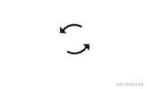
21

.loading,
.loading > div {
position: relative;
box-sizing: border-box;
}
.loading {
display: block;
font-size: 0;
color: #000;
}
.loading.la-dark {
color: #333;
}
.loading > div {
display: inline-block;
float: none;
background-color: currentColor;
border: 0 solid currentColor;
}
.loading {
width: 8px;
height: 8px;
}
.loading > div {
position: absolute;
width: 12px;
height: 12px;
border-radius: 100%;
transform: translate(-50%, -50%);
animation: ball-fussion-ball1 1s 0s ease infinite;
}
.loading > div:nth-child(1) {
top: 0;
left: 50%;
z-index: 1;
}
.loading > div:nth-child(2) {
top: 50%;
left: 100%;
z-index: 2;
animation-name: ball-fussion-ball2;
}
.loading > div:nth-child(3) {
top: 100%;
left: 50%;
z-index: 1;
animation-name: ball-fussion-ball3;
}
.loading > div:nth-child(4) {
top: 50%;
left: 0;
z-index: 2;
animation-name: ball-fussion-ball4;
}
.loading.la-sm {
width: 4px;
height: 4px;
}
.loading.la-sm > div {
width: 6px;
height: 6px;
}
.loading.la-2x {
width: 16px;
height: 16px;
}
.loading.la-2x > div {
width: 24px;
height: 24px;
}
.loading.la-3x {
width: 24px;
height: 24px;
}
.loading.la-3x > div {
width: 36px;
height: 36px;
}
@keyframes ball-fussion-ball2 {
0% {
opacity: 0.35;
}
50% {
top: 200%;
left: 200%;
opacity: 1;
}
100% {
top: 100%;
left: 50%;
z-index: 1;
opacity: 0.35;
}
}
@keyframes ball-fussion-ball1 {
0% {
opacity: 0.35;
}
50% {
top: -100%;
left: 200%;
opacity: 1;
}
100% {
top: 50%;
left: 100%;
z-index: 2;
opacity: 0.35;
}
}
@keyframes ball-fussion-ball3 {
0% {
opacity: 0.35;
}
50% {
top: 200%;
left: -100%;
opacity: 1;
}
100% {
top: 50%;
left: 0;
z-index: 2;
opacity: 0.35;
}
}
@keyframes ball-fussion-ball4 {
0% {
opacity: 0.35;
}
50% {
top: -100%;
left: -100%;
opacity: 1;
}
100% {
top: 0;
left: 50%;
z-index: 1;
opacity: 0.35;
}
}
22

.loading,
.loading > div {
position: relative;
box-sizing: border-box;
}
.loading {
display: block;
font-size: 0;
color: #000;
}
.loading.la-dark {
color: #333;
}
.loading > div {
display: inline-block;
float: none;
background-color: currentColor;
border: 0 solid currentColor;
}
.loading {
width: 36px;
height: 36px;
}
.loading > div {
width: 8px;
height: 8px;
margin: 2px;
border-radius: 100%;
animation-name: ball-grid-beat;
animation-iteration-count: infinite;
}
.loading > div:nth-child(1) {
animation-duration: 0.65s;
animation-delay: 0.03s;
}
.loading > div:nth-child(2) {
animation-duration: 1.02s;
animation-delay: 0.09s;
}
.loading > div:nth-child(3) {
animation-duration: 1.06s;
animation-delay: -0.69s;
}
.loading > div:nth-child(4) {
animation-duration: 1.5s;
animation-delay: -0.41s;
}
.loading > div:nth-child(5) {
animation-duration: 1.6s;
animation-delay: 0.04s;
}
.loading > div:nth-child(6) {
animation-duration: 0.84s;
animation-delay: 0.07s;
}
.loading > div:nth-child(7) {
animation-duration: 0.68s;
animation-delay: -0.66s;
}
.loading > div:nth-child(8) {
animation-duration: 0.93s;
animation-delay: -0.76s;
}
.loading > div:nth-child(9) {
animation-duration: 1.24s;
animation-delay: -0.76s;
}
@keyframes ball-grid-beat {
0% {
opacity: 1;
}
50% {
opacity: 0.35;
}
100% {
opacity: 1;
}
}
23

.loading,
.loading > div {
position: relative;
box-sizing: border-box;
}
.loading {
display: block;
font-size: 0;
color: #000;
}
.loading.la-dark {
color: #333;
}
.loading > div {
display: inline-block;
float: none;
background-color: currentColor;
border: 0 solid currentColor;
}
.loading {
width: 36px;
height: 36px;
}
.loading > div {
width: 8px;
height: 8px;
margin: 2px;
border-radius: 100%;
animation-name: ball-grid-pulse;
animation-iteration-count: infinite;
}
.loading > div:nth-child(1) {
animation-duration: 0.65s;
animation-delay: 0.03s;
}
.loading > div:nth-child(2) {
animation-duration: 1.02s;
animation-delay: 0.09s;
}
.loading > div:nth-child(3) {
animation-duration: 1.06s;
animation-delay: -0.69s;
}
.loading > div:nth-child(4) {
animation-duration: 1.5s;
animation-delay: -0.41s;
}
.loading > div:nth-child(5) {
animation-duration: 1.6s;
animation-delay: 0.04s;
}
.loading > div:nth-child(6) {
animation-duration: 0.84s;
animation-delay: 0.07s;
}
.loading > div:nth-child(7) {
animation-duration: 0.68s;
animation-delay: -0.66s;
}
.loading > div:nth-child(8) {
animation-duration: 0.93s;
animation-delay: -0.76s;
}
.loading > div:nth-child(9) {
animation-duration: 1.24s;
animation-delay: -0.76s;
}
.loading.la-sm {
width: 18px;
height: 18px;
}
.loading.la-sm > div {
width: 4px;
height: 4px;
margin: 1px;
}
.loading.la-2x {
width: 72px;
height: 72px;
}
.loading.la-2x > div {
width: 16px;
height: 16px;
margin: 4px;
}
.loading.la-3x {
width: 108px;
height: 108px;
}
.loading.la-3x > div {
width: 24px;
height: 24px;
margin: 6px;
}
@keyframes ball-grid-pulse {
0% {
opacity: 1;
transform: scale(1);
}
50% {
opacity: 0.35;
transform: scale(0.45);
}
100% {
opacity: 1;
transform: scale(1);
}
}
24
.loading,
.loading > div {
position: relative;
box-sizing: border-box;
}
.loading {
display: block;
font-size: 0;
color: #000;
}
.loading.la-dark {
color: #333;
}
.loading > div {
display: inline-block;
float: none;
background-color: currentColor;
border: 0 solid currentColor;
}
.loading {
width: 40px;
height: 10px;
}
.loading > div {
width: 10px;
height: 10px;
border-radius: 100%;
}
.loading > div:first-child {
transform: translateX(0%);
animation: ball-newton-cradle-left 1s 0s ease-out infinite;
}
.loading > div:last-child {
transform: translateX(0%);
animation: ball-newton-cradle-right 1s 0s ease-out infinite;
}
.loading.la-sm {
width: 20px;
height: 4px;
}
.loading.la-sm > div {
width: 4px;
height: 4px;
}
.loading.la-2x {
width: 80px;
height: 20px;
}
.loading.la-2x > div {
width: 20px;
height: 20px;
}
.loading.la-3x {
width: 120px;
height: 30px;
}
.loading.la-3x > div {
width: 30px;
height: 30px;
}
@keyframes ball-newton-cradle-left {
25% {
transform: translateX(-100%);
animation-timing-function: ease-in;
}
50% {
transform: translateX(0%);
}
}
@keyframes ball-newton-cradle-right {
50% {
transform: translateX(0%);
}
75% {
transform: translateX(100%);
animation-timing-function: ease-in;
}
100% {
transform: translateX(0%);
}
}
25

.loading,
.loading > div {
position: relative;
box-sizing: border-box;
}
.loading {
display: block;
font-size: 0;
color: #000;
}
.loading.la-dark {
color: #333;
}
.loading > div {
display: inline-block;
float: none;
background-color: currentColor;
border: 0 solid currentColor;
}
.loading {
width: 54px;
height: 18px;
}
.loading > div:nth-child(1) {
animation-delay: -200ms;
}
.loading > div:nth-child(2) {
animation-delay: -100ms;
}
.loading > div:nth-child(3) {
animation-delay: 0ms;
}
.loading > div {
width: 10px;
height: 10px;
margin: 4px;
border-radius: 100%;
animation: ball-pulse 1s ease infinite;
}
.loading.la-sm {
width: 26px;
height: 8px;
}
.loading.la-sm > div {
width: 4px;
height: 4px;
margin: 2px;
}
.loading.la-2x {
width: 108px;
height: 36px;
}
.loading.la-2x > div {
width: 20px;
height: 20px;
margin: 8px;
}
.loading.la-3x {
width: 162px;
height: 54px;
}
.loading.la-3x > div {
width: 30px;
height: 30px;
margin: 12px;
}
@keyframes ball-pulse {
0%,
60%,
100% {
opacity: 1;
transform: scale(1);
}
30% {
opacity: 0.1;
transform: scale(0.01);
}
}
26

.loading,
.loading > div {
position: relative;
box-sizing: border-box;
}
.loading {
display: block;
font-size: 0;
color: #000;
}
.loading.la-dark {
color: #333;
}
.loading > div {
display: inline-block;
float: none;
background-color: currentColor;
border: 0 solid currentColor;
}
.loading {
width: 70px;
height: 14px;
}
.loading > div {
width: 10px;
height: 10px;
margin: 2px;
border-radius: 100%;
animation: ball-pulse-rise-even 1s cubic-bezier(0.15, 0.36, 0.9, 0.6) 0s
infinite;
}
.loading > div:nth-child(2n-1) {
animation-name: ball-pulse-rise-odd;
}
.loading.la-sm {
width: 34px;
height: 6px;
}
.loading.la-sm > div {
width: 4px;
height: 4px;
margin: 1px;
}
.loading.la-2x {
width: 140px;
height: 28px;
}
.loading.la-2x > div {
width: 20px;
height: 20px;
margin: 4px;
}
.loading.la-3x {
width: 210px;
height: 42px;
}
.loading.la-3x > div {
width: 30px;
height: 30px;
margin: 6px;
}
@keyframes ball-pulse-rise-even {
0% {
opacity: 1;
transform: scale(1.1);
}
25% {
transform: translateY(-200%);
}
50% {
opacity: 0.35;
transform: scale(0.3);
}
75% {
transform: translateY(200%);
}
100% {
opacity: 1;
transform: translateY(0);
transform: scale(1);
}
}
@keyframes ball-pulse-rise-odd {
0% {
opacity: 0.35;
transform: scale(0.4);
}
25% {
transform: translateY(200%);
}
50% {
opacity: 1;
transform: scale(1.1);
}
75% {
transform: translateY(-200%);
}
100% {
opacity: 0.35;
transform: translateY(0);
transform: scale(0.75);
}
}
27

.loading,
.loading > div {
position: relative;
box-sizing: border-box;
}
.loading {
display: block;
font-size: 0;
color: #000;
}
.loading.la-dark {
color: #333;
}
.loading > div {
display: inline-block;
float: none;
background-color: currentColor;
border: 0 solid currentColor;
}
.loading {
width: 54px;
height: 18px;
}
.loading > div {
width: 10px;
height: 10px;
margin: 4px;
border-radius: 100%;
animation: ball-pulse-sync 0.6s infinite ease-in-out;
}
.loading > div:nth-child(1) {
animation-delay: -0.14s;
}
.loading > div:nth-child(2) {
animation-delay: -0.07s;
}
.loading > div:nth-child(3) {
animation-delay: 0s;
}
.loading.la-sm {
width: 26px;
height: 8px;
}
.loading.la-sm > div {
width: 4px;
height: 4px;
margin: 2px;
}
.loading.la-2x {
width: 108px;
height: 36px;
}
.loading.la-2x > div {
width: 20px;
height: 20px;
margin: 8px;
}
.loading.la-3x {
width: 162px;
height: 54px;
}
.loading.la-3x > div {
width: 30px;
height: 30px;
margin: 12px;
}
@keyframes ball-pulse-sync {
33% {
transform: translateY(100%);
}
66% {
transform: translateY(-100%);
}
100% {
transform: translateY(0);
}
}
28
.loading,
.loading > div {
position: relative;
box-sizing: border-box;
}
.loading {
display: block;
font-size: 0;
color: #000;
}
.loading.la-dark {
color: #333;
}
.loading > div {
display: inline-block;
float: none;
background-color: currentColor;
border: 0 solid currentColor;
}
.loading {
width: 10px;
height: 10px;
}
.loading > div {
position: absolute;
width: 10px;
height: 10px;
margin-left: -25px;
border-radius: 100%;
animation: ball-running-dots-animate 2s linear infinite;
}
.loading > div:nth-child(1) {
animation-delay: 0s;
}
.loading > div:nth-child(2) {
animation-delay: -0.4s;
}
.loading > div:nth-child(3) {
animation-delay: -0.8s;
}
.loading > div:nth-child(4) {
animation-delay: -1.2s;
}
.loading > div:nth-child(5) {
animation-delay: -1.6s;
}
.loading > div:nth-child(6) {
animation-delay: -2s;
}
.loading > div:nth-child(7) {
animation-delay: -2.4s;
}
.loading > div:nth-child(8) {
animation-delay: -2.8s;
}
.loading > div:nth-child(9) {
animation-delay: -3.2s;
}
.loading > div:nth-child(10) {
animation-delay: -3.6s;
}
.loading.la-sm {
width: 4px;
height: 4px;
}
.loading.la-sm > div {
width: 4px;
height: 4px;
margin-left: -12px;
}
.loading.la-2x {
width: 20px;
height: 20px;
}
.loading.la-2x > div {
width: 20px;
height: 20px;
margin-left: -50px;
}
.loading.la-3x {
width: 30px;
height: 30px;
}
.loading.la-3x > div {
width: 30px;
height: 30px;
margin-left: -75px;
}
@keyframes ball-running-dots-animate {
0%,
100% {
width: 100%;
height: 100%;
transform: translateY(0) translateX(500%);
}
80% {
transform: translateY(0) translateX(0);
}
85% {
width: 100%;
height: 100%;
transform: translateY(-125%) translateX(0);
}
90% {
width: 200%;
height: 75%;
}
95% {
width: 100%;
height: 100%;
transform: translateY(-100%) translateX(500%);
}
}
29

.loading,
.loading > div {
position: relative;
box-sizing: border-box;
}
.loading {
display: block;
font-size: 0;
color: #000;
}
.loading.la-dark {
color: #333;
}
.loading > div {
display: inline-block;
float: none;
background-color: currentColor;
border: 0 solid currentColor;
}
.loading {
width: 32px;
height: 32px;
}
.loading > div {
position: absolute;
top: 0;
left: 0;
width: 32px;
height: 32px;
border-radius: 100%;
opacity: 0;
animation: ball-scale-multiple 1s 0s linear infinite;
}
.loading > div:nth-child(2) {
animation-delay: 0.2s;
}
.loading > div:nth-child(3) {
animation-delay: 0.4s;
}
.loading.la-sm {
width: 16px;
height: 16px;
}
.loading.la-sm > div {
width: 16px;
height: 16px;
}
.loading.la-2x {
width: 64px;
height: 64px;
}
.loading.la-2x > div {
width: 64px;
height: 64px;
}
.loading.la-3x {
width: 96px;
height: 96px;
}
.loading.la-3x > div {
width: 96px;
height: 96px;
}
@keyframes ball-scale-multiple {
0% {
opacity: 0;
transform: scale(0);
}
5% {
opacity: 0.75;
}
100% {
opacity: 0;
transform: scale(1);
}
}
30

.loading,
.loading > div {
position: relative;
box-sizing: border-box;
}
.loading {
display: block;
font-size: 0;
color: #000;
}
.loading.la-dark {
color: #333;
}
.loading > div {
display: inline-block;
float: none;
background-color: currentColor;
border: 0 solid currentColor;
}
.loading {
width: 32px;
height: 32px;
}
.loading > div {
position: absolute;
top: 0;
left: 0;
width: 32px;
height: 32px;
border-radius: 100%;
opacity: 0.5;
animation: ball-scale-pulse 2s infinite ease-in-out;
}
.loading > div:last-child {
animation-delay: -1s;
}
.loading.la-sm {
width: 16px;
height: 16px;
}
.loading.la-sm > div {
width: 16px;
height: 16px;
}
.loading.la-2x {
width: 64px;
height: 64px;
}
.loading.la-2x > div {
width: 64px;
height: 64px;
}
.loading.la-3x {
width: 96px;
height: 96px;
}
.loading.la-3x > div {
width: 96px;
height: 96px;
}
@keyframes ball-scale-pulse {
0%,
100% {
transform: scale(0);
}
50% {
transform: scale(1);
}
}
31

.loading,
.loading > div {
position: relative;
box-sizing: border-box;
}
.loading {
display: block;
font-size: 0;
color: #000;
}
.loading.la-dark {
color: #333;
}
.loading > div {
display: inline-block;
float: none;
background-color: currentColor;
border: 0 solid currentColor;
}
.loading {
width: 32px;
height: 32px;
}
.loading > div {
width: 32px;
height: 32px;
background: transparent;
border-width: 2px;
border-radius: 100%;
opacity: 0;
animation: ball-scale-ripple 1s 0s infinite
cubic-bezier(0.21, 0.53, 0.56, 0.8);
}
.loading.la-sm {
width: 16px;
height: 16px;
}
.loading.la-sm > div {
width: 16px;
height: 16px;
border-width: 1px;
}
.loading.la-2x {
width: 64px;
height: 64px;
}
.loading.la-2x > div {
width: 64px;
height: 64px;
border-width: 4px;
}
.loading.la-3x {
width: 96px;
height: 96px;
}
.loading.la-3x > div {
width: 96px;
height: 96px;
border-width: 6px;
}
@keyframes ball-scale-ripple {
0% {
opacity: 1;
transform: scale(0.1);
}
70% {
opacity: 0.65;
transform: scale(1);
}
100% {
opacity: 0;
}
}
32

.loading,
.loading > div {
position: relative;
box-sizing: border-box;
}
.loading {
display: block;
font-size: 0;
color: #000;
}
.loading.la-dark {
color: #333;
}
.loading > div {
display: inline-block;
float: none;
background-color: currentColor;
border: 0 solid currentColor;
}
.loading {
width: 32px;
height: 32px;
}
.loading > div {
position: absolute;
top: 0;
left: 0;
width: 32px;
height: 32px;
background: transparent;
border-width: 2px;
border-radius: 100%;
opacity: 0;
animation: ball-scale-ripple-multiple 1.25s 0s infinite
cubic-bezier(0.21, 0.53, 0.56, 0.8);
}
.loading > div:nth-child(1) {
animation-delay: 0s;
}
.loading > div:nth-child(2) {
animation-delay: 0.25s;
}
.loading > div:nth-child(3) {
animation-delay: 0.5s;
}
.loading.la-sm {
width: 16px;
height: 16px;
}
.loading.la-sm > div {
width: 16px;
height: 16px;
border-width: 1px;
}
.loading.la-2x {
width: 64px;
height: 64px;
}
.loading.la-2x > div {
width: 64px;
height: 64px;
border-width: 4px;
}
.loading.la-3x {
width: 96px;
height: 96px;
}
.loading.la-3x > div {
width: 96px;
height: 96px;
border-width: 6px;
}
@keyframes ball-scale-ripple-multiple {
0% {
opacity: 1;
transform: scale(0.1);
}
70% {
opacity: 0.5;
transform: scale(1);
}
95% {
opacity: 0;
}
}
33

.loading,
.loading > div {
position: relative;
box-sizing: border-box;
}
.loading {
display: block;
font-size: 0;
color: #000;
}
.loading.la-dark {
color: #333;
}
.loading > div {
display: inline-block;
float: none;
background-color: currentColor;
border: 0 solid currentColor;
}
.loading {
width: 32px;
height: 32px;
}
.loading > div {
position: absolute;
top: 50%;
left: 50%;
width: 8px;
height: 8px;
margin-top: -4px;
margin-left: -4px;
border-radius: 100%;
animation: ball-spin 1s infinite ease-in-out;
}
.loading > div:nth-child(1) {
top: 5%;
left: 50%;
animation-delay: -1.125s;
}
.loading > div:nth-child(2) {
top: 18.1801948466%;
left: 81.8198051534%;
animation-delay: -1.25s;
}
.loading > div:nth-child(3) {
top: 50%;
left: 95%;
animation-delay: -1.375s;
}
.loading > div:nth-child(4) {
top: 81.8198051534%;
left: 81.8198051534%;
animation-delay: -1.5s;
}
.loading > div:nth-child(5) {
top: 94.9999999966%;
left: 50.0000000005%;
animation-delay: -1.625s;
}
.loading > div:nth-child(6) {
top: 81.8198046966%;
left: 18.1801949248%;
animation-delay: -1.75s;
}
.loading > div:nth-child(7) {
top: 49.9999750815%;
left: 5.0000051215%;
animation-delay: -1.875s;
}
.loading > div:nth-child(8) {
top: 18.179464974%;
left: 18.1803700518%;
animation-delay: -2s;
}
.loading.la-sm {
width: 16px;
height: 16px;
}
.loading.la-sm > div {
width: 4px;
height: 4px;
margin-top: -2px;
margin-left: -2px;
}
.loading.la-2x {
width: 64px;
height: 64px;
}
.loading.la-2x > div {
width: 16px;
height: 16px;
margin-top: -8px;
margin-left: -8px;
}
.loading.la-3x {
width: 96px;
height: 96px;
}
.loading.la-3x > div {
width: 24px;
height: 24px;
margin-top: -12px;
margin-left: -12px;
}
@keyframes ball-spin {
0%,
100% {
opacity: 1;
transform: scale(1);
}
20% {
opacity: 1;
}
80% {
opacity: 0;
transform: scale(0);
}
}
34

.loading,
.loading > div {
position: relative;
box-sizing: border-box;
}
.loading {
display: block;
font-size: 0;
color: #000;
}
.loading.la-dark {
color: #333;
}
.loading > div {
display: inline-block;
float: none;
background-color: currentColor;
border: 0 solid currentColor;
}
.loading {
width: 32px;
height: 32px;
}
.loading > div {
position: absolute;
top: 50%;
left: 50%;
width: 8px;
height: 8px;
margin-top: -4px;
margin-left: -4px;
border-radius: 100%;
animation: ball-spin-clockwise 1s infinite ease-in-out;
}
.loading > div:nth-child(1) {
top: 5%;
left: 50%;
animation-delay: -0.875s;
}
.loading > div:nth-child(2) {
top: 18.1801948466%;
left: 81.8198051534%;
animation-delay: -0.75s;
}
.loading > div:nth-child(3) {
top: 50%;
left: 95%;
animation-delay: -0.625s;
}
.loading > div:nth-child(4) {
top: 81.8198051534%;
left: 81.8198051534%;
animation-delay: -0.5s;
}
.loading > div:nth-child(5) {
top: 94.9999999966%;
left: 50.0000000005%;
animation-delay: -0.375s;
}
.loading > div:nth-child(6) {
top: 81.8198046966%;
left: 18.1801949248%;
animation-delay: -0.25s;
}
.loading > div:nth-child(7) {
top: 49.9999750815%;
left: 5.0000051215%;
animation-delay: -0.125s;
}
.loading > div:nth-child(8) {
top: 18.179464974%;
left: 18.1803700518%;
animation-delay: 0s;
}
.loading.la-sm {
width: 16px;
height: 16px;
}
.loading.la-sm > div {
width: 4px;
height: 4px;
margin-top: -2px;
margin-left: -2px;
}
.loading.la-2x {
width: 64px;
height: 64px;
}
.loading.la-2x > div {
width: 16px;
height: 16px;
margin-top: -8px;
margin-left: -8px;
}
.loading.la-3x {
width: 96px;
height: 96px;
}
.loading.la-3x > div {
width: 24px;
height: 24px;
margin-top: -12px;
margin-left: -12px;
}
@keyframes ball-spin-clockwise {
0%,
100% {
opacity: 1;
transform: scale(1);
}
20% {
opacity: 1;
}
80% {
opacity: 0;
transform: scale(0);
}
}
35

.loading,
.loading > div {
position: relative;
box-sizing: border-box;
}
.loading {
display: block;
font-size: 0;
color: #000;
}
.loading.la-dark {
color: #333;
}
.loading > div {
display: inline-block;
float: none;
background-color: currentColor;
border: 0 solid currentColor;
}
.loading {
width: 32px;
height: 32px;
}
.loading > div {
position: absolute;
top: 50%;
left: 50%;
width: 8px;
height: 8px;
margin-top: -4px;
margin-left: -4px;
border-radius: 100%;
animation: ball-spin-clockwise-fade 1s infinite linear;
}
.loading > div:nth-child(1) {
top: 5%;
left: 50%;
animation-delay: -0.875s;
}
.loading > div:nth-child(2) {
top: 18.1801948466%;
left: 81.8198051534%;
animation-delay: -0.75s;
}
.loading > div:nth-child(3) {
top: 50%;
left: 95%;
animation-delay: -0.625s;
}
.loading > div:nth-child(4) {
top: 81.8198051534%;
left: 81.8198051534%;
animation-delay: -0.5s;
}
.loading > div:nth-child(5) {
top: 94.9999999966%;
left: 50.0000000005%;
animation-delay: -0.375s;
}
.loading > div:nth-child(6) {
top: 81.8198046966%;
left: 18.1801949248%;
animation-delay: -0.25s;
}
.loading > div:nth-child(7) {
top: 49.9999750815%;
left: 5.0000051215%;
animation-delay: -0.125s;
}
.loading > div:nth-child(8) {
top: 18.179464974%;
left: 18.1803700518%;
animation-delay: 0s;
}
.loading.la-sm {
width: 16px;
height: 16px;
}
.loading.la-sm > div {
width: 4px;
height: 4px;
margin-top: -2px;
margin-left: -2px;
}
.loading.la-2x {
width: 64px;
height: 64px;
}
.loading.la-2x > div {
width: 16px;
height: 16px;
margin-top: -8px;
margin-left: -8px;
}
.loading.la-3x {
width: 96px;
height: 96px;
}
.loading.la-3x > div {
width: 24px;
height: 24px;
margin-top: -12px;
margin-left: -12px;
}
@keyframes ball-spin-clockwise-fade {
50% {
opacity: 0.25;
transform: scale(0.5);
}
100% {
opacity: 1;
transform: scale(1);
}
}
36

.loading,
.loading > div {
position: relative;
box-sizing: border-box;
}
.loading {
display: block;
font-size: 0;
color: #000;
}
.loading.la-dark {
color: #333;
}
.loading > div {
display: inline-block;
float: none;
background-color: currentColor;
border: 0 solid currentColor;
}
.loading {
width: 32px;
height: 32px;
animation: ball-spin-clockwise-fade-rotating-rotate 6s infinite linear;
}
.loading > div {
position: absolute;
top: 50%;
left: 50%;
width: 8px;
height: 8px;
margin-top: -4px;
margin-left: -4px;
border-radius: 100%;
animation: ball-spin-clockwise-fade-rotating 1s infinite linear;
}
.loading > div:nth-child(1) {
top: 5%;
left: 50%;
animation-delay: -0.875s;
}
.loading > div:nth-child(2) {
top: 18.1801948466%;
left: 81.8198051534%;
animation-delay: -0.75s;
}
.loading > div:nth-child(3) {
top: 50%;
left: 95%;
animation-delay: -0.625s;
}
.loading > div:nth-child(4) {
top: 81.8198051534%;
left: 81.8198051534%;
animation-delay: -0.5s;
}
.loading > div:nth-child(5) {
top: 94.9999999966%;
left: 50.0000000005%;
animation-delay: -0.375s;
}
.loading > div:nth-child(6) {
top: 81.8198046966%;
left: 18.1801949248%;
animation-delay: -0.25s;
}
.loading > div:nth-child(7) {
top: 49.9999750815%;
left: 5.0000051215%;
animation-delay: -0.125s;
}
.loading > div:nth-child(8) {
top: 18.179464974%;
left: 18.1803700518%;
animation-delay: 0s;
}
.loading.la-sm {
width: 16px;
height: 16px;
}
.loading.la-sm > div {
width: 4px;
height: 4px;
margin-top: -2px;
margin-left: -2px;
}
.loading.la-2x {
width: 64px;
height: 64px;
}
.loading.la-2x > div {
width: 16px;
height: 16px;
margin-top: -8px;
margin-left: -8px;
}
.loading.la-3x {
width: 96px;
height: 96px;
}
.loading.la-3x > div {
width: 24px;
height: 24px;
margin-top: -12px;
margin-left: -12px;
}
@keyframes ball-spin-clockwise-fade-rotating-rotate {
100% {
transform: rotate(-360deg);
}
}
@keyframes ball-spin-clockwise-fade-rotating {
50% {
opacity: 0.25;
transform: scale(0.5);
}
100% {
opacity: 1;
transform: scale(1);
}
}
37

.loading,
.loading > div {
position: relative;
box-sizing: border-box;
}
.loading {
display: block;
font-size: 0;
color: #000;
}
.loading.la-dark {
color: #333;
}
.loading > div {
display: inline-block;
float: none;
background-color: currentColor;
border: 0 solid currentColor;
}
.loading {
width: 32px;
height: 32px;
}
.loading > div {
position: absolute;
top: 50%;
left: 50%;
width: 8px;
height: 8px;
margin-top: -4px;
margin-left: -4px;
border-radius: 100%;
animation: ball-spin-fade 1s infinite linear;
}
.loading > div:nth-child(1) {
top: 5%;
left: 50%;
animation-delay: -1.125s;
}
.loading > div:nth-child(2) {
top: 18.1801948466%;
left: 81.8198051534%;
animation-delay: -1.25s;
}
.loading > div:nth-child(3) {
top: 50%;
left: 95%;
animation-delay: -1.375s;
}
.loading > div:nth-child(4) {
top: 81.8198051534%;
left: 81.8198051534%;
animation-delay: -1.5s;
}
.loading > div:nth-child(5) {
top: 94.9999999966%;
left: 50.0000000005%;
animation-delay: -1.625s;
}
.loading > div:nth-child(6) {
top: 81.8198046966%;
left: 18.1801949248%;
animation-delay: -1.75s;
}
.loading > div:nth-child(7) {
top: 49.9999750815%;
left: 5.0000051215%;
animation-delay: -1.875s;
}
.loading > div:nth-child(8) {
top: 18.179464974%;
left: 18.1803700518%;
animation-delay: -2s;
}
.loading.la-sm {
width: 16px;
height: 16px;
}
.loading.la-sm > div {
width: 4px;
height: 4px;
margin-top: -2px;
margin-left: -2px;
}
.loading.la-2x {
width: 64px;
height: 64px;
}
.loading.la-2x > div {
width: 16px;
height: 16px;
margin-top: -8px;
margin-left: -8px;
}
.loading.la-3x {
width: 96px;
height: 96px;
}
.loading.la-3x > div {
width: 24px;
height: 24px;
margin-top: -12px;
margin-left: -12px;
}
@keyframes ball-spin-fade {
0%,
100% {
opacity: 1;
transform: scale(1);
}
50% {
opacity: 0.25;
transform: scale(0.5);
}
}
38

.loading,
.loading > div {
position: relative;
box-sizing: border-box;
}
.loading {
display: block;
font-size: 0;
color: #000;
}
.loading.la-dark {
color: #333;
}
.loading > div {
display: inline-block;
float: none;
background-color: currentColor;
border: 0 solid currentColor;
}
.loading {
width: 32px;
height: 32px;
animation: ball-spin-fade-rotate 6s infinite linear;
}
.loading > div {
position: absolute;
top: 50%;
left: 50%;
width: 8px;
height: 8px;
margin-top: -4px;
margin-left: -4px;
border-radius: 100%;
animation: ball-spin-fade 1s infinite linear;
}
.loading > div:nth-child(1) {
top: 5%;
left: 50%;
animation-delay: -1.125s;
}
.loading > div:nth-child(2) {
top: 18.1801948466%;
left: 81.8198051534%;
animation-delay: -1.25s;
}
.loading > div:nth-child(3) {
top: 50%;
left: 95%;
animation-delay: -1.375s;
}
.loading > div:nth-child(4) {
top: 81.8198051534%;
left: 81.8198051534%;
animation-delay: -1.5s;
}
.loading > div:nth-child(5) {
top: 94.9999999966%;
left: 50.0000000005%;
animation-delay: -1.625s;
}
.loading > div:nth-child(6) {
top: 81.8198046966%;
left: 18.1801949248%;
animation-delay: -1.75s;
}
.loading > div:nth-child(7) {
top: 49.9999750815%;
left: 5.0000051215%;
animation-delay: -1.875s;
}
.loading > div:nth-child(8) {
top: 18.179464974%;
left: 18.1803700518%;
animation-delay: -2s;
}
.loading.la-sm {
width: 16px;
height: 16px;
}
.loading.la-sm > div {
width: 4px;
height: 4px;
margin-top: -2px;
margin-left: -2px;
}
.loading.la-2x {
width: 64px;
height: 64px;
}
.loading.la-2x > div {
width: 16px;
height: 16px;
margin-top: -8px;
margin-left: -8px;
}
.loading.la-3x {
width: 96px;
height: 96px;
}
.loading.la-3x > div {
width: 24px;
height: 24px;
margin-top: -12px;
margin-left: -12px;
}
@keyframes ball-spin-fade-rotate {
100% {
transform: rotate(360deg);
}
}
@keyframes ball-spin-fade {
0%,
100% {
opacity: 1;
transform: scale(1);
}
50% {
opacity: 0.25;
transform: scale(0.5);
}
}
39

.loading,
.loading > div {
position: relative;
box-sizing: border-box;
}
.loading {
display: block;
font-size: 0;
color: #000;
}
.loading.la-dark {
color: #333;
}
.loading > div {
display: inline-block;
float: none;
background-color: currentColor;
border: 0 solid currentColor;
}
.loading {
width: 32px;
height: 32px;
animation: ball-spin-rotate 2s infinite linear;
}
.loading > div {
position: absolute;
top: 0;
width: 60%;
height: 60%;
border-radius: 100%;
animation: ball-spin-bounce 2s infinite ease-in-out;
}
.loading > div:last-child {
top: auto;
bottom: 0;
animation-delay: -1s;
}
.loading.la-sm {
width: 16px;
height: 16px;
}
.loading.la-2x {
width: 64px;
height: 64px;
}
.loading.la-3x {
width: 96px;
height: 96px;
}
@keyframes ball-spin-rotate {
100% {
transform: rotate(360deg);
}
}
@keyframes ball-spin-bounce {
0%,
100% {
transform: scale(0);
}
50% {
transform: scale(1);
}
}
更多推荐
《Fabric.js 从入门到精通》
《纯CSS实现『斑马纹理投影文字』》
《console.log也能插图!!!》
《给console来的样式》
|