|
目录实心圆圆环(空心圆)半圆四分之一圆(扇形)心形吃豆人鸡蛋椭圆胶囊叶子(花瓣)五叶花瓣四叶草三角形平行四边形梯形边框对话框太极八卦阵图月亮立体球形
我们在编写前端代码时,经常会遇到各种各样的形状图形(如:边框对话框,三角形,平行四边形、圆角边框、圆形、四叶草、花瓣等),除了用背景图片(css雪碧图或css精灵图+定位引用)和插入img图片的方法,我们还可以用css边框、圆角(border-radius)、渐变和定位的方法结合使用,绘制各种各样的形状图形。
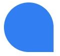
实心圆
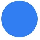
.circle {
width: 120px;
height: 120px;
background: #317ef3;
border-radius: 100%;
}
圆环(空心圆)
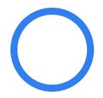
.ring {
width: 120px;
height: 120px;
border: 10px solid #317ef3;
border-radius: 100%;
box-sizing: border-box;
}
半圆
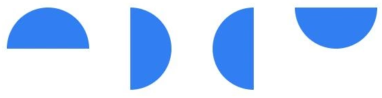
//上半圆
.top-semicircle {
width: 120px;
height: 60px;
background: #317ef3;
border-radius: 60px 60px 0 0;
/*顺时针方向,四个值依次分别表示左上、右上、右下、左下*/
}
//右半圆
.rt-semicircle {
width: 60px;
height: 120px;
background: #317ef3;
border-radius: 0 60px 60px 0;
}
//左半圆
.lf-semicircle {
width: 60px;
height: 120px;
background: #317ef3;
border-radius: 60px 0 0 60px;
}
//下半圆
.bot-semicircle {
width: 120px;
height: 60px;
background: #317ef3;
border-radius: 0 0 60px 60px;
}
四分之一圆(扇形)

.toplf-sector,
.toprt-sector,
.botlf-sector,
.botrt-sector {
width: 60px;
height: 60px;
background: #317ef3;
}
.toprt-sector {
border-radius: 60px 0 0 0;
}
.toplf-sector {
border-radius: 0 60px 0 0;
}
.botlf-sector {
border-radius: 0 0 60px 0;
}
.botrt-sector {
border-radius: 0 0 0 60px;
}
心形

.love {
width: 100px;
height: 100px;
background: #317ef3;
position: relative;
transform: rotate(45deg);
-webkit-transform: rotate(45deg);
-moz-transform: rotate(45deg);
-o-transform: rotate(45deg);
}
.love::before,.love:after{
content: "";
background: #317ef3;
position: absolute;
}
.love:after {
width: 50px;
height: 100px;
background: #317ef3;
border-radius: 50px 0 0 50px;
right: 99px;
top: 0;
}
.love::before {
width: 100px;
height: 50px;
border-radius: 50px 50px 0 0;
bottom: 99px;
left: 0;
}
原理图,奉上
吃豆人

.eat {
width: 0;
height: 0;
border: 60px solid #317ef3;
border-radius: 100%;
border-right-color: transparent;
}
值得注意的是如果右边框的颜色设置为白色的话,右边会有一条蓝色线条

鸡蛋
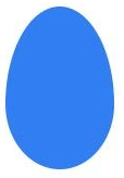
.egg {
width: 100px;
height: 150px;
background: #317ef3;
border-radius: 50px 50px 50px 50px/90px 90px 60px 60px;
}
原理图奉上:

椭圆
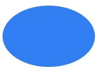
.ellipse1 {
width: 180px;
height: 120px;
background: #317ef3;
border-radius: 100%;
/* border-radius: 90px/60px; */
}
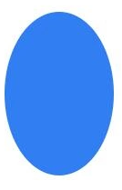
.ellipse2 {
width: 120px;
height: 180px;
background: #317ef3;
border-radius: 100%;
/* border-radius: 60px/90px; */
}
胶囊
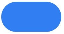
.capsule1 {
width: 200px;
height: 100px;
background: #317ef3;
border-radius: 50px;
}
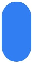
.capsule2 {
width: 100px;
height: 200px;
background: #317ef3;
border-radius: 50px;
}
叶子(花瓣)
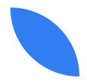
.leaf1 {
width: 100px;
height: 100px;
background: #317ef3;
border-radius: 0 100px;
}
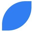
.leaf2 {
width: 100px;
height: 100px;
background: #317ef3;
border-radius: 80px 0px;
}
.leaf3 {
width: 100px;
height: 100px;
background: #317ef3;
border-radius: 50px 50px 0 50px;
}
五叶花瓣

.five-petal {
width: 160px;
height: 160px;
}
.five-petal span {
display: block;
width: 80px;
height: 80px;
background: #317ef3;
border-radius: 0 100px;
transform-origin: 100% 100%;
position: absolute;
}
.five-petal .petal2 {
transform: rotate(72deg);
}
.five-petal .petal3 {
transform: rotate(144deg);
}
.five-petal .petal4 {
transform: rotate(216deg);
}
.five-petal .petal5 {
transform: rotate(288deg);
}
四叶草

.four-leaf {
width: 210px;
height: 210px;
position: relative;
}
.four-leaf span {
display: block;
width: 100px;
height: 100px;
background: #317ef3;
position: absolute;
}
.four-leaf span.leaf1 {
left: 0;
top: 0;
border-radius: 50px 50px 0 50px;
}
.four-leaf span.leaf2 {
right: 0;
top: 0;
border-radius: 50px 50px 50px 0;
}
.four-leaf span.leaf3 {
left: 0;
bottom: 0;
border-radius: 50px 0 50px 50px;
}
.four-leaf span.leaf4 {
right: 0;
bottom: 0;
border-radius: 0 50px 50px 50px;
}
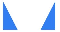
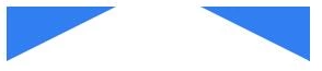
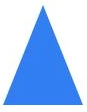
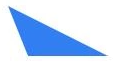
三角形
实现原理:
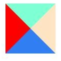
.triangle-shiyi {
width: 0;
height: 0;
border: 50px solid #317ef3;
border-left-color: red;
border-top-color: aquamarine;
border-right-color: bisque;
}
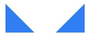
.dbzj-sanjiao1 {
width: 0;
height: 0;
border-bottom: 100px solid #317ef3;
border-right: 100px solid transparent;
}
.dbzj-sanjiao2 {
width: 0;
height: 0;
border-bottom: 100px solid #317ef3;
border-left: 100px solid transparent;
}
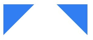
.dbzj-sanjiao3 {
width: 0;
height: 0;
border-top: 100px solid #317ef3;
border-right: 100px solid transparent;
}
.dbzj-sanjiao4 {
width: 0;
height: 0;
border-top: 100px solid #317ef3;
border-left: 100px solid transparent;
}
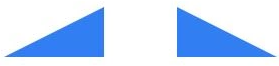
.dbzj-sanjiao5 {
width: 0;
height: 0;
border-bottom: 50px solid #317ef3;
border-left: 100px solid transparent;
/* border-left、border-right决定宽度 */
/* border-top、border-bottom决定高度 */
}
.dbzj-sanjiao6 {
width: 0;
height: 0;
border-bottom: 50px solid #317ef3;
border-right: 100px solid transparent;
}
.dbzj-sanjiao7 {
width: 0;
height: 0;
border-bottom: 100px solid #317ef3;
border-right: 50px solid transparent;
}
.dbzj-sanjiao8 {
width: 0;
height: 0;
border-bottom: 100px solid #317ef3;
border-left: 50px solid transparent;
}
.dbzj-sanjiao9 {
width: 0;
height: 0;
border-top: 50px solid #317ef3;
border-right: 100px solid transparent;
}
.dbzj-sanjiao10 {
width: 0;
height: 0;
border-top: 50px solid #317ef3;
border-left: 100px solid transparent;
}
.dbzj-sanjiao11 {
width: 0;
height: 0;
border-left: 40px solid transparent;
border-right: 40px solid transparent;
border-bottom: 100px solid #317ef3;
/*三角形的宽度w=left+right,h=bottom*/
}
.dbzj-sanjiao12 {
width: 0;
height: 0;
border-bottom: 50px solid #317ef3;
border-right: 100px solid transparent;
position: relative;
}
.dbzj-sanjiao12::before {
content: "";
position: absolute;
left: 0;
top: 0;
border-bottom: 50px solid #fff;
border-right: 20px solid transparent;
}
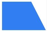
平行四边形
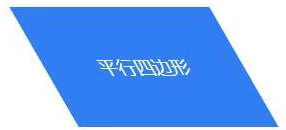
.pxsbx1 {
width: 200px;
height: 120px;
background: #317ef3;
color: #fff;
text-align: center;
line-height: 120px;
font-size: 18px;
transform: skewX(30deg);
}
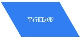
.pxsbx2 {
width: 200px;
height: 120px;
text-align: center;
line-height: 120px;
position: relative;
font-size: 18px;
color: #fff;
}
.pxsbx2::after {
content: "";
position: absolute;
left: 0;
top: 0;
z-index: -1;
width: 200px;
height: 120px;
background: #317ef3;
transform: skewX(30deg);
}
与上面的平行四边形相比,可以看到该图形中的文字不会发生倾斜,方法是在文字层后添加一个伪元素绘制平行四边。
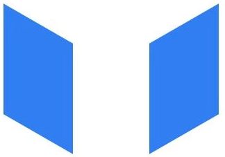
.pxsbx3 {
width: 100px;
height: 160px;
background: #317ef3;
transform: skewY(30deg);
}
.pxsbx4 {
width: 100px;
height: 160px;
background: #317ef3;
transform: skewY(-30deg);
}
梯形
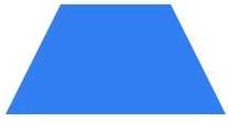
.tixing1 {
width: 100px;
height: 0;
border-bottom: 100px solid #317ef3;
border-left: 50px solid transparent;
border-right: 50px solid transparent;
}
.tixing2 {
width: 100px;
height: 100px;
background: #317ef3;
position: relative;
}
.tixing2::before {
content: "";
width: 0;
height: 0;
border-bottom: 100px solid #317ef3;
border-right: 50px solid transparent;
position: absolute;
left: 100%;
top: 0;
}
边框对话框
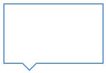
.duihuakuang1 {
width: 200px;
height: 120px;
border: 2px solid #317ef3;
position: relative;
}
.duihuakuang1::before {
content: "";
position: absolute;
left: 40px;
top: 92%;
width: 20px;
height: 20px;
border-right: 2px solid #317ef3;
border-bottom: 2px solid #317ef3;
transform: rotate(45deg);
background: #fff;
}
太极八卦阵图
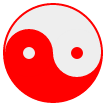
#yin-yang {
width: 96px;
height: 48px;
background: #eee;
border-color: red;
border-style: solid;
border-width: 2px 2px 50px 2px;
border-radius: 100%;
position: relative;
}
#yin-yang:before {
content: "";
position: absolute;
top: 50%;
left: 0;
background: #eee;
border: 18px solid red;
border-radius: 100%;
width: 12px;
height: 12px;
}
#yin-yang:after {
content: "";
position: absolute;
top: 50%;
left: 50%;
background: red;
border: 18px solid #eee;
border-radius:100%;
width: 12px;
height: 12px;
}
月亮
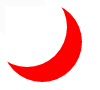
#moon {
width: 80px;
height: 80px;
border-radius: 50%;
box-shadow: 15px 15px 0 0 red;
}
立体球形
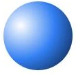
.litiqiuxing1 {
width: 100px;
height: 100px;
border-radius: 100%;
background: #317ef3;
background: radial-gradient(circle at 25% 35%, #fff, #317ef3, #071529);
}
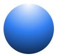
.litiqiuxing2 {
width: 100px;
height: 100px;
border-radius: 100%;
background: #317ef3;
background: radial-gradient(circle at top, #fff, #317ef3, #071529)
}
参考:
(用CSS绘制最常见的40种形状和图形)[https://www.cnblogs.com/zs-xanadu/p/9229242.html]
|