uniapp 单选框以及多选框样式更改 |
您所在的位置:网站首页 › uniapp复选框动态选选中 › uniapp 单选框以及多选框样式更改 |
uniapp 单选框以及多选框样式更改
|
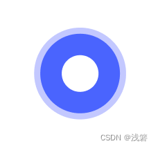
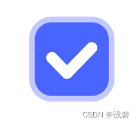
radio以及checkbox默认样式不符合自身需求时,根据自身需求更改样式,以下是自身的示例: 单选: 多选: 由于uniapp自身包含了一套默认的样式,所以如果不想全局更改只想在某个单据页面使用的话,就要考虑CSS优先级的问题,以下为具体样式,给大家做一个参考:(我这边可能会麻烦一点,大家按照自身需求删减哈) 单选框CSS: /* radio 边框颜色 */ /deep/ uni-radio .uni-radio-input{ width: 30rpx; height: 30rpx; border:2rpx solid rgba(166, 175, 255, 0.5)!important; transform: rotateZ(360deg); //防止IOS出现一侧边框缺失的问题 background-color: rgba(255, 255, 255, 0)!important; margin-right:0rpx!important; //uniapp 默认右侧会有一定的margin,大家根据自身需求去除 } /* radio 选中后的边框颜色 */ /deep/ uni-radio .uni-radio-input-checked { border:2rpx solid #CACFFF!important; transform: rotateZ(360deg); background-color: #556FFE!important; display:flex; align-items: center; justify-content: center; } /* radio 选中后的图标样式*/ /deep/ uni-radio .uni-radio-input.uni-radio-input-checked::before{ display: block; content: ""!important; width:20rpx!important; height:20rpx!important; text-align:center; background:#fff!important; border-radius:20rpx!important; }多选框CSS: /deep/ uni-checkbox .uni-checkbox-input{ width: 30rpx; height: 30rpx; border-radius: 8rpx; border: 2rpx solid #5262E8; transform: rotateZ(360deg); background-color: rgba(255, 255, 255, 0)!important; pointer-events: none; } /deep/ uni-checkbox .uni-checkbox-input-checked{ border:2rpx solid #CACFFF!important; transform: rotateZ(360deg); background-color: #556FFE!important; } /deep/ uni-checkbox .uni-checkbox-input-checked::before{ font-size: 12px!important; font-weight:bold; color:#fff; } |
【本文地址】
今日新闻 |
推荐新闻 |