Stata绘图学习手册 |
您所在的位置:网站首页 › statacollapse用法 › Stata绘图学习手册 |
Stata绘图学习手册
|
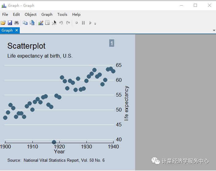
graph-command plot-command,plot-options || plot-command , plot-options || , graph-options * graph-command定义图的类型, plot-command 定义曲线类型,同一个图中如果有多条曲线可以用括号分开,也可以用“| *”分开,曲线有其自身的选项,而整个图也有其选项。例如twoway为graph-command中的命令之一,而scatter为plot-command *中的命令之一。 曲线选项和图选项,例如 * twoway (scatter mpg weight) , title("美国汽车") //图选项:标题 * twoway (scatter mpg weight , msymbol(Oh)) //曲线选项,点的类型 上述命令没反应了直接敲 * twoway (scatter mpg weight , msymbol(Oh)) , title("美国汽车") //同时用图与曲线选项 命令可以简写,如下列命令等价 *sysuse auto, clear graph twoway scatter mpg weight twoway scatter mpg weight 三.散点图 散点图在各个绘图中占有重要作用,散点图具有表明变量之间关系的作用,因此在统计分析中得到广泛应用 散点图的功能与意义:对数据进行预处理的重要图形之一,散点图深受专家学者的喜爱,散点图主要作用在于描绘某变量随着另一个变量变化的大致趋势,进行对变量之间的相关关系进行研究 help twoway scatter sysuse uslifeexp2, clear scatter le year, title("Scatterplot") subtitle("Life expectancy at birth, U.S.") note("1") caption("Source: National Vital Statistics Report, Vol. 50 No. 6") scheme(economist)
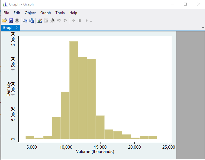
四.直方图 直方图又称为柱状图,是一种统计报告图,一般用横轴表示数据类型,纵轴表示分布状况,直方图可以表示分布状况变化,例如分别有一组数据,分别为地区,31个省份,然后分别为有高校的个数,分别字母region和number表示 直方图命令为 histogram number, frequency sysuse sp500 histogram volume
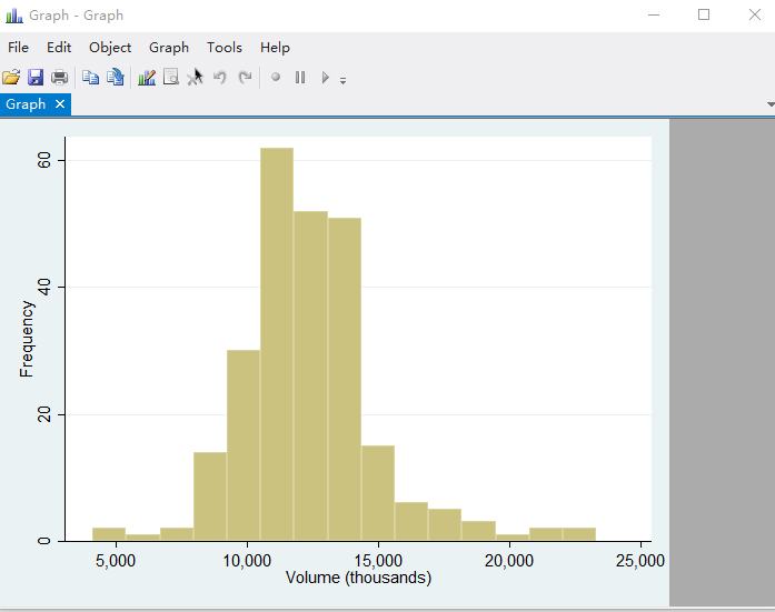
histogram volume, frequency
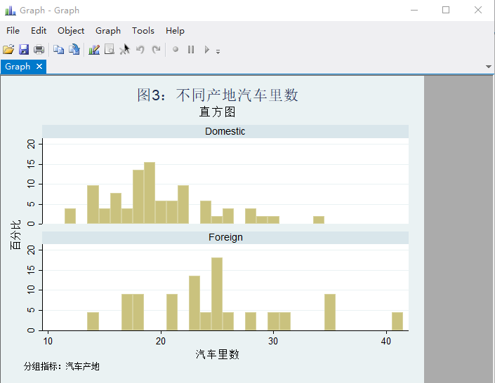
分组绘制直方图 sysuse auto, clear histogram mpg, percent discrete/// by(foreign, col(1) note(分组指标:汽车产地)/// title("图3:不同产地汽车里数")/// subtitle("直方图") /// ) /// ytitle(百分比) xtitle(汽车里数)
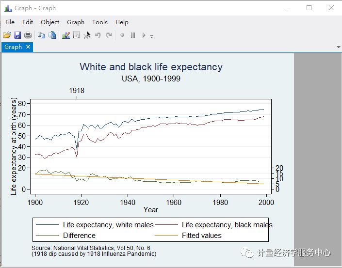
五.折线图或者曲线标绘图 折线图或者曲线标绘图是双向关系图中的一种,用线条的升降来表示变量或者现象之间的关系,与散点图的区别在于用线连接,可以看出整体趋势,但是弱化了每一个具体点上面的数值大小 sysuse uslifeexp, clear generate diff = le_wm - le_bm label var diff "Difference" line le_wm year, yaxis(1 2) xaxis(1 2) || line le_bm year || line diff year || lfit diff year ||, ylabel(0(5)20, axis(2) gmin angle(horizontal)) ylabel(0 20(10)80, gmax angle(horizontal)) ytitle("", axis(2)) xlabel(1918, axis(2)) xtitle("", axis(2)) ylabel(, axis(2) grid) ytitle("Life expectancy at birth (years)") title("White and black life expectancy") subtitle("USA, 1900-1999") note("Source: National Vital Statistics, Vol 50, No. 6" "(1918 dip caused by 1918 Influenza Pandemic)")
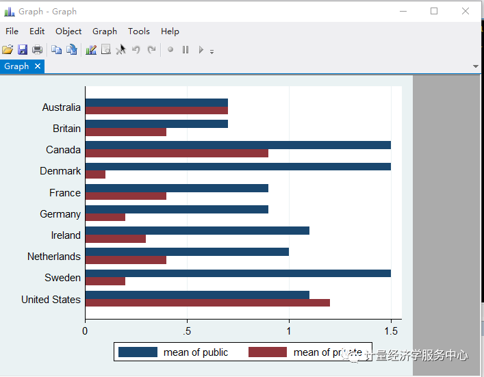
六.条形图 矩形的长度来表示相互独立的变量大小 help graph bar 命令格式1: graph bar yvars [if] [in] [weight] [, options] graph hbar yvars [if] [in] [weight] [, options] 基本用法: graph bar yvars ... sysuse nlsw88, clear graph bar wage, over(race) 累加柱体或者横向条形图 sysuse educ99gdp, clear graph hbar (mean) public private, over(country)
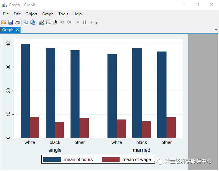
重叠柱体 sysuse nlsw88, clear graph bar (mean) hours wage, over(race) over(married)
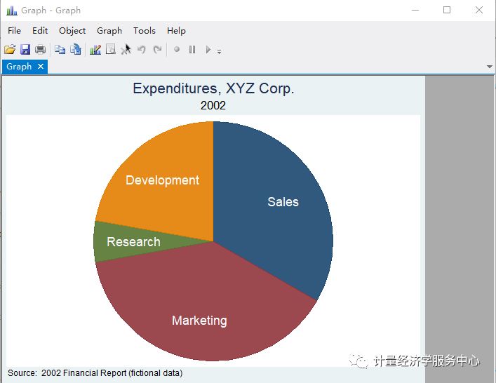
七.饼图 百分比图 用圆形或者扇形内大小来表示总体中各部分所占比例的大小 命令为 帮助文件为 help graph pie 菜单式操作为Menu>raphics > Pie chart Syntax Slices as totals or percentages of each variable graph pie varlist [if] [in] [weight] [, options] Slices as totals or percentages within over() categories graph pie varname [if] [in] [weight], over(varname) [options] Slices as frequencies within over() categories graph pie [if] [in] [weight], over(varname) [options] input sales marketing research development sales marketing research develop~t 1. 12 14 2 8 2. end . label var sales "Sales" . label var market "Marketing" . label var research "Research" . label var develop "Development" . graph pie sales marketing research development, plabel(_all name, size(*1.5) color(white)) (Note 1) legend(off) (Note 2) plotregion(lstyle(none)) (Note 3) title("Expenditures, XYZ Corp.") subtitle("2002") note("Source: 2002 Financial Report (fictional data)")
|
 返回搜狐,查看更多
【本文地址】