【Python】如何为Matplotlib图像添加标签? |
您所在的位置:网站首页 › python画函数曲线图 › 【Python】如何为Matplotlib图像添加标签? |
【Python】如何为Matplotlib图像添加标签?
|
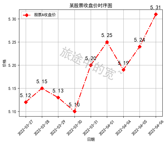
一、添加文本标签 plt.text()
用于在绘图过程中,在图像上指定坐标的位置添加文本。需要用到的是plt.text()方法。 其主要的参数有三个: plt.text(x, y, s)其中x、y表示传入点的x和y轴坐标。s表示字符串。 需要注意的是,这里的坐标,如果设定有xticks、yticks标签,则指的不是标签,而是绘图时x、轴的原始值。 因为参数过多,不再一一解释,根据代码学习其用法。 ha = 'center’表示垂直对齐方式居中,fontsize = 30表示字体大小为30,rotation = -25表示旋转的角度为-25度。c 设定颜色,alpha设定透明度。va表示水平对齐方式。 1. 示例代码在图像中添加了两段文本,一段是“旅途中的宽~”的斜体水印,透明度为0.4。 另一段是在折线的每个折点附近标出当天收盘价。 import matplotlib.pyplot as plt plt.rcParams['font.sans-serif'] = ['SimHei'] plt.rcParams['axes.unicode_minus'] = False x = range(9) y = [5.12, 5.15, 5.13, 5.10, 5.2, 5.25, 5.19, 5.24, 5.31] c = 0.5 * (min(x) + max(x)) d = min(y) + 0.3 * (max(y) - min(y)) # 水印效果 plt.text(c, d, '旅途中的宽~', ha = 'center', fontsize = 30, rotation = -25, c = 'gray', alpha = 0.4) plt.plot(x, y, label = '股票A收盘价', c = 'r', ls = '-.', marker = 'D', lw = 2) plt.xticks(x, [ '2022-03-27', '2022-03-28', '2022-03-29', '2022-03-30', '2022-03-31', '2022-04-01', '2022-04-04', '2022-04-05', '2022-04-06'], rotation = 45) plt.title('某股票收盘价时序图') plt.xlabel('日期') plt.ylabel('价格') plt.grid(True) plt.legend() # 标出每天的收盘价 for a, b in zip(x, y): plt.text(a, b + 0.01, '%.2f' % b, ha = 'center', va = 'bottom', fontsize = 14) plt.show()
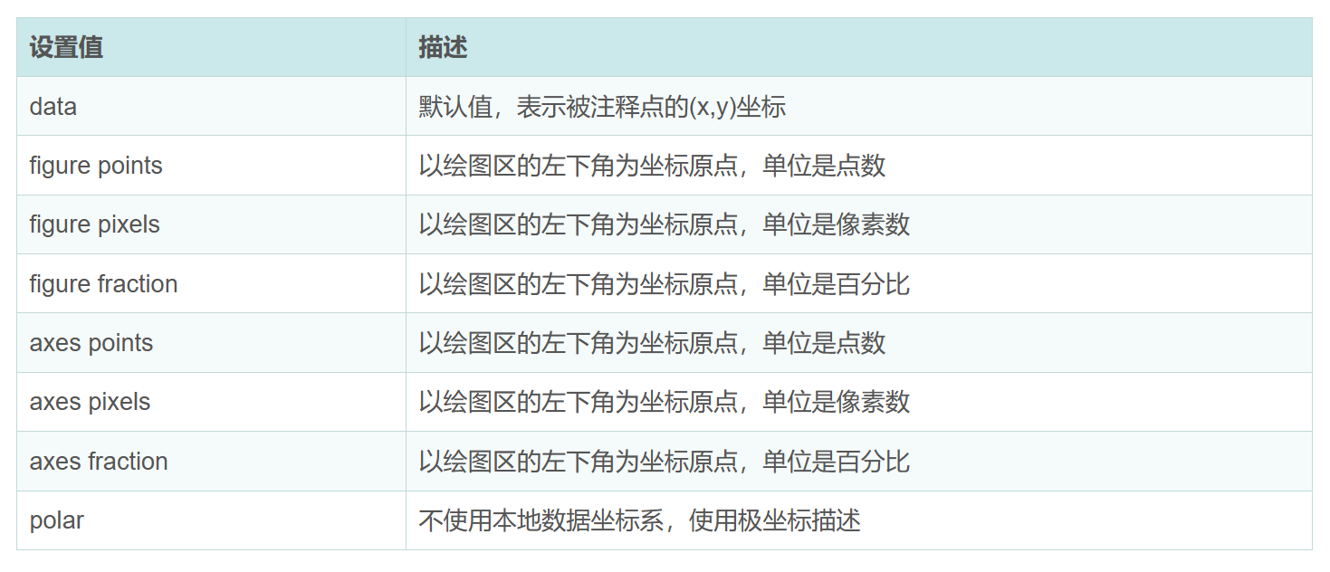
在上例代码的基础之上,添加注释。注释即对图像中某一位置的解释,可以用箭头来指向。 添加注释使用的是plt.annotate()方法 其语法中的常用参数如下 plt.annotate(str,xy,xytext,xycoords,arrowcoords)其中str即注释要使用的字符串,即注释文本;xy指被注释的坐标点;xytext指注释文本要写在的位置;xycoords是被注释的点的坐标系属性,即以什么样的方式描述该点的坐标。设置值默为"data",即用(x,y)坐标来描述。其他可以选择的设置值如下,其中figure指的是整个画布作为一个参考系。而axes则表示仅对于其中的一个axes对象区域。
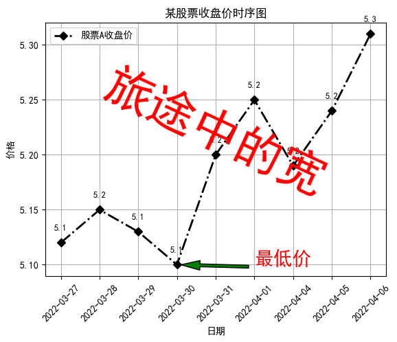
字典内可以设置的值有: 以标出图中的最低价的点为例。在目标位置添加一个红色的箭头,及“最低价”三个字。 其他更多参数,如关于设置注释文本的字体的,c或color表示颜色,fontsize表示字体大小。更多属性自行了解尝试。 import matplotlib.pyplot as plt plt.rcParams['font.sans-serif'] = ['SimHei'] plt.rcParams['axes.unicode_minus'] = False x = range(9) y = [5.12, 5.15, 5.13, 5.10, 5.2, 5.25, 5.19, 5.24, 5.31] c = 0.5 * (min(x) + max(x)) d = min(y) + 0.3 * (max(y) - min(y)) # 仿水印效果 plt.text(c, d, '旅途中的宽', ha = 'center', fontsize = 30, rotation = -25, c = 'gray', alpha = 0.4) plt.plot(x, y, label = '股票A收盘价', c = 'r', ls = '-.', marker = 'D', lw = 2) # plt.plot([5.09, 5.13, 5.16, 5.12, 5.09, 5.25, 5.16, 5.20, 5.25], label='股票B收盘价', c='g', ls=':', marker='H', lw=4) plt.xticks(x, [ '2022-03-27', '2022-03-28', '2022-03-29', '2022-03-30', '2022-03-31', '2022-04-01', '2022-04-04', '2022-04-05', '2022-04-06'], rotation = 45) plt.title('某股票收盘价时序图') plt.xlabel('日期') plt.ylabel('价格') plt.grid(True) plt.legend() # 标出每天的收盘价 for a, b in zip(x, y): plt.text(a, b + 0.01, '%.3f'% b, ha = 'center', va = 'bottom', fontsize = 9) # 添加注释 plt.annotate('最低价', (x[y.index(min(y))], min(y)), (x[y.index(min(y))] + 0.5, min(y)), xycoords = 'data', arrowprops = dict(facecolor = 'r', shrink = 0.1), c = 'r',fontsize = 15) plt.show()
下边换一种效果呈现,添加的注释箭头宽度为3,箭头的头部宽度为10,长度为20,缩短0.05,且箭头为绿色,注释字体为红色。代码示例如下: import matplotlib.pyplot as plt plt.rcParams['font.sans-serif'] = ['SimHei'] plt.rcParams['axes.unicode_minus'] = False x = range(9) y = [5.12, 5.15, 5.13, 5.10, 5.2, 5.25, 5.19, 5.24, 5.31] c = 0.5 * (min(x) + max(x)) d = min(y) + 0.3 * (max(y)-min(y)) plt.plot(x, y, label = '股票A收盘价', c = 'k', ls = '-.', marker = 'D', lw = 2) plt.xticks(x, [ '2022-03-27', '2022-03-28', '2022-03-29', '2022-03-30', '2022-03-31', '2022-04-01', '2022-04-04', '2022-04-05', '2022-04-06'], rotation = 45) plt.title('某股票收盘价时序图') plt.xlabel('日期') plt.ylabel('价格') plt.grid(True) plt.legend() # 标出每天的收盘价 for a, b in zip(x, y): plt.text(a, b+0.01, '%.1f'%b, ha='center', va='bottom', fontsize=9) plt.text(c, d, '旅途中的宽', ha = 'center', fontsize = 50, rotation = -25, c = 'r') plt.annotate('最低价', (x[y.index(min(y))], min(y)), (x[y.index(min(y))] + 2, min(y)), xycoords = 'data', arrowprops = dict(width = 3, headwidth = 10, headlength = 20, facecolor = 'g', shrink = 0.05), c = 'r',fontsize = 20) plt.show()
|
 arrowprops是一个字典,用来设置箭头的属性。写在这个字典之外的参数都表示的是注释文本的属性。
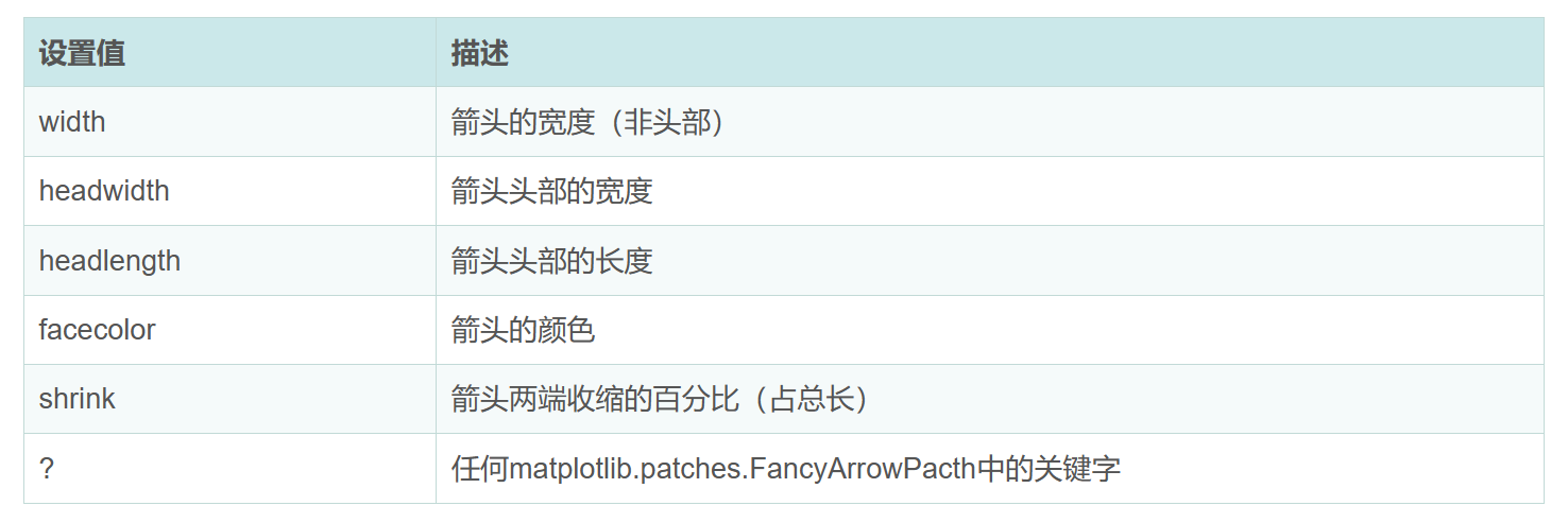 关于这些参数的进一步解释:其中箭头的总长度先是通过被注释点位置坐标 与 注释文本位置坐标 所决定的,可以通过调节参数arrowprops中的shrink键来进一步调节箭头的长度,shrink表示将箭头缩短的长度占总长度(被注释点位置坐标 与 注释文本位置坐标 决定的长度)的百分比。当不设定shrink时,shrink默认为0,即不缩短。当shrink很大,接近1时,其效果等同于不缩短。
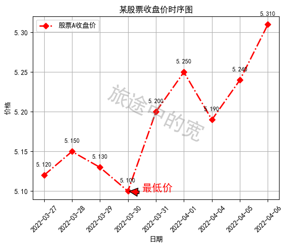
【本文地址】
今日新闻 |
推荐新闻 |