机器学习入门 |
您所在的位置:网站首页 › prediction用法总结 › 机器学习入门 |
机器学习入门
|
任务概述
此任务中,我们要完成三项任务: 使用随机森林算法完成基本建模任务 基本任务需要我们处理数据,观察特征,完成建模并进行可视化展示分析观察数据量与特征个数对结果影响 在保证算法一致的前提下, 加大数据个数,观察结果变换。重新考虑特征工程,引入新特征后观察结果走势。对随机森林算法进行调参,找到最合适的参数 掌握机器学习中两种经典调参方法,对当前模型进行调节 数据展示 # Pandas is used for data manipulation import pandas as pd # Read in data as pandas dataframe and display first 5 rows features = pd.read_csv('data/temps.csv') features.head(5)
在此数据集中,我们可以看到关于时间的特征是分散的,下面我们需要把他们合并一下,得到一个datetime格式的特征数据 # 处理时间数据 import datetime # 分别得到年月日 years = features['year'] months = features['month'] days = features['day'] # datetime格式 dates = [str(int(year)) + '-' + str(int(month)) + '-' + str(int(day)) for year, month, day in zip(years, months, days)] dates = [datetime.datetime.strptime(date, '%Y-%m-%d') for date in dates] 查看数据 # 准备画图 import matplotlib.pyplot as plt %matplotlib inline # 指定默认风格 plt.style.use('fivethirtyeight') # 设计布局 fig, ((ax1, ax2), (ax3, ax4)) = plt.subplots(nrows=2, ncols=2, figsize = (10,10)) fig.autofmt_xdate(rotation = 45) # 标签值 ax1.plot(dates, features['actual']) ax1.set_xlabel(''); ax1.set_ylabel('Temperature'); ax1.set_title('Max Temp') # 昨天 ax2.plot(dates, features['temp_1']) ax2.set_xlabel(''); ax2.set_ylabel('Temperature'); ax2.set_title('Previous Max Temp') # 前天 ax3.plot(dates, features['temp_2']) ax3.set_xlabel('Date'); ax3.set_ylabel('Temperature'); ax3.set_title('Two Days Prior Max Temp') # 朋友的评价 ax4.plot(dates, features['friend']) ax4.set_xlabel('Date'); ax4.set_ylabel('Temperature'); ax4.set_title('Friend Estimate') plt.tight_layout(pad=2)得到可视化信息如下: 在文章一开始的观察数据的那一步,我们就发现了一个问题,week 特征它不是数字形式,而是 Mon、Tue、Wed、Thu、Fri、Sat、Sun 使用 独热编码 One-Hot Encoding 方式进行数据处理,使其全部成为数字形式,这里我们使用 pd.get_dummies(),它的 官网API # 独热编码 pd.get_dummies自动寻找 features = pd.get_dummies(features) features.head(5)
所有准备工作都已经完成了,现在可以来建立随机森林模型了,导入Sklearn工具包,在这里我们先建立1000个树模型尝试一下,其他参数先用默认值,之后再细化调参任务 # 导入随机森林算法模型 from sklearn.ensemble import RandomForestRegressor # 实例化模型 rf = RandomForestRegressor(n_estimators= 1000, random_state=42) # 训练数据模型 rf.fit(train_features, train_labels) 测试 # 在测试数据上使用森林预测方法 predictions = rf.predict(test_features) # 计算绝对误差 errors = abs(predictions - test_labels) # 计算绝对百分比误差 mape = 100*(errors/test_labels) accuracy = 100 - np.mean(mape) # 打印出平均绝对误差(mae) print('Mean Absolute Error:', round(np.mean(errors), 2),) # 打印准确率 print('Accuracy:', round(accuracy,2),'%') Mean Absolute Error: 3.83 Accuracy: 93.99 %预测指标 MAE、MAPE: MAE: 平均绝对误差(Mean Absolute Error) M A E = 1 n ∑ i = 1 n ∣ y ^ i − y i ∣ MAE=\frac{1}{n}\sum_{i=1}^{n}|\hat{y}_i-yi| MAE=n1i=1∑n∣y^i−yi∣ 值域:[0,+∞) 当预测值与真实值完全吻合时等于0,即完美模型;误差越大,MAE 值越大。 MAPE: 平均绝对百分比误差(Mean Absolute Percentage Error) M A P E = 100 % n ∑ i = 1 n ∣ y ^ i − y i y i ∣ MAPE=\frac{100\%}{n}\sum_{i=1}^{n}|\frac{\hat{y}_i-yi}{y_i}| MAPE=n100%i=1∑n∣yiy^i−yi∣ 值域:[0,+∞),MAPE 为0%表示完美模型,MAPE 大于 100 %则表示劣质模型。 但 MAPE 有一点需要注意,当真实值 y i y_i yi 有数据等于0时,存在分母 0 0 0 除问题,则该公式无意义不可用 可视化展示与特征重要性树模型的可视化需要安装软件库 Graphviz,并好相关环境变量 graphviz-2.38.msi 官方下载地址:https://graphviz.gitlab.io/_pages/Download/Download_windows.html # 导入工具包 from sklearn.tree import export_graphviz import pydot #pip install pydot # 拿到其中的一棵树 tree = rf.estimators_[5] # 将图像导出为 dot 文件 export_graphviz(tree, out_file = 'tree.dot', feature_names = feature_list, rounded = True, precision = 1) # 绘图 (graph, ) = pydot.graph_from_dot_file('tree.dot') # 展示 graph.write_png('tree.png');
解释:
得到了我们的特征重要性之后,我们可以了解到模型训练时用到的主要特征是 temp_1、average,那么我们就来看一下,如果只用这两个特征进行训练,效果会是什么样子,会不会对结果无影响 # 选择最重要的两个特征来实验 rf_most_important = RandomForestRegressor(n_estimators= 1000, random_state=42) # 拿到特征值 important_indices = [feature_list.index('temp_1'), feature_list.index('average')] train_important = train_features[:, important_indices] test_important = test_features[:, important_indices] # 重新训练模型 rf_most_important.fit(train_important, train_labels) # 预测结果 predictions = rf_most_important.predict(test_important) # 计算绝对误差 errors = abs(predictions - test_labels) # 计算 MAPE mape = np.mean(100 * (errors / test_labels)) accuracy = 100 - mape # 打印 print('Mean Absolute Error:', round(np.mean(errors), 2)) print('Accuracy:', round(accuracy, 2), '%') Mean Absolute Error: 3.92 Accuracy: 93.77 %使用所有特征训练时:Mean Absolute Error: 3.83,Accuracy: 93.99 %;使用两个特征训练时:Mean Absolute Error: 3.92,Accuracy: 93.77 %。数据集共有15个特征,在经过特征重要性筛选后我们使用的是2个特征,训练速度肯定是变快了,但是精度值有一点下降。在实际应用场景中,我们可以根据应用场景中是更注重预测速度还是更注重预测精度来进行模型选择。 预测值与真实值之间的差异最后我们将本文中做的实验结果进行整合 # 日期数据 months = features[:, feature_list.index('month')] days = features[:, feature_list.index('day')] years = features[:, feature_list.index('year')] # 转换日期格式 dates = [str(int(year)) + '-' + str(int(month)) + '-' + str(int(day)) for year, month, day in zip(years, months, days)] dates = [datetime.datetime.strptime(date, '%Y-%m-%d') for date in dates] # 创建一个表格来存日期和其对应的标签数值 true_data = pd.DataFrame(data = {'date': dates, 'actual': labels}) # 再创建一个表格来存日期和其对应的标签数值 months = test_features[:, feature_list.index('month')] days = test_features[:, feature_list.index('day')] years = test_features[:, feature_list.index('year')] # Column of dates test_dates = [str(int(year)) + '-' + str(int(month)) + '-' + str(int(day)) for year, month, day in zip(years, months, days)] # Convert to datetime objects test_dates = [datetime.datetime.strptime(date, '%Y-%m-%d') for date in test_dates] # Dataframe with predictions and dates predictions_data = pd.DataFrame(data = {'date': test_dates, 'prediction': predictions}) # 真实值 plt.plot(true_data['date'], true_data['actual'], 'b-', label = 'actual') # 预测值 plt.plot(predictions_data['date'], predictions_data['prediction'], 'ro', label = 'prediction') plt.xticks(rotation = '60'); plt.legend() # 画图 plt.xlabel('Date') plt.ylabel('Maximum Temperature (F)') plt.title('Actual and Predicted Values')
|
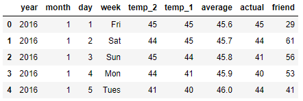 本数据表中:
 无异常值我们就可以接着往下做了
 横轴为日期,纵轴分别是 actual、temp_1、temp_2、friend
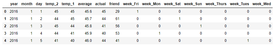
 生成的原始图像文件中,树的深度是15,下面我们简化一下,将树的深度改为3,再看一下
 这张图像显示的即是树模型的上面的形状

 此图显示出数据的走势,证明我们已经基本能够掌握此模型了,接下来就是要深入到数据中,做更精细的调整!
【本文地址】
今日新闻 |
推荐新闻 |