|
这是我参与8月更文挑战的第5天,活动详情查看:8月更文挑战
Echarts 图标样式个性化设置,如饼图空白间距,图例自定义,图例显示百分比,提示框自定义,百分比和标签同时存在等等,解决折磨人的细节样式问题。
环形饼图
官网环形饼图示例:echarts.apache.org/examples/zh…
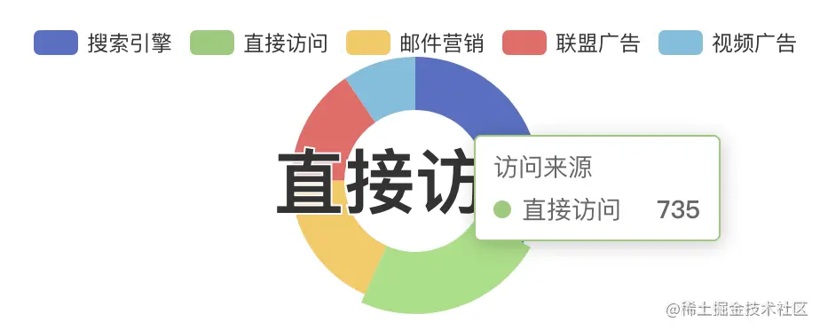
legend 图例位置调整
调整图例位置,位于饼图右侧(top,left);
调整图例排列方式orient,默认水平排列,改为垂直排列horization
解决 legend 显示百分比问题,在formatter函数中自定义,当然百分比不是用的默认的,需要自己计算
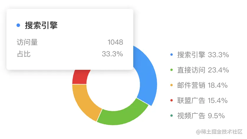
// 饼图测试数据
const seriesData = [
{ value: 1048, name: "搜索引擎", rate: 0.333 },
{ value: 735, name: "直接访问", rate: 0.234 },
{ value: 580, name: "邮件营销", rate: 0.184 },
{ value: 484, name: "联盟广告", rate: 0.154 },
{ value: 300, name: "视频广告", rate: 0.095 },
];
// 计算测试数据总和
const seriesSum = R.reduce((acc, item) => acc + item.value, 0, seriesData);
// legend其他样式可查看之前的系列文章,这里显示不同的地方;默认legend是一样的
let legend = R.mergeDeepRight(legend, {
orient: "horization", // 垂直排列
top: 40,
left: 180,
itemGap: 14, // 调整每项之前的间距
textStyle: {
color: "#808080", // 文本颜色
},
formatter: function(name) {
let rate = R.propOr(0, "rate", R.find(R.propEq("name", name))(seriesData));
rate = (rate * 100).toFixed(1);
// 显示名称+百分比
return `${name} ${rate}%`;
},
});
饼图基础样式调整
饼图位置(center),大小(radius)
添加白色间隙(itemStyle.borderWidth)
let series = [
{
name: "访问来源",
type: "pie",
radius: ["45%", "70%"], // 饼图的半径
avoidLabelOverlap: false, // 防止标签重叠,默认开启
center: [90, 102], // 饼图的中心(圆心)坐标
label: { // 文本标签
show: false,
// position: "center", // 文本标签位置
},
labelLine: { // 引导线
show: false,
},
itemStyle: { // 饼图白色间隙
borderWidth: 1,
borderColor: "#fff",
},
},
];
tooltip 提示框自定义
// 数据源
let dataset = {
dimensions: ["value", "name", "rate"],
source: seriesData,
};
let tooltip = R.merge(tooltip, {
trigger: "item",
borderColor: "#fff",
formatter: function(params) {
// console.log(params);
// 计算百分比时,params.percent是图表自己计算的;
// params.data.rate(在dimensions中定义的)是我们自己传的值
let html = `
${params.name}
访问量
${params.data.value}
占比
${(params.data.rate * 100).toFixed(1)}%
`;
return html;
},
});
总体效果展示
import * as R from "ramda";
export default {
data() {
return {
charts: null,
};
},
mounted() {
// 初始化配置
let option = { legend, series, dataset, tooltip };
this.charts = this.$echarts.init(document.getElementById("pieCharts"), null, { renderer: "svg" });
this.charts.setOption(R.clone(option));
},
};
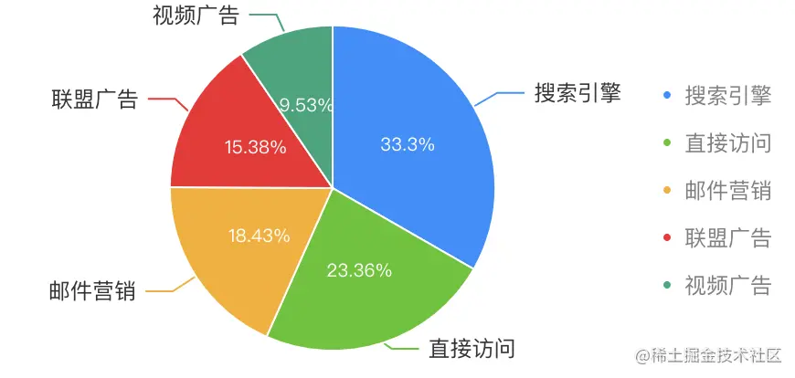
正常饼图
官网饼图示例:echarts.apache.org/examples/zh…
饼图内部展示百分比
一个饼图是满足不了要求的,必须用两个饼图合在一起才行。
第一层:展示文本标签 label 和引导线 labelLine
第二层:展示百分比
let seriesObj = {
name: "访问来源",
type: "pie",
radius: "90%",
center: [186, 102],
itemStyle: {
borderWidth: 1,
borderColor: "#fff",
},
};
let initOption2 = {
legend: R.mergeDeepRight(legend, {
orient: "horization",
top: 40,
left: 360,
itemGap: 14,
textStyle: {
color: "#808080",
},
}),
color: colorList,
series: [
seriesObj, // 第一层
R.merge(seriesObj, { // 第二层
label: {
show: true,
position: "inner", // 标签的位置
textStyle: {
fontSize: 10, //字体大小
color: "#fff", // 文字颜色
},
formatter: "{d}%", // 内容
},
}),
],
dataset: {
dimensions: ["value", "name", "rate"],
source: seriesData,
},
};
|