Flutter 底部导航详解 |
您所在的位置:网站首页 › flutter导航栏动画 › Flutter 底部导航详解 |
Flutter 底部导航详解
|
底部导航是常见的APP布局方式,实际上我自己常用的app都是底部导航的。Android和iOS都有官方组件可供使用。Flutter也有BottomNavigationBar,使用时有踩坑,这里记录一下。 一般用法普通实现: BottomNavigationBar botttomNavBar = BottomNavigationBar( items: [ BottomNavigationBarItem(icon: Icon(Icons.code), title: Text('code')), BottomNavigationBarItem(icon: Icon(Icons.add), title: Text('add')), BottomNavigationBarItem(icon: Icon(Icons.print), title: Text('print')) ], currentIndex: _currentIndex, type: BottomNavigationBarType.fixed, onTap: (int index) { setState(() { _currentIndex = index; }); }, );问:看起来很简单,至于分析这么多吗? 答:emmmm,这实现优点是设计标准规范,官方组件也简单稳定可靠。但前提是设计师接受这种设定(即使是fixed,选中图标和文字也会有放大缩小动画),至少中国主流的APP,navigation item都是fixed而且没有动画,官方组件并不提供这种选择。 有点问题既然设计师有要求那不能怂,分析是因为内部的_BottomNavigationTile作祟,那自己实现navigationItem控制是否选中,并且不传currentIndex给BottomNavigationBar,应该可以吧 Widget _buildBottomNavigationBar() { return BottomNavigationBar( type: BottomNavigationBarType.fixed, items: [ _buildItem(icon: Icons.code, tabItem: TabItem.code), _buildItem(icon: Icons.add, tabItem: TabItem.add), _buildItem(icon: Icons.print, tabItem: TabItem.print), ], onTap: _onSelectTab, ); } // 用定制化的icon和tabItem构建BottomNavigationBarItem BottomNavigationBarItem _buildItem({IconData icon, TabItem tabItem}) { String text = tabItemName(tabItem); return BottomNavigationBarItem( icon: Icon( icon, color: _colorTabMatching(item: tabItem), ), title: Text( text, style: TextStyle( color: _colorTabMatching(item: tabItem), ), ), ); } // 切换item的颜色,选中用primaryColor,其他都是grey Color _colorTabMatching({TabItem item}) { return currentItem == item ? Theme.of(context).primaryColor : Colors.grey; }问:效果如何? 答:嗯,不错。等等。。。啊,怎么有个大一点。没道理啊,事出蹊跷必有妖,需要从源码中找答案了。下图的home明显比mail大,对吧? 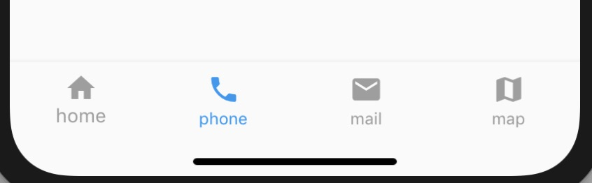 源码阅读
源码阅读
主要代码都在bottom_navigation_bar.dart里,bottom_navigation_bar_item.dart是item的定义 bottom_navigation_bar_item.dart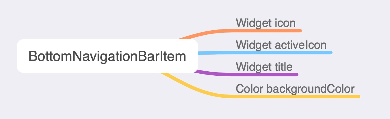
相当于是一个自定义的Button,用来放在BottomNavigationBar上,它实现了Material(Android)和Cupertino(iOS)两种风格。 bottom_navigation_bar.dart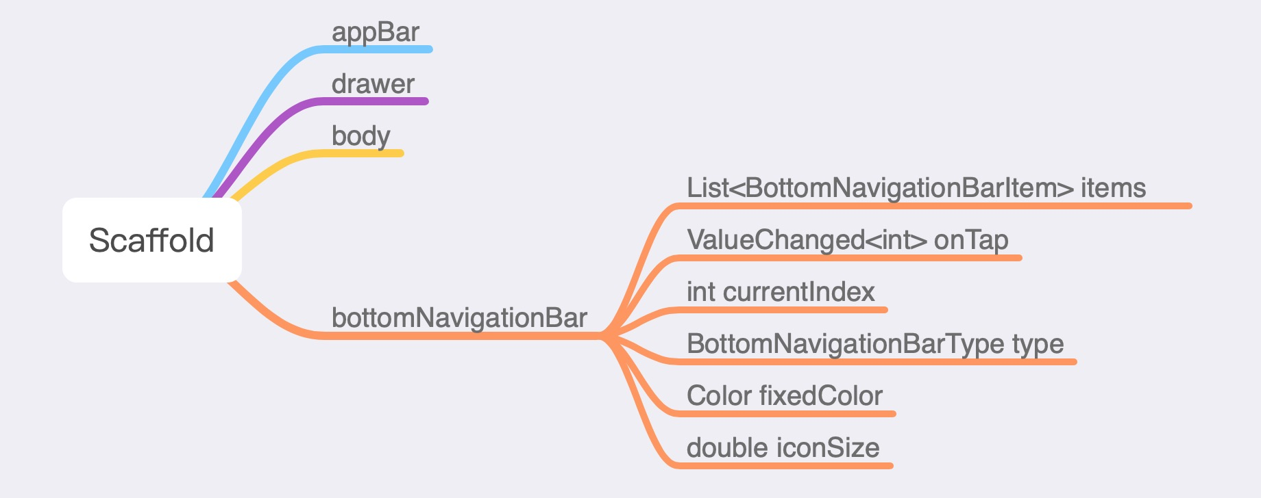
Scaffold是Root Widget- MaterialApp的脚手架。封装了Material Design App会用到的AppBar,Drawer,SnackBar,BottomNavigationBar等。BottomNavigationBarType有fixed 和shifting两种样式,超过3个才会有区别,一般为了体验一致,我们会用fixed type。 BottomNavigationBar是一个StatefulWidget,可以按以下步骤分析这种组件:1,先看它持有的状态,2,看下他的生命周期实现,3,再仔细分析它的build方法。 持有状态 List _controllers = []; List _animations; // A queue of color splashes currently being animated. final Queue _circles = Queue(); // Last splash circle's color, and the final color of the control after // animation is complete. Color _backgroundColor;前面三个属性都和动画相关,第四个是设背景。 问:BottomNavigationBar为什么没有变量标记当前哪个item选中? 答:函数式编程一个原则是要函数尽量纯,currentIndex这个属性依赖外边传入,每次变化重新触发Render。如果自己维护,则还需要提供一个回调方法供外部调用,返回最新的currentIndex值。 生命周期方法 // 初始化操作,具体实现再resetState里,对上面的这些状态属性初始化操作 @override void initState() { super.initState(); _resetState(); } // 回收资源操作,一般用到动画都需要的 @override void dispose() { for (AnimationController controller in _controllers) controller.dispose(); for (_Circle circle in _circles) circle.dispose(); super.dispose(); } // 当属性变化时Flutter系统回调该方法。当item数量变化时直接重新初始化;当index变化,做相应动画。 @override void didUpdateWidget(BottomNavigationBar oldWidget) { super.didUpdateWidget(oldWidget); // No animated segue if the length of the items list changes. if (widget.items.length != oldWidget.items.length) { _resetState(); return; } if (widget.currentIndex != oldWidget.currentIndex) { switch (widget.type) { case BottomNavigationBarType.fixed: break; case BottomNavigationBarType.shifting: _pushCircle(widget.currentIndex); break; } _controllers[oldWidget.currentIndex].reverse(); _controllers[widget.currentIndex].forward(); } if (_backgroundColor != widget.items[widget.currentIndex].backgroundColor) _backgroundColor = widget.items[widget.currentIndex].backgroundColor; } // 下面分析 @override Widget build(BuildContext context) {}注意:initState里有个操作比较隐蔽:_controllers[widget.currentIndex].value = 1.0; 分析build方法 @override Widget build(BuildContext context) { // debug 检查 assert(debugCheckHasDirectionality(context)); assert(debugCheckHasMaterialLocalizations(context)); // Labels apply up to _bottomMargin padding. Remainder is media padding. final double additionalBottomPadding = math.max(MediaQuery.of(context).padding.bottom - _kBottomMargin, 0.0); // 根据BottomNavigationBarType设背景色,shifting才会有 Color backgroundColor; switch (widget.type) { case BottomNavigationBarType.fixed: break; case BottomNavigationBarType.shifting: backgroundColor = _backgroundColor; break; } return Semantics( // Semantics用来实现无障碍的 container: true, explicitChildNodes: true, child: Stack( children: [ Positioned.fill( child: Material( // Casts shadow. elevation: 8.0, color: backgroundColor, ), ), ConstrainedBox( constraints: BoxConstraints(minHeight: kBottomNavigationBarHeight + additionalBottomPadding), child: Stack( children: [ Positioned.fill( // 点击时的圆形类波纹动画 child: CustomPaint( painter: _RadialPainter( circles: _circles.toList(), textDirection: Directionality.of(context), ), ), ), Material( // Splashes. type: MaterialType.transparency, child: Padding( padding: EdgeInsets.only(bottom: additionalBottomPadding), child: MediaQuery.removePadding( context: context, removeBottom: true, // tiles就是_BottomNavigationTile,里面放BottomNavigationBarItem child: _createContainer(_createTiles()), )))]))])); }} _BottomNavigationTile看下 Widget _buildIcon() { ... // 构建Iocn } Widget _buildFixedLabel() { .... // 骚操作,用矩阵来给文字作动画,更平滑 // The font size should grow here when active, but because of the way // font rendering works, it doesn't grow smoothly if we just animate // the font size, so we use a transform instead. child: Transform( transform: Matrix4.diagonal3( Vector3.all( Tween( begin: _kInactiveFontSize / _kActiveFontSize, end: 1.0, ).evaluate(animation), ), ), alignment: Alignment.bottomCenter, child: item.title, ), ), ), ); } Widget _buildShiftingLabel() { return Align( ..... // shifting的label是fade动画,只有当前选中的才会显示label child: FadeTransition( alwaysIncludeSemantics: true, opacity: animation, child: DefaultTextStyle.merge( style: const TextStyle( fontSize: _kActiveFontSize, color: Colors.white, ), child: item.title, ), ), ), ); } @override Widget build(BuildContext context) { int size; Widget label; // 生成不同的label switch (type) { case BottomNavigationBarType.fixed: size = 1; label = _buildFixedLabel(); break; case BottomNavigationBarType.shifting: size = (flex * 1000.0).round(); label = _buildShiftingLabel(); break; } return Expanded( .... children: [ _buildIcon(), label, ], ), ), Semantics( label: indexLabel, } 改进实现通过分析分析源码,发现原因是bottomNavigationBarState的initState里_controllers[widget.currentIndex].value = 1.0设了currentIndex item动画的初值,currentIndex的默认值是0,所以第一个图标会大一点点。这个问题也有比较鸡贼的手法可以处理(魔改源码什么~),但这样大家都觉得不妥。同事眉头一皱,做了一个大胆的决定,不用系统组件BottomNavigationBar,自己封装一下: // SafeArea来兼容下iPhone X,android和iOS阴影不一样,所以区分下。 Widget _buildBottomNavigationBar() { return SafeArea( child: SizedBox( height: 50.0, child: Card( color: Platform.isIOS ? Colors.transparent : Colors.white, elevation: Platform.isIOS ? 0.0 : 8.0, // iphone 无阴影 shape: RoundedRectangleBorder(), margin: EdgeInsets.all(0.0), child: Column( mainAxisAlignment: MainAxisAlignment.center, children: [ Divider(), Expanded( child: Row( mainAxisAlignment: MainAxisAlignment.center, crossAxisAlignment: CrossAxisAlignment.center, children: [ _buildBottomItem( image: HImages.home, text: '首页', index: 0), _buildBottomItem( image: HImages.stats, text: '数据', index: 1), _buildBottomItem( image: HImages.mine, text: '我的', index: 3) ]), ) ])))); } // 封装的BottomItem,选中颜色为primaryColor,未选中grey。点击波纹效果InkResponse Widget _buildBottomItem({String image, String text, int index}) { Color color = currentIndex == index ? Theme.of(context).primaryColor : Colors.grey; return Expanded( child: InkResponse( child: Column( mainAxisAlignment: MainAxisAlignment.center, crossAxisAlignment: CrossAxisAlignment.center, children: [ Image.asset(image, color: color, width: 22.0, height: 22.0), Text(text, style: TextStyle(color: color, fontSize: 10.0)) ]), onTap: () => setState(() => currentIndex = index))); }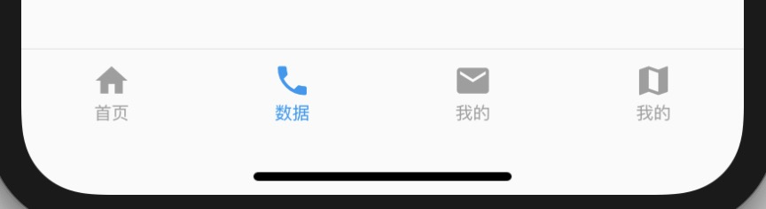
问:这该是最终版了吧?* 答:Naive,是连iPhone X都考虑了,但细节渐变颜色,platform特性支持还没有。。。说到特性我就佛了,一佛,我就想起西天取经,明年年初,中美合拍的西游记即将正式开机,我继续扮演美猴王孙悟空,我会用美猴王艺术形象努力创造一个正能量的形象,文体两开花,弘扬中华文化,希望大家多多关注。 一些收获 组件动画实现可以参考BottomNavigationBar,规范, 文字动画实现可以用Matrix4和Vector3,比较高级(这个在TabBar用上了), 考虑给官方提个issue(区域化需求)。本文源码地址:https://github.com/hyjfine/flutter-play (完) @子路宇, 本文版权属于再惠研发团队,欢迎转载,转载请保留出处。 |
【本文地址】
今日新闻 |
推荐新闻 |