echarts通过dataZoom,实现x轴和y轴放大缩小(亲测可用) |
您所在的位置:网站首页 › echarts的折线图X轴刻度位置 › echarts通过dataZoom,实现x轴和y轴放大缩小(亲测可用) |
echarts通过dataZoom,实现x轴和y轴放大缩小(亲测可用)
|
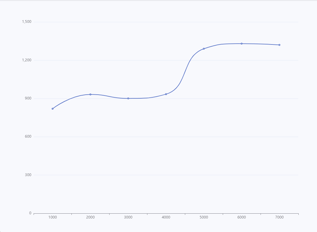
为满足项目需求,要求echarts图表实现和示波器曲线图一样的效果,x轴和y轴的数值可放大缩小,且x轴下方还要进度条,可以进行拖动显示。 1.x轴放大缩小: option = { xAxis: { type: 'category', data: [1000, 2000, 3000, 4000, 5000, 6000, 7000], }, dataZoom: { type: 'inside', //放大缩小x轴数值 }, yAxis: { type: 'value' }, series: [ { data: [820, 932, 901, 934, 1290, 1330, 1320], type: 'line', smooth: true } ] };效果图1:
2.Y轴放大缩小: dataZoom:[{ type: 'inside', // 放大和缩小 orient: 'vertical', },],2.效果图:
3.x轴和y轴都可以缩放 dataZoom:[{ type: 'inside', // 放大和缩小 orient: 'vertical', },{ type: 'inside', }],3.效果图:
4.实现x轴下方滚动条拖拽(图例效果不好,是因为数值太少) option = { xAxis: { type: 'category', data: [1000, 2000, 3000, 4000, 5000, 6000, 7000], }, dataZoom:[{ type: 'inside', // 放大和缩小 orient: 'vertical', },{ type: 'inside', },{ // start: 0,//默认为0 // end: 100,//默认为100 type: 'slider', show: true, // xAxisIndex: [0], handleSize: 0,//滑动条的 左右2个滑动条的大小 startValue: 0, // 初始显示值 endValue: 500000, // 结束显示值,自己定 height: 5,//组件高度 left: '10%', //左边的距离 right: '10%',//右边的距离 bottom: 15,//底边的距离 borderColor: "#ccc", fillerColor: '#4cccfe', borderRadius: 5, backgroundColor: '#efefef',//两边未选中的滑动条区域的颜色 showDataShadow: false,//是否显示数据阴影 默认auto showDetail: false,//即拖拽时候是否显示详细数值信息 默认true realtime: true, //是否实时更新 filterMode: 'filter', }], yAxis: { type: 'value' }, series: [ { data: [820, 932, 901, 934, 1290, 1330, 1320], type: 'line', smooth: true } ] };效果图:
|


【本文地址】
今日新闻 |
推荐新闻 |