使用flex解决overflow需要设置固定高度的问题 |
您所在的位置:网站首页 › css设置元素最大高度为1 › 使用flex解决overflow需要设置固定高度的问题 |
使用flex解决overflow需要设置固定高度的问题
|
背景
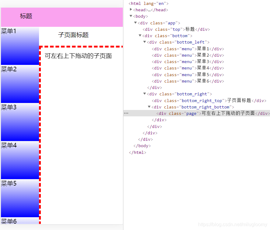
通常在页面上的某一部分,需要超出滚动的情况,我们会设置固定高度或者宽度,但这样设置固定高度或者宽度很不灵活,当页面需要隐藏某一部分,就需要重新计算固定的高度或者宽度,很繁琐且容易出错。 这里可以使用flex弹性布局来解决overflow需要设置固定高度的问题。 实现假设我们要实现以下页面,页面结构可以看右边的dom,分为top标题栏,bottom_left菜单栏,bottom_right_top子页面标题,bottom_right_bottom子页面四个部分。 这样会发现顶部标题栏固定顶部失效,会跟着滚动,而且标题栏高度被压缩(50px变成40.6px) 在bottom_left的父级bottom上设置flex-shrink为0,height为0。flex-shrink为0表示不会被压缩,配合上height为0,flex为1一起就表示永远会占满剩下的区域,不会超出也不会被压缩。 .bottom { flex: 1; flex-shrink: 0; height: 0; width: 100%; display: flex; } 方式二在bottom_left的父级bottom上设置overflow: scroll。 .bottom { flex: 1; overflow: scroll; width: 100%; display: flex; }右边可上下左右拖动的部分和左边类似,也可以使用两种方式实现 完整代码 Title * { margin: 0; box-sizing: border-box; } .app { height: 100vh; width: 100vw; display: flex; flex-direction: column; } .top{ height: 50px; padding: 10px 50px; width: 100%; background: #faa3ef; } .bottom { flex: 1; /* 方式一 设置flex-shrink为0,设置height为0 */ /* 方式二 设置overflow: scroll */ flex-shrink: 0; height: 0; /*overflow: scroll;*/ width: 100%; display: flex; } .bottom_left { height: 100%; width: 100px; overflow: scroll; } .menu { height: 100px; background: linear-gradient(#fafafc, blue); } .bottom_right { flex: 1; /* 方式一 设置flex-shrink为0,设置width为0 */ /* 方式二 设置overflow: scroll */ flex-shrink: 0; width: 0; /*overflow: scroll;*/ display: flex; flex-direction: column; } .bottom_right_top { height: 50px; padding: 10px 50px; } .bottom_right_bottom { flex: 1; overflow: scroll; } .page { width: 2000px; height: 2000px; padding: 10px; overflow: scroll; border: 5px dashed red; } 标题 菜单1 菜单2 菜单3 菜单4 菜单5 菜单6 子页面标题 可左右上下拖动的子页面 最终效果最终效果如下图,这其中的要点就是要针对可滚动区域的父级设置样式,以上两种方式都行。 |
 先看bottom_left菜单这部分,要在不设置高度的情况下实现超出部分可滚动,设置各块样式如下
 这时候在bottom_left上增减样式已经无效了,需要在他的父级bottom这块上调整样式,有两种方式。
【本文地址】
今日新闻 |
推荐新闻 |