|
web——CSS精灵图(背景图、定位背景图片background-position 属性)
一、background-position属性二、实例
一、background-position属性
例如下图,若我们只需显示其中一部分 我们可以设置一个div,并设置如下两个属性
background-image: url(opera.jpg); //背景图片
background-position: -498px -0px; //背景相对移动的距离
注意:background-position: -498px -0px; 在这种情况下我们div的位置不改变,背景图片相对div运动,露出相应的部分。 第一个值代表左右移动,负数代表左移; 第二个值代表上下移动,负数代表上移。 具体值设置为多少,可以在windows自带的“画图”工具,使用选择工具进行测量。 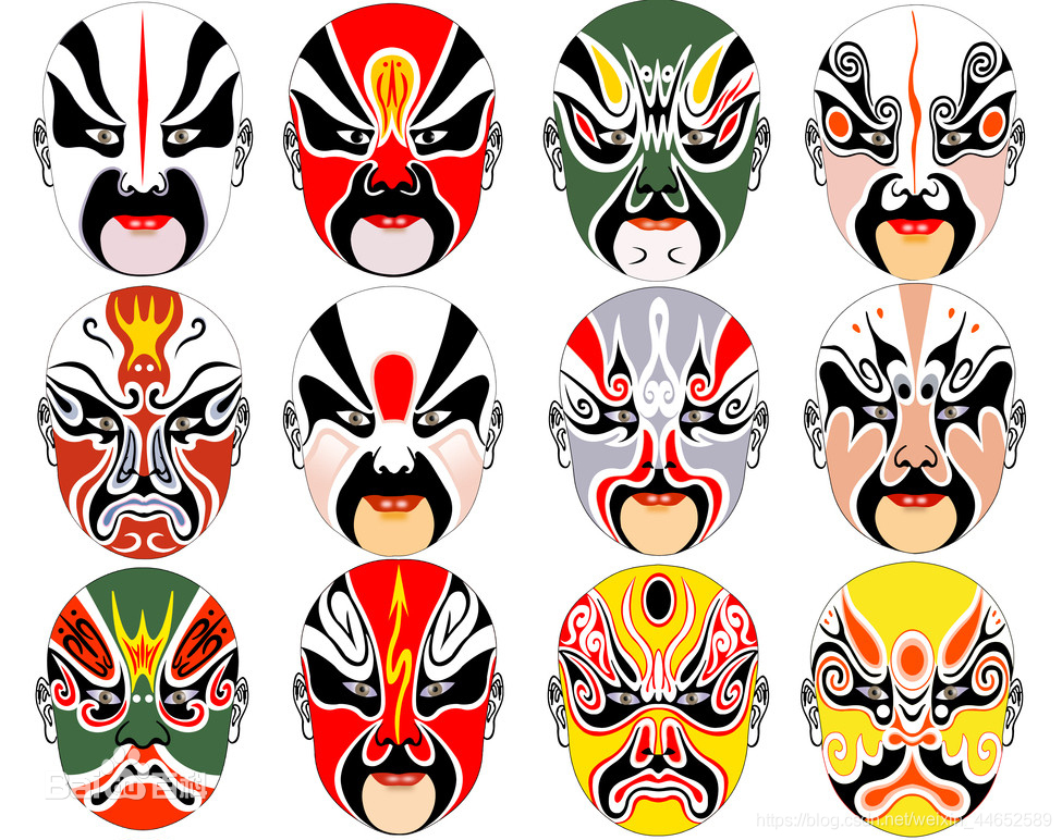
二、实例
例如网页实现如下图的效果 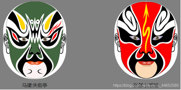
*{
margin: 0 auto;
}
#main{
width: 600px;
height: 300px;
background-color: gray;
}
#face1,#face2{
width: 300px;
height: 300px;
float: left;
}
#aaa{
width: 210px;
height: 260px;
background: white;
background-image: url(opera.jpg);
background-position: -498px -0px;
border-radius: 100px; //圆角矩形的弧度
margin-top:5px;
/*float: left;*/
margin-left:10px ;
}
#bbb{
width: 210px;
height: 260px;
background: white;
background-image: url(opera.jpg);
background-position: -289px -522px;
border-radius: 100px;
background-size: 1050px 785px;
margin-top:5px;
margin-right: 10px;
/*float: right;*/
}
#face1 p{
width: 200px;
text-align: center;
margin-top:9px;
margin-left:15px;
}
#face2 p{
width: 200px;
text-align: center;
margin-top:9px;
margin-right:15px;
}
马谡:失街亭
张郃:长坂坡
|