|
两栏布局
一栏固定宽度,一栏自适应
left固定
right自适应
复制代码
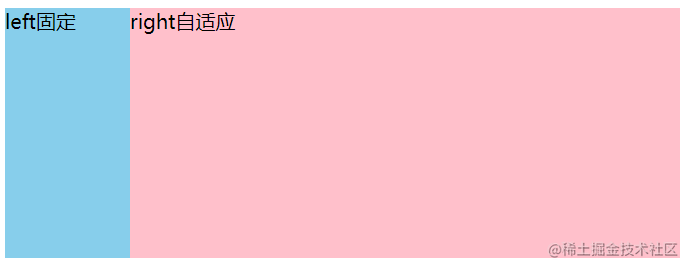
1. 左侧float:left + 右侧margin-left
.left{
float: left; /* 固定侧浮动 */
width: 100px;
height: 200px;
background-color: skyblue;
}
.right{
margin-left: 100px; /* 值为固定侧的宽度 */
height: 200px;
background-color: pink;
}
复制代码
因为块级元素有流体特性,默认填充外部容器,因此只需要设置margin,不设置width也可以让内容填满剩余部分。
2. 左侧float:left + 右侧overflow:hidden
.left{
float: left;
width: 100px;
height: 200px;
background-color: skyblue;
}
.right{
height: 200px;
overflow: hidden; /* 触发BFC,独立容器,保留流体特性,自动退避浮动元素宽度的距离 */
background-color: pink;
}
复制代码
设置overflow:hidden会触发块级格式化上下文(BFC)。
具有BFC特性的元素可以看作是隔离了的独立容器,容器里面的元素不会在布局上影响外面的元素。
触发了BFC的元素仍然保持流体特性,也就是说BFC元素虽然不与浮动交集,自动退避浮动元素宽度的距离,但本身作为普通元素的流体特性依然存在,反映在布局上就是自动填满除去浮动内容以外的剩余空间。
BFC具有普通元素没有的特性:
下边距不发生折叠;可以清除浮动;可以阻止元素被覆盖。
正因为有了这些特性,所以右边可以用触发BFC的元素来清除左边浮动的影响。
触发BFC的方法:
body根元素
浮动元素(除了float:none)
定位的元素(absolute、fixed)
display ( inline-block、table-cells、flex )
overflow ( hidden、auto、scroll )
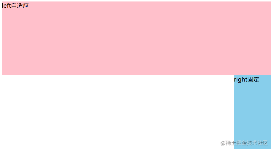
注:如果是右固定左自适应,html结构中.right的div在.left的div上方,如果right写在下方,.left元素不会脱离文档流,那么.right会自成一行,达不到想要的结果。
3. 使用绝对定位absolute
.container{
position: relative;
}
.left{
height: 200px;
width: 100px;
background-color: skyblue;
}
.right{
height: 200px;
position: absolute; /* 子绝父相,要记得给父元素设置相对定位 */
top: 0;
left: 100px; /* left值为左盒子宽度 */
right: 0; /* 通过设置right:0;来限制右边块级元素的宽度 */
background-color: pink;
}
复制代码
4. 利用弹性布局flex(推荐)
.container{
display: flex;
}
.left{
height: 200px;
width: 100px;
background-color: skyblue;
}
.right{
height: 200px;
flex: 1; /* 自动填充满容器 */
background-color: pink;
}
复制代码
flex属性是flex-grow, flex-shrink 和 flex-basis的简写,默认值为0 1 auto。后两个属性可选。
flex-grow: 定义项目的放大比例,默认为0,即如果存在剩余空间,也不放大
flex-shrink: 定义了项目的缩小比例,默认为1,即如果空间不足,该项目将缩小
flex-basis: 给上面两个属性分配多余空间之前, 计算项目是否有多余空间, 默认值为 auto, 即项目本身的大小
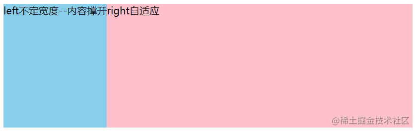
一栏不定宽,一栏自适应
不定宽度那一侧宽度就会随着里面内容的大小而缩放,内容撑开不用设置宽度。
1. 左侧float:left + 右侧overflow:hidden
.left,.right{
height: 200px;
}
.left{
float: left;
background-color: skyblue;
}
.right{
overflow: hidden;
background-color: pink;
}
复制代码
2. 弹性布局flex
.container{
display: flex;
}
.left,.right{
height: 200px;
}
.left{
background-color: skyblue;
}
.right{
flex: 1;
background-color: pink;
}
复制代码
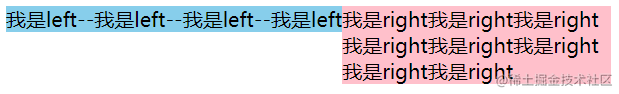
设置两栏高度相等
上述方法,设置了.left和.right高度相同,但是如果不设置高度,高度被内容撑开,会出现两栏不等高的情况,如下图所示:
我是left--我是left--我是left--我是left
我是right我是right我是right我是right我是right我是right我是right我是right
复制代码
1. 给两栏设置相等高度
2. 利用弹性布局flex
.container {
display: flex;
}
.left{
background-color: skyblue;
}
.right{
background-color: pink;
}
复制代码
左右宽度比1:2,右边分为上下结构,高度比为1:1
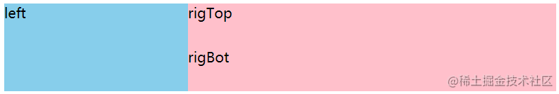
left
rigTop
rigBot
复制代码
.container {
display: flex;
}
.left{
width: 33.3%;
height: 100px;
background-color: skyblue;
}
.right{
flex: 1;
height: 100px;
background-color: pink;
}
.rigTop,.rigBottom {
height: 50%;
}
复制代码
三栏布局
所谓三栏布局就是指页面分为左中右三部分,左右固定,中间部分自适应的一种布局方式。
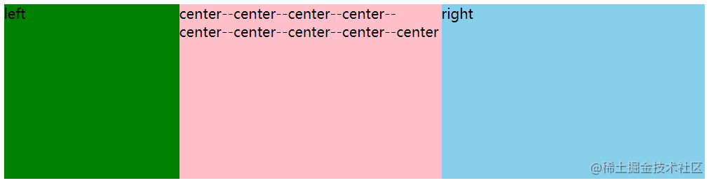
弹性布局flex(推荐)
left
center--center--center--center--center--center--center--center--center
right
复制代码
.container{
display: flex;
}
.left {
background: green;
width: 200px;
height: 200px;;
}
.center {
background: pink;
height: 200px;;
flex: 1;
}
.right {
background: skyblue;
width: 300px;
height: 200px;;
}
复制代码
绝对定位
left
center--center--center--center--center--center--center--center--center
right
复制代码
/* 简单的进行CSS reset */
body,html{
height: 100%;
padding: 0;
margin: 0;
}
.left,.right{
position: absolute;
top: 0;
background-color: skyblue;
height: 100%;
}
.left {
left: 0;
width: 100px;
}
.right {
right: 0;
width: 200px;
}
.center {
margin-left: 100px;
margin-right: 200px;
height: 100%;
background-color: pink;
}
复制代码
浮动
left
right
center--center--center--center--center--center--center--center--center
复制代码
body,html {
height:100%;
padding: 0;
margin: 0
}
.left {
background: green;
width: 200px;
float: left;
height: 100%;
}
.center {
background: pink;
height: 100%;
margin:0px 300px 0px 200px;
}
.right {
background: skyblue;
width: 300px;
float: right;
height: 100%;
}
复制代码
圣杯布局
center--center--center--center--center--center--center--center--center
left
right
复制代码
/* 简单的进行CSS reset */
body,html{
height:100%;
padding: 0;
margin: 0;
}
/* 父元素body空出左右栏的位置 */
body {
padding-left: 200px;
padding-right: 300px;
}
.center {
background: pink;
width: 100%;/* 中间部分宽度自适应所以用100%,左中右向左浮动,中间100%,此时左层和右层在center下方,所以还要对left和right进行margin和定位的设置 */
height: 200px;
float: left;
}
.left {
background: green;
width: 200px;
float: left;
margin-left: -100%; /* 左侧margin负100后,left上去了,负到窗口没位置了,只能往上挪。此时left移上去挡住了center的内容*/
position: relative; /* 相对定位,相对于自己的位置把自己挪出去,刚好占据body空出的位置 */
left: -200px; /* 偏移量为自身宽度 */
height: 200px;
}
.right {
background: skyblue;
width: 300px;
height: 200px;
float: left;
margin-left: -300px;
position: relative;
right: -300px;
}
复制代码
双飞翼布局
圣杯布局的弊端就是当浏览器宽度缩小到一定程度时,会使得中间子元素的宽度比左右子元素宽度小,此时布局就会出现问题,如下图所示:
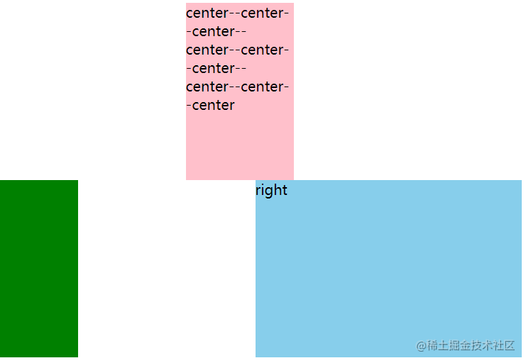 这也提示我们在使用圣杯布局时,一定要设置整个容器的最小宽度,避免发生以下布局混乱现象。
双飞翼和圣杯布局的区别
圣杯布局和双飞翼布局解决问题的方案都是左中右三栏全部float浮动,在左右两栏加上负margin让其跟中间栏div并排,以形成三栏布局。
不同之处在于中间栏div内容不被遮挡解决思路不一样:
圣杯布局:将body设置了左右padding-left和padding-right后,左右用相对定位配合宽度属性,来实现不遮挡
双飞翼布局:中间div外层又包裹了一层div,在该子div里用margin-left和margin-right为左右两栏div留出位置
center--center--center--center--center--center--center--center--center
left
right
复制代码
/* 简单的进行CSS reset */
body,html {
height:100%;
padding: 0;
margin: 0
}
.left {
background: green;
width: 200px;
float: left;
margin-left: -100%;
height: 100%;
/*position: relative;*/
/*left:-200px;*/
}
.mid {
background: pink;
width: 100%;
float: left;
height: 100%;
}
.right {
background: skyblue;
width: 300px;
float: left;
margin-left: -300px;
height: 100%;
/*position:relative;*/
/*right:-300px;*/
}
.center {
margin-left: 200px;
margin-right: 300px;
}
复制代码
参考文档:CSS 常见布局方式
|