Qt: QPushButton 常见样式设置 |
您所在的位置:网站首页 › button的字体大小 › Qt: QPushButton 常见样式设置 |
Qt: QPushButton 常见样式设置
|
目的
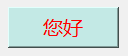
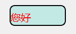
主要用来整理QPushButton 样式相关设置, 方便后期能够进行设置。鉴于博主 1、无样式的按钮 2、改变字体颜色 color:#ff0000;
3、改变字体 font-family:Microsoft Yahei;
4、改变字号 font-size:15pt;
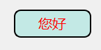
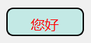
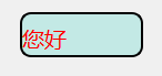
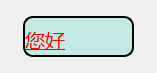
5、改变背景颜色 background-color:#c3e9e5;
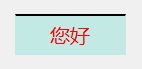
6、设置上边框为2个像素,样式为实线,颜色为黑色 border-top:2px solid #000000;
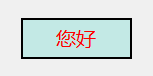
7、设置所有边框为2个像素,样式为实线,颜色为黑色 border:2px solid #000000;
8、设置左上角圆角为:10px border-top-left-radius:10px;
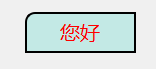
9、设置圆角都为:10px; border-radius:10px;
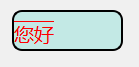
10、设置上内边距为:8px;文字向下移动 padding-top:8px;
11、文字左对齐 text-align:left; //center
12、给文字加下划线 text-decoration:underline;
13、给文字加删除线 text-decoration:line-through;
14、给文字加上划线 text-decoration:overline;
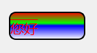
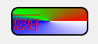
15、渐变色(从上往下线性渐变) background-color:qlineargradient(x1: 0, y1: 0, x2: 0, y2: 1, stop: 0 #ff0000, stop: 0.4 #00ff00, stop: 0.5 #0000ff, stop: 1.0 #ffffff);
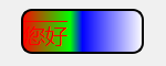
16、渐变色(从左往右线性渐变) background-color:qlineargradient(x1: 0, y1: 0, x2: 1, y2: 0, stop: 0 #ff0000, stop: 0.4 #00ff00, stop: 0.5 #0000ff, stop: 1.0 #ffffff);
17、渐变色(从里到外径向渐变) background-color:qradialgradient(spread:pad, cx:0.5, cy:0.5, radius:0.5,fx:0.5, fy:0.5, stop:0 #ff0000, stop:0.4 #00ff00, stop:0.5 #0000ff,stop:1 #ffffff);
18、渐变色(角度渐变) background-color:qconicalgradient(cx:0.5, cy:0.5, angle:0, stop:0 #ff0000, stop:0.4 #00ff00, stop:0.5 #0000ff,stop:1 #ffffff);
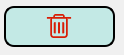
19、加图标 image:url(":/delete.png");
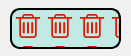
20、加图标 background-image:url(":/delete.png"); //background-repeat: no-repeat; 加入这个 就只有一张图片
21、加图标 border-image:url(":/delete.png");
21、设置轮廓样式 outline: 1px solid #0000ff;/*设置轮廓样式*/ background-color: #cccccc; color: #ff0000; border-radius: 4px; padding: 2px;
22、按钮禁用时,设置样式 QPushButton:disabled { /*设置禁用时按钮的样式*/ }23、按钮选中时,设置样式 前提是setCheckable(true) QPushButton:checked { /*设置选中时按钮的样式*/ } QPushButton:!checked { /*设置未选中时按钮的样式*/ }24、按钮选中并且禁用时,设置样式 QPushButton:checked:disabled { /*设置选中并且禁用时按钮的样式*/ }25、点击按钮时,设置样式 QPushButton:pressed { /*设置点击按钮时按钮的样式*/ }25、鼠标悬浮在按钮上时,设置样式 QPushButton:hover { }等等 以上是我们常见设置样式, 由于本人比较, 就直接把这位大神拷贝过来 ,结合自己常用的也修改了一部分说明注意。 希望这位大神不要见怪, 哈哈。 那么拓展重点来了, QPushButton 与 QToolButton 在设置样式区别。 拓展由QIcon 说起 这两个按钮都能 setIcon QString normalStr = "E:/work/xxx/src/creator/resource/images/edit/effect/btn_text1_press.png"; QString selectStr = "E:/work/xxx/src/creator/resource/images/edit/effect/btn_text2_press.png"; QString activerStr = "E:/work/xxx/src/creator/resource/images/edit/effect/btn_text6_press.png"; QString disableStr = "E:/work/xxx/src/creator/resource/images/edit/effect/btn_text7_press.png"; funcIcon.addPixmap(QPixmap(normalStr), QIcon::Normal, QIcon::On); funcIcon.addPixmap(QPixmap(selectStr), QIcon::Selected, QIcon::On); funcIcon.addPixmap(QPixmap(activerStr), QIcon::Active, QIcon::On); funcIcon.addPixmap(QPixmap(disableStr), QIcon::Disabled, QIcon::On); ui->pushButton->setIcon(funcIcon); //no select stauts //item has toolBtn->setIcon(funcIcon); // no select active status可以通过设置这个方式 , 当不同状态下 他会改变此icon 图标。 还可以通过qss 不同的状态设置 qproperty-icon qproperty-icon: url(" "); qproperty-iconSize: 16px 16px; QPushButton#audioTBtn{ qproperty-icon: url(:/images/images/edit/effect/btn_music_nor.png) center; } QPushButton#audioTBtn:disabled{ qproperty-icon: url(:/images/images/edit/effect/btn_music_dis.png) center; } |
【本文地址】
今日新闻 |
推荐新闻 |