New Aster字体包,New Aster字体打包下载 |
您所在的位置:网站首页 › aster官网下载 › New Aster字体包,New Aster字体打包下载 |
New Aster字体包,New Aster字体打包下载
|
字体介绍
这款用于书籍和报纸的字体是由Francesco Simoncini于1958年设计的。第二次世界大战之后,字体设计陷入停滞状态,多年的重建意味着对排印世界以及整个欧洲旧的价值观的重新审视。Aster是这一运动的结果,它并没有受到现代字体的影响,而是有点过渡字体特征的迹象,而且有种轻盈的感觉。New Aster是由Linotype Design Studio制作的改良版。 This book and newspaper font was designed by Francesco Simoncini in 1958. After the Second World War brought type design to a standstill, the years of reconstruction meant a reconsideration of old values in the typographical world as well as in Europe in general. Aster is the result of this movement, displaying instead of Modern Face influence, a tendency toward Transitional characteristics and giving text a light feel. New Aster is an improved version which was made by Linotype Design Studio. No painzno gain pain past is pleasure. One sigh that should be wholly thine.ABCDEFGHIJKLMNOPQRSTUVWXYZabcdefghijklmnopqrstuvwxyz0123456789@.,:;!?’)]”<>/&- 字体展示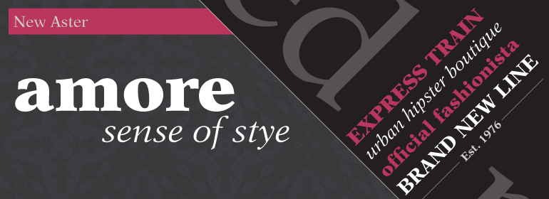
|
【本文地址】
今日新闻 |
推荐新闻 |