鸿蒙开发 |
您所在的位置:网站首页 › ark图片 › 鸿蒙开发 |
鸿蒙开发
|
一.Image:图片显示组件
1.声明Image组件并设置图片源:
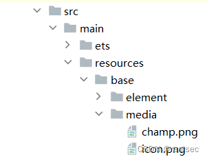
Image(src: string| PixelMap| Resource) 加载图片资源 本地资源 Image('images/view.jpg') .width(200) 网络资源 引入网络图片需申请权限ohos.permission.INTERNET。如何申请权限ohos.permission.INTERNET:需要在module.json5配置文件中声明权限。 "requestPermissions": [ { "name": 'ohos.permission.INTERNET' } ] Image('https://www.example.com/example.JPG') Resource资源使用资源格式可以跨包/跨模块引入图片,resources文件夹下的图片都可以通过$r资源接口读取到并转换到Resource格式。 图1 resources
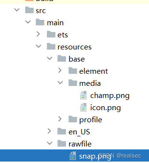
调用方式: Image($r('app.media.icon'))还可以将图片放在rawfile文件夹下。 图2 rawfile
调用方式: Image($rawfile('snap')) 2.添加图片属性 Image($r('app.media.icon')) .width(100)//宽度 .height(120)//高度 .borderRadius(10)//边框圆角 .interpolation(ImageInterpolation.High)//图片插值更多查看官方文档:显示图片(Image)-显示图形-基于ArkTS的声明式开发范式-UI开发-开发-HarmonyOS应用开发 二.Text:文本显示组件 1.声明Text组件并设置文本内容Text(content?:string| Resource) 创建文本 string格式,直接填写文本内容 Text('图片宽度') Resource格式,读取本地资源文件资源引用类型可以通过$r创建Resource类型对象,文件位置为/resources/base/element/string.json。 Text($r('app.string.width_label')) 2. 添加文本属性 Text('注册账号!') .lineHeight(32)//行高fontsize(20)//字体大小 .fontColor('#ff1876f8')//字体颜色 .fontWeight(FontWeight.Medium)//字体粗细更多查看官方文档:文本显示(Text/Span)-添加常用组件-添加组件-基于ArkTS的声明式开发范式-UI开发-开发-HarmonyOS应用开发 三.TextInput:文本输入框 1.声明TextInput组件:TextInput( {placeholder?: Resourcestr,text?: ResourceStr}) 单行输入框 TextInput()
TextInput有5种可选类型,分别为Normal基本输入模式、Password密码输入模式、Email邮箱地址输入模式、Number纯数字输入模式、PhoneNumber电话号码输入模式。通过type属性进行设置: 密码输入模式 TextInput() .type(InputType.Password)更多查看官方文档:文本输入(TextInput/TextArea)-添加常用组件-添加组件-基于ArkTS的声明式开发范式-UI开发-开发-HarmonyOS应用开发 四.Button:按钮组件 1.创建按钮 创建不包含子组件的按钮。 Button(label?: string, options?: { type?: ButtonType, stateEffect?: boolean })该接口用于创建不包含子组件的按钮,其中label用来设置按钮文字,type用于设置Button类型,stateEffect属性设置Button是否开启点击效果。 Button('Ok', { type: ButtonType.Normal, stateEffect: true }) .borderRadius(8) .backgroundColor(0x317aff) .width(90) .height(40)
Button有三种可选类型,分别为Capsule(胶囊类型)、Circle(圆形按钮)和Normal(普通按钮),通过type进行设置。 //胶囊按钮(默认类型)此类型按钮的圆角自动设置为高度的一半,不支持通过borderRadius属性重新设置圆角。 Button('Disable', { type: ButtonType.Capsule, stateEffect: false }) .backgroundColor(0x317aff) .width(90) .height(40) //圆形按钮 此类型按钮为圆形,不支持通过borderRadius属性重新设置圆角。 Button('Circle', { type: ButtonType.Circle, stateEffect: false }) .backgroundColor(0x317aff) .width(90) .height(90) //普通按钮 此类型的按钮默认圆角为0,支持通过borderRadius属性重新设置圆角。 Button('Ok', { type: ButtonType.Normal, stateEffect: true }) .borderRadius(8) .backgroundColor(0x317aff) .width(90) .height(40)
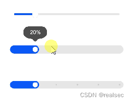
更多查看官方文档:按钮(Button)-添加常用组件-添加组件-基于ArkTS的声明式开发范式-UI开发-开发-HarmonyOS应用开发 五.Slider:滑动条组件 Slider({ min:0,//最小值 max:100,//最大值 value:40,//当前值 step:10,//滑动步长 style: sliderstyle.0utset,// InSet direction: Axis.Horizontal,//Vertical reverse:false//是否反向滑动 }) .width('90%') .showTips(true)//是否展示value百分比提示 .blockColor('#36d') .onChange(value =>{ //value就是当前滑块值 })
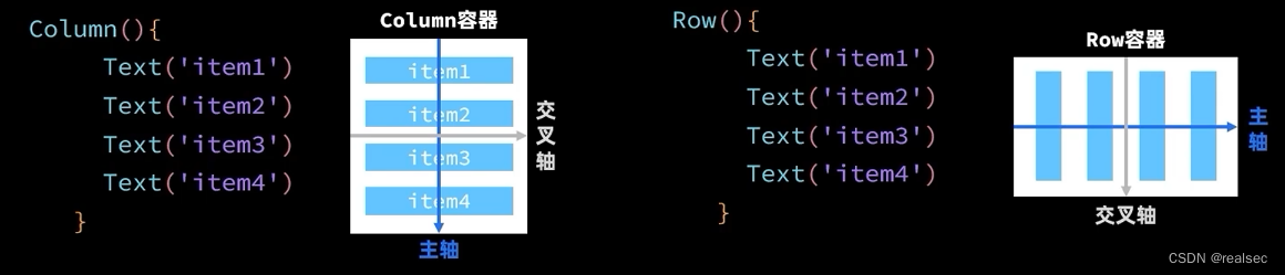
更多查看官方文档:slider-基础组件-组件参考(兼容JS的类Web开发范式-ArkUI.Full)-ArkTS API参考-HarmonyOS应用开发 六.Column与Row 1.纵向布局使用Column容器,横向布局采用Row容器
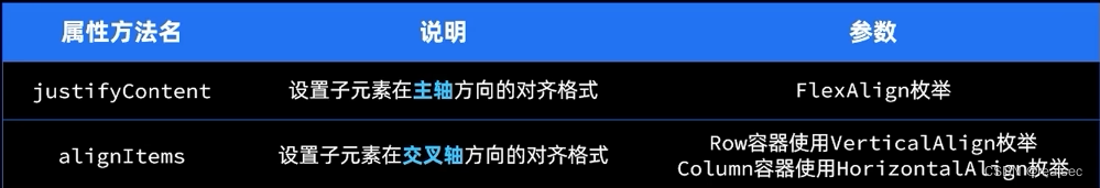
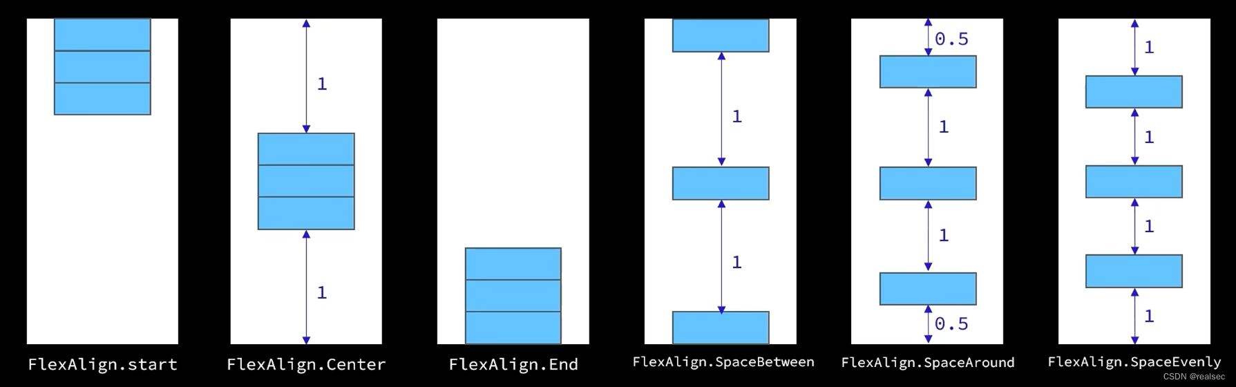
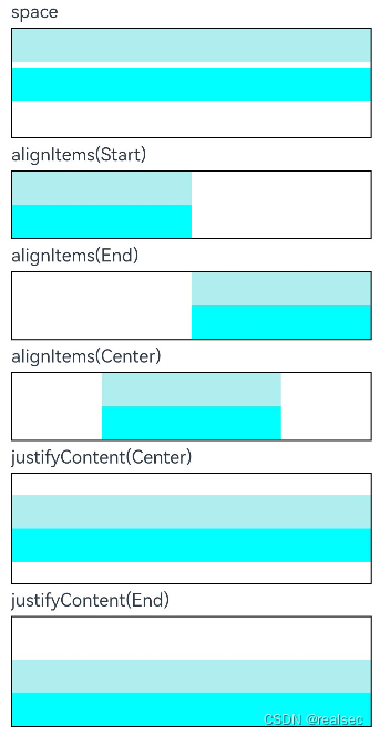
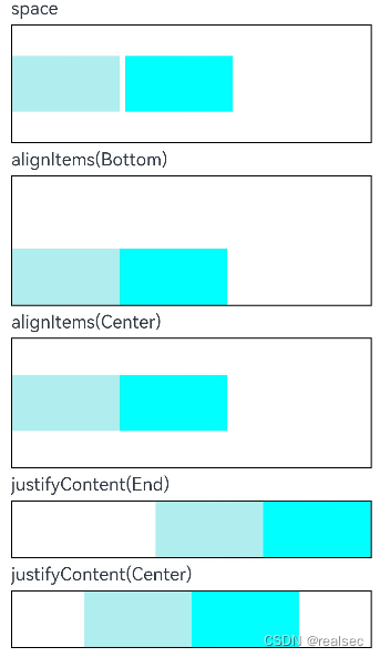
示例: @Entry @Component struct ColumnExample { build() { Column({ space: 5 }) { // 设置子元素垂直方向间距为5 Text('space').width('90%') Column({ space: 5 }) { Column().width('100%').height(30).backgroundColor(0xAFEEEE) Column().width('100%').height(30).backgroundColor(0x00FFFF) }.width('90%').height(100).border({ width: 1 }) // 设置子元素水平方向对齐方式 Text('alignItems(Start)').width('90%') Column() { Column().width('50%').height(30).backgroundColor(0xAFEEEE) Column().width('50%').height(30).backgroundColor(0x00FFFF) }.alignItems(HorizontalAlign.Start).width('90%').border({ width: 1 }) Text('alignItems(End)').width('90%') Column() { Column().width('50%').height(30).backgroundColor(0xAFEEEE) Column().width('50%').height(30).backgroundColor(0x00FFFF) }.alignItems(HorizontalAlign.End).width('90%').border({ width: 1 }) Text('alignItems(Center)').width('90%') Column() { Column().width('50%').height(30).backgroundColor(0xAFEEEE) Column().width('50%').height(30).backgroundColor(0x00FFFF) }.alignItems(HorizontalAlign.Center).width('90%').border({ width: 1 }) // 设置子元素垂直方向的对齐方式 Text('justifyContent(Center)').width('90%') Column() { Column().width('90%').height(30).backgroundColor(0xAFEEEE) Column().width('90%').height(30).backgroundColor(0x00FFFF) }.height(100).border({ width: 1 }).justifyContent(FlexAlign.Center) Text('justifyContent(End)').width('90%') Column() { Column().width('90%').height(30).backgroundColor(0xAFEEEE) Column().width('90%').height(30).backgroundColor(0x00FFFF) }.height(100).border({ width: 1 }).justifyContent(FlexAlign.End) }.width('100%').padding({ top: 5 }) RowExample() } } @Component struct RowExample { build() { Column({ space: 5 }) { // 设置子组件水平方向的间距为5 Text('space').width('90%') Row({ space: 5 }) { Row().width('30%').height(50).backgroundColor(0xAFEEEE) Row().width('30%').height(50).backgroundColor(0x00FFFF) }.width('90%').height(107).border({ width: 1 }) // 设置子元素垂直方向对齐方式 Text('alignItems(Bottom)').width('90%') Row() { Row().width('30%').height(50).backgroundColor(0xAFEEEE) Row().width('30%').height(50).backgroundColor(0x00FFFF) }.width('90%').alignItems(VerticalAlign.Bottom).height('15%').border({ width: 1 }) Text('alignItems(Center)').width('90%') Row() { Row().width('30%').height(50).backgroundColor(0xAFEEEE) Row().width('30%').height(50).backgroundColor(0x00FFFF) }.width('90%').alignItems(VerticalAlign.Center).height('15%').border({ width: 1 }) // 设置子元素水平方向对齐方式 Text('justifyContent(End)').width('90%') Row() { Row().width('30%').height(50).backgroundColor(0xAFEEEE) Row().width('30%').height(50).backgroundColor(0x00FFFF) }.width('90%').border({ width: 1 }).justifyContent(FlexAlign.End) Text('justifyContent(Center)').width('90%') Row() { Row().width('30%').height(50).backgroundColor(0xAFEEEE) Row().width('30%').height(50).backgroundColor(0x00FFFF) }.width('90%').border({ width: 1 }).justifyContent(FlexAlign.Center) }.width('100%') } }
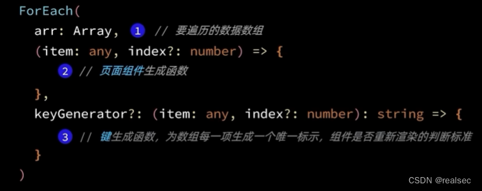
更多查看官方文档:Column-容器组件-组件参考(基于ArkTS的声明式开发范式)-ArkTS API参考-HarmonyOS应用开发 Row-容器组件-组件参考(基于ArkTS的声明式开发范式)-ArkTS API参考-HarmonyOS应用开发 七.循环控制 1.ForEach:循环遍历数组,根据数组内容渲染页面组件
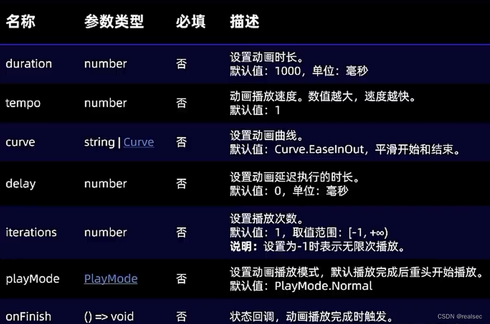
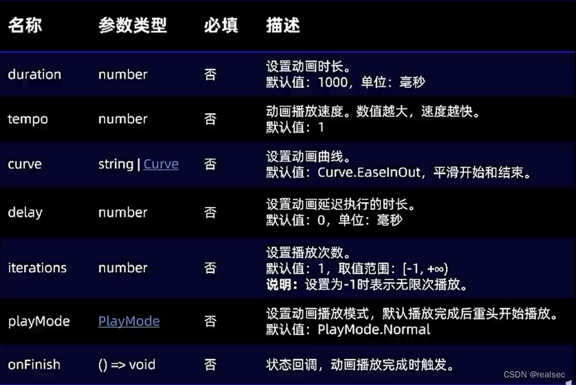
更多查看官方文档:if/else:条件渲染-渲染控制-学习ArkTS语言-入门-HarmonyOS应用开发 八.List列表包含一系列相同宽度的列表项。适合连续、多行呈现同类数据,例如图片和文本。 List({space:7}){ ForEach( this.items,//循环数组 (item:Item) => { ListItem(){ //List子组件 ... } } ) } .width('100%') .layoutWeight(1) // 设置权重 .alignListItem(ListItemAlign.Center) //使List居中更多查看官方文档:List-容器组件-组件参考(基于ArkTS的声明式开发范式)-ArkTS API参考-HarmonyOS应用开发 九.页面路由页面路由指在应用程序中实现不同页面之间的跳转和数据传递。HarmonyOS提供了Router模块,通过不同的url地址,可以方便地进行页面路由,轻松地访问不同的页面。 页面栈的最大容量为32个页面。如果超过这个限制,可以调用router.clear()方法清空历史页面栈,释放内存空间。Router模块提供了两种跳转模式,分别是router.pushUrl()和router.replaceUrl()。这两种模式决定了目标页是否会替换当前页。 router.pushUrl():目标页不会替换当前页,而是压入页面栈。这样可以保留当前页的状态,并且可以通过返回键或者调用router.back()方法返回到当前页。router.replaceUrl():目标页会替换当前页,并销毁当前页。这样可以释放当前页的资源,并且无法返回到当前页。同时,Router模块提供了两种实例模式,分别是Standard和Single。 Standard:标准实例模式,也是默认情况下的实例模式。每次调用该方法都会新建一个目标页,并压入栈顶。 Single:单实例模式。即如果目标页的url在页面栈中已经存在同url页面,则离栈顶最近的同url页面会被移动到栈顶,并重新加载;如果目标页的url在页面栈中不存在同url页面,则按照标准模式跳转。 1.首先要导入HarmonyOS提供的Router模块 import router from '@ohos.router'; 2.然后利用router实现跳转、返回等操作: router.pushUrl({ url: 'pages/Detail' // 目标url }, router.RouterMode.Standard,//页面模式:RouterMode枚举 (err) => { if (err) { console.error(err);//异常响应回调函数 return; } console.info('succeeded.'); }); 3.可以使用以下几种方式进行页面返回: 返回提示 //返回确认提示 router.showAlertBeforeBackPage({ message:"确定返回吗?" }) 方式一:返回到上一个页面。 router.showAlertBeforeBackPage({ message:"确定返回吗?" }) //确定之后才会回退 router.back();这种方式会返回到上一个页面,即上一个页面在页面栈中的位置。但是,上一个页面必须存在于页面栈中才能够返回,否则该方法将无效。 方式二:返回到指定页面。 router.back({ url: 'pages/Home' });这种方式可以返回到指定页面,需要指定目标页的路径。目标页必须存在于页面栈中才能够返回。 方式三:返回到指定页面,并传递自定义参数信息。 router.back({ url: 'pages/Home', params: { info: '来自Home页' } });这种方式不仅可以返回到指定页面,还可以在返回的同时传递自定义参数信息。这些参数信息可以在目标页中通过调用router.getParams()方法进行获取和解析。 解析参数 //获取传递过来的参数 onPageShow() { const params = router.getParams(); // 获取传递过来的参数对象 const info = params['info']; // 获取info属性的值 }更多查看官方文档:页面路由(router)-设置页面路由和组件导航-基于ArkTS的声明式开发范式-UI开发-开发-HarmonyOS应用开发 十.页面动画 1.属性动画 一加全部加属性动画是通过设置组件的animation属性来给组件添加动画,当组件的width、height、opacity、backgroundcolor、scale、rotate、translate等属性变更时,可以实现渐变过渡效果。 Text('^_^') .position({ x:10,// x轴坐标 y:0// y轴坐标 }) .rotate({ angle:0,//旋转角度 centerX:'50%',// 旋转中心横坐标 centerY:'50%'// 旋转中心纵坐标 }) .animation({ duration: 1000, curve: Curve,EaseInOut )
显式动画是通过全局animateTo函数来修改组件属性,实现属性变化时的渐变过渡效果。 Text('^_^') .position({ x:10,// x轴坐标 y:0// y轴坐标 }) .rotate({ angle:0,//旋转角度 centerX:'50%',// 旋转中心横坐标 centerY:'50%'// 旋转中心纵坐标 }) .onClick(()=>{ animateTo( {duration:1000}, ()=>{ // 开始游戏,显示小鱼 this.isBegin = true } ) })
更多查看官方文档:布局更新动画-页面内的动画-使用动画-基于ArkTS的声明式开发范式-UI开发-开发-HarmonyOS应用开发 |


【本文地址】