css居中 |
您所在的位置:网站首页 › Css水平居中 › css居中 |
css居中
|
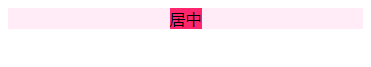
网页布局居中必不可少,其中包括水平居中,垂直居中,上下左右居中,下面一一详述。 水平居中 居中1.text-align: center; 对父元素设置text-align: center;子元素即可居中。但子元素是有限制的,只对图片,文字等行内元素有效。 如果子元素有一定宽度,可以设置子元素display:inline-block; .container { text-align: center; } .item{ display: inline-block; width: 100px; background-color: #ff266e; } 效果
2.margin: 0 auto; 元素本身设置 margin: 0 auto; 这种方法对能设置宽度的元素起作用. .container { text-align: center; background-color: #a08b8b; } .item{ margin: 0 auto; width: 100px; background-color: #ff266e; } 效果
3.position:absolute; 这种方法也需要固定元素的宽度. .container { text-align: center; position: relative; } .item{ position: absolute; width: 100px; left: 0; right: 0; margin: auto; background-color: #ff266e; }
效果
4.flex .container { text-align: center; display: flex; justify-content: center; background-color: #ffecf7; } .item{ background-color: #ff266e; }
效果
垂直居中
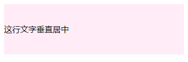
1.一行文字垂直居中 .center { height: 100px; line-height: 100px; background-color: #ffecf7; }这行文字垂直居中
效果
2.未知高度元素居中
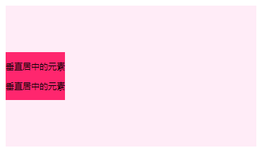
第一种方法 垂直居中的元素 垂直居中的元素 .container { font-size: 0; background-color: #ffecf7; height: 200px; } .container:after { content: ''; display: inline-block; vertical-align: middle; height: 100%; } .item { display: inline-block; vertical-align: middle; font-size: 12px; background-color: #ff266e; }
第二种方法 .container { display: flex; background-color: #ffecf7; height: 200px; align-items: center; } .item { height: 100px; background-color: #ff266e; }
效果
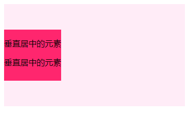
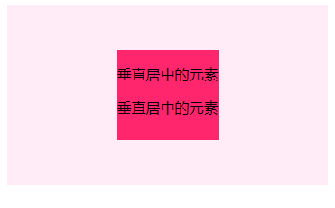
3.高度已知垂直居中 第一种方法 垂直居中的元素 垂直居中的元素 .container { position: relative; background-color: #ffecf7; height: 200px; } .item { position: absolute; top: 0; bottom: 0; margin: auto; height: 100px; background-color: #ff266e; }
第二种方法 .container { position: relative; background-color: #ffecf7; height: 200px; } .item { position: absolute; top: 50%; margin-top: -50px; height: 100px; background-color: #ff266e; }
第三种方法 .container { position: relative; background-color: #ffecf7; height: 200px; } .item { position: absolute; top: 50%; transform: translate(0,-50%); height: 100px; background-color: #ff266e; }
效果
上下左右居中 上下垂直居中,把上面的综合起来就可以啦
1.子元素宽和高不确定
第一种方法 .container { display: flex; background-color: #ffecf7; height: 200px; align-items: center; justify-content: center; } .item { background-color: #ff266e; }
第二种方法 .container { background-color: #ffecf7; height: 200px; font-size: 0; text-align: center; } .container:after { content: ''; display: inline-block; height: 100%; vertical-align: middle; } .item { display: inline-block; background-color: #ff266e; vertical-align: middle; font-size: 12px; }
2.子元素宽和高确定 第一种方法 .container { position: relative; background-color: #ffecf7; height: 200px; } .item { position: absolute; top: 0; bottom: 0; left: 0; right: 0; margin: auto; width: 120px; height: 120px; background-color: #ff266e; }
第二种方法 .container { position: relative; background-color: #ffecf7; height: 200px; } .item { position: absolute; top: 50%; left: 50%; margin: -60px -60px; /*宽,高的一半*/ width: 120px; height: 120px; background-color: #ff266e; }
第三种方法 .container { position: relative; background-color: #ffecf7; height: 200px; } .item { position: absolute; top: 50%; left: 50%; transform: translate(-50%,-50%); width: 120px; height: 120px; background-color: #ff266e; }
|


【本文地址】
今日新闻 |
推荐新闻 |