|
送给读者的话:
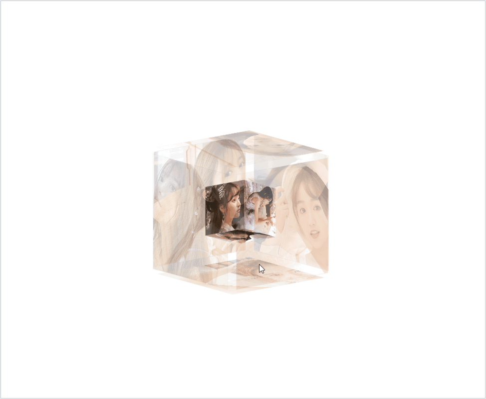
目前在抖音上很火的送给女朋友的3D立体动态相册,现在把代码分享给大家,有兴趣的朋友建议自己重头敲打一遍,这样才会理解的更加透彻。哈哈,先上效果图,吸引起你们的兴趣!
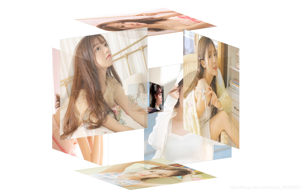 接下来就进入正题了!前方高能,注意别眨眼,哈哈! 接下来就进入正题了!前方高能,注意别眨眼,哈哈!
制作过程
一、新建一个css文件,代码如下
@charset "utf-8";
*{
margin:0;
padding:0;
}
body{
max-width: 100%;
min-width: 100%;
height: 100%;
background-size: cover;
background-repeat: no-repeat;
background-attachment: fixed;
background-size:100% 100%;
position: absolute;
margin-left: auto;
margin-right: auto;
}
li{
list-style: none;
}
.box{
width:200px;
height:200px;
background-size: cover;
background-repeat: no-repeat;
background-attachment: fixed;
background-size:100% 100%;
position: absolute;
margin-left: 42%;
margin-top: 22%;
-webkit-transform-style:preserve-3d;
-webkit-transform:rotateX(13deg);
-webkit-animation:move 5s linear infinite;
}
.minbox{
width:100px;
height:100px;
position: absolute;
left:50px;
top:30px;
-webkit-transform-style:preserve-3d;
}
.minbox li{
width:100px;
height:100px;
position: absolute;
left:0;
top:0;
}
.minbox li:nth-child(1){
background: url(../img/01.png) no-repeat 0 0;
-webkit-transform:translateZ(50px);
}
.minbox li:nth-child(2){
background: url(../img/02.png) no-repeat 0 0;
-webkit-transform:rotateX(180deg) translateZ(50px);
}
.minbox li:nth-child(3){
background: url(../img/03.png) no-repeat 0 0;
-webkit-transform:rotateX(-90deg) translateZ(50px);
}
.minbox li:nth-child(4){
background: url(../img/04.png) no-repeat 0 0;
-webkit-transform:rotateX(90deg) translateZ(50px);
}
.minbox li:nth-child(5){
background: url(../img/05.png) no-repeat 0 0;
-webkit-transform:rotateY(-90deg) translateZ(50px);
}
.minbox li:nth-child(6){
background: url(../img/06.png) no-repeat 0 0;
-webkit-transform:rotateY(90deg) translateZ(50px);
}
.maxbox li:nth-child(1){
background: url(../img/1.png) no-repeat 0 0;
-webkit-transform:translateZ(50px);
}
.maxbox li:nth-child(2){
background: url(../img/2.png) no-repeat 0 0;
-webkit-transform:translateZ(50px);
}
.maxbox li:nth-child(3){
background: url(../img/3.png) no-repeat 0 0;
-webkit-transform:rotateX(-90deg) translateZ(50px);
}
.maxbox li:nth-child(4){
background: url(../img/4.png) no-repeat 0 0;
-webkit-transform:rotateX(90deg) translateZ(50px);
}
.maxbox li:nth-child(5){
background: url(../img/5.png) no-repeat 0 0;
-webkit-transform:rotateY(-90deg) translateZ(50px);
}
.maxbox li:nth-child(6){
background: url(../img/6.png) no-repeat 0 0;
-webkit-transform:rotateY(90deg) translateZ(50px);
}
.maxbox{
width: 800px;
height: 400px;
position: absolute;
left: 0;
top: -20px;
-webkit-transform-style: preserve-3d;
}
.maxbox li{
width: 200px;
height: 200px;
background: #fff;
border:1px solid #ccc;
position: absolute;
left: 0;
top: 0;
opacity: 0.2;
-webkit-transition:all 1s ease;
}
.maxbox li:nth-child(1){
-webkit-transform:translateZ(100px);
}
.maxbox li:nth-child(2){
-webkit-transform:rotateX(180deg) translateZ(100px);
}
.maxbox li:nth-child(3){
-webkit-transform:rotateX(-90deg) translateZ(100px);
}
.maxbox li:nth-child(4){
-webkit-transform:rotateX(90deg) translateZ(100px);
}
.maxbox li:nth-child(5){
-webkit-transform:rotateY(-90deg) translateZ(100px);
}
.maxbox li:nth-child(6){
-webkit-transform:rotateY(90deg) translateZ(100px);
}
.box:hover ol li:nth-child(1){
-webkit-transform:translateZ(300px);
width: 400px;
height: 400px;
opacity: 0.8;
left: -100px;
top: -100px;
}
.box:hover ol li:nth-child(2){
-webkit-transform:rotateX(180deg) translateZ(300px);
width: 400px;
height: 400px;
opacity: 0.8;
left: -100px;
top: -100px;
}
.box:hover ol li:nth-child(3){
-webkit-transform:rotateX(-90deg) translateZ(300px);
width: 400px;
height: 400px;
opacity: 0.8;
left: -100px;
top: -100px;
}
.box:hover ol li:nth-child(4){
-webkit-transform:rotateX(90deg) translateZ(300px);
width: 400px;
height: 400px;
opacity: 0.8;
left: -100px;
top: -100px;
}
.box:hover ol li:nth-child(5){
-webkit-transform:rotateY(-90deg) translateZ(300px);
width: 400px;
height: 400px;
opacity: 0.8;
left: -100px;
top: -100px;
}
.box:hover ol li:nth-child(6){
-webkit-transform:rotateY(90deg) translateZ(300px);
width: 400px;
height: 400px;
opacity: 0.8;
left: -100px;
top: -100px;
}
@keyframes move{
0%{
-webkit-transform: rotateX(13deg) rotateY(0deg);
}
100%{
-webkit-transform:rotateX(13deg) rotateY(360deg);
}
}
二、新建一个html文件,代码如下
纯CSS实现鼠标经过3D立体动态展示图片特效代码
三、文件目录的结构
把css文件放到css文件夹中,图片放到img文件夹中 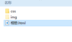
四、图片尺寸的修改
打开美图秀秀进行图片尺寸修改 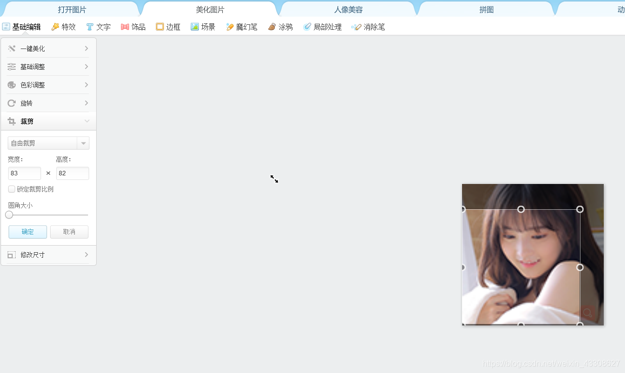
五、图片的尺寸及摆放
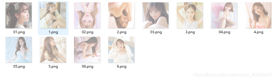 如上图所示: 01-06编号命名的图片尺寸是100x100px的大小的,1-6编号是400x400px大小的 01-06是小正方体的图片,1-6是大正方体的图片 第3张和第4张注意要头朝下 如上图所示: 01-06编号命名的图片尺寸是100x100px的大小的,1-6编号是400x400px大小的 01-06是小正方体的图片,1-6是大正方体的图片 第3张和第4张注意要头朝下
六、动态效果
 以上就是3D立体动态相册的实现过程,学会的兄弟们赶快去手动制作吧,让你的那个她感受到你的浪漫 以上就是3D立体动态相册的实现过程,学会的兄弟们赶快去手动制作吧,让你的那个她感受到你的浪漫
2020-4-2更新
去年就将更新版的3D相册写了出来,但是由于毕设相关事宜忘了将更新版放到博客上面,现在应兄弟们的要求,将更新版的相册发布出来。 哈哈,话不多说,先上图
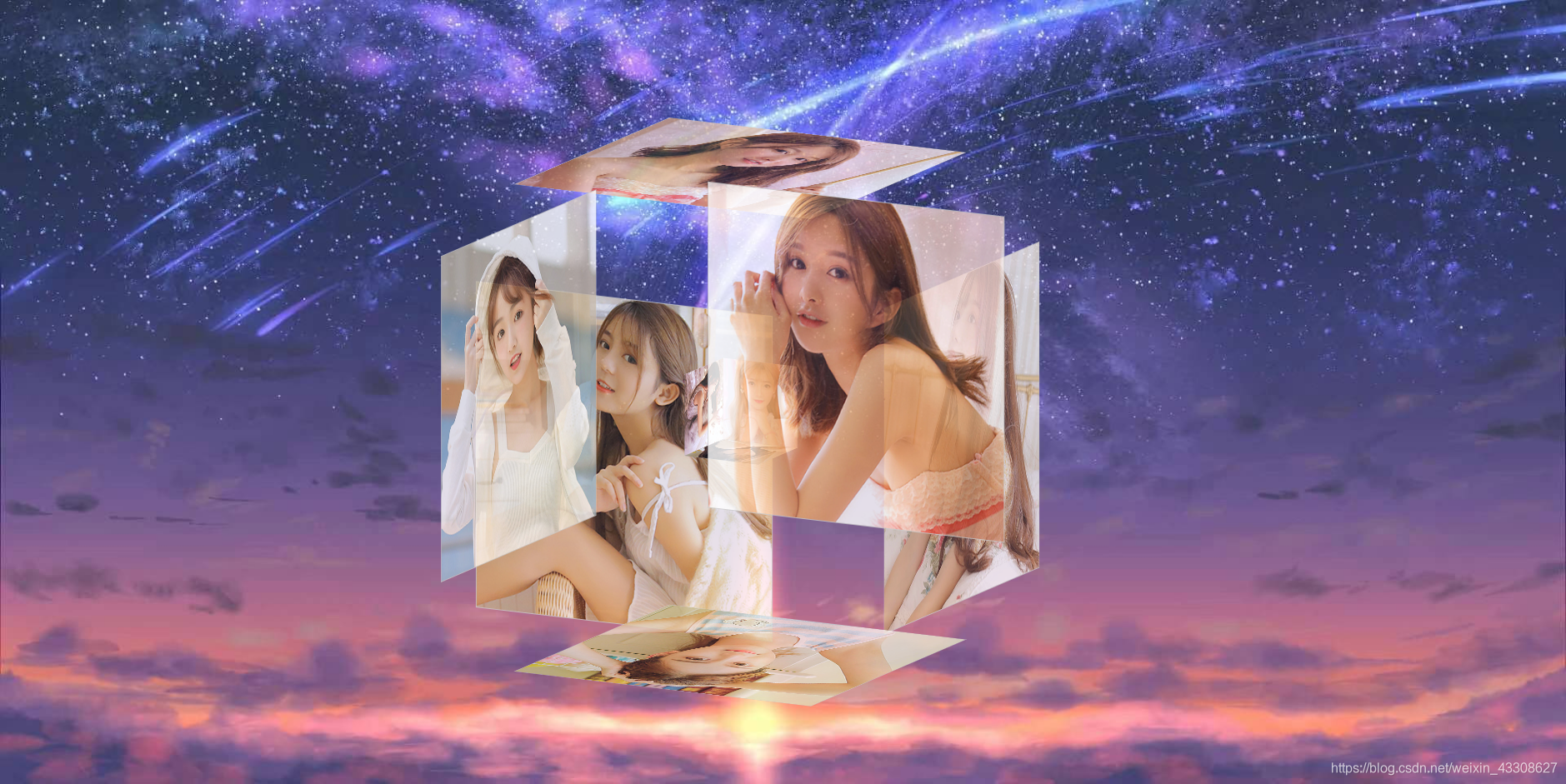
更新内容: 1.添加了相关背景音乐,使得相册体验感更好 2.添加了相关背景图片,使得相册的美感更佳 3.解决了相关路径存放问题,使得相册可以放在任何文件夹中使用,兼容性更高 4.新版相册可直接作为系统桌面,带给你不一样的体验
具体操作方法
1.图片
图片选取与设计参考前面的教程,将所有图片按照相应的尺寸设计好之后放入img文件夹即可 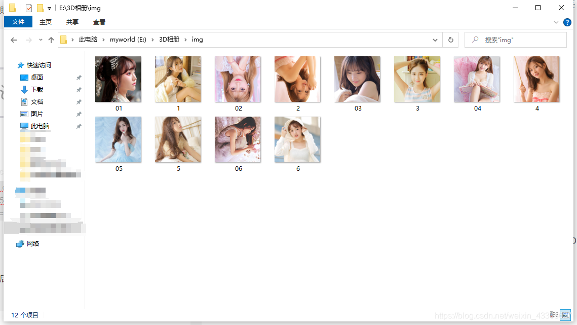
2.背景音乐
自己在网上下载相关歌曲的mp3文件,下载好之后修改文件名为tt然后放入解压之后的3D相册文件夹中替换文件夹中相同的文件即可 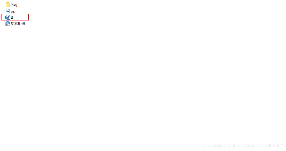
3.背景图片
自己在网上下载相关的图片文件,下载好之后修改文件名为pp然后放入解压之后的3D相册文件夹中替换文件夹中相同的文件即可(注:此处的图片分辨率最好为1080p,这样效果会更好) 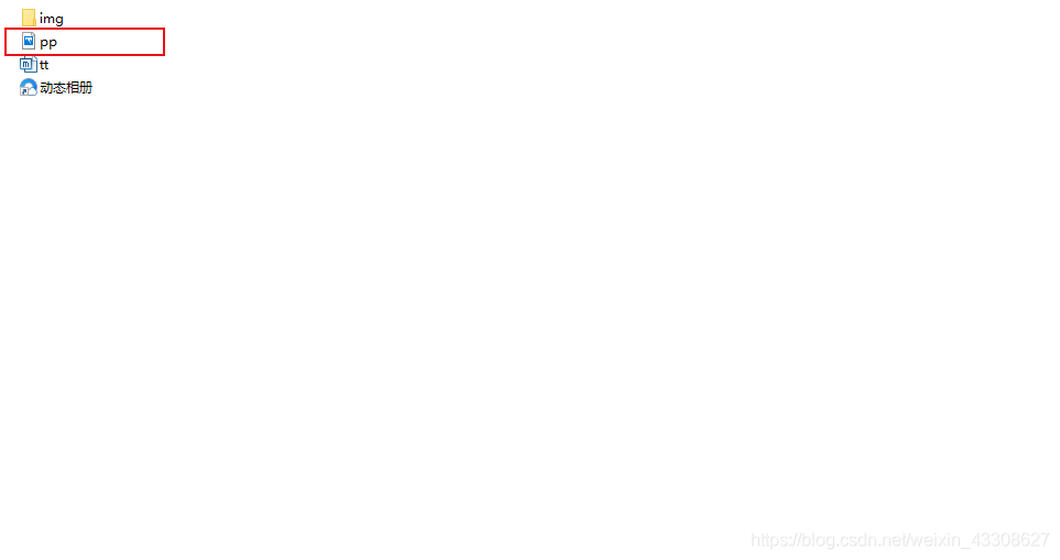
4.系统桌面
在Steam上下载wallpaper engine软件,使用此软件可以将上面的动态相册变为系统桌面(注:此处不是为Steam打广告,主要是博主个人感觉这款软件真心不错,推荐大家去使用)
注:代码不用修改,本人已全部写好,只需按照上述步骤修改相关图片、音乐即可,对新手非常友好,最后祝愿广大兄弟们都能成功告别单身!
本次更新资源我会放在博客结尾处,需要的兄弟可自行加载
本篇博客主要是自己的兴趣使然,希望可以帮助广大朋友成功撩到自己的女神,明白编程的乐趣。 此篇博客中若有错误,欢迎大家指正交流!!!
福利:我会将此代码文件放到我的资源中,需要的兄弟可自行下载,但笔者还是希望兄弟们可以自己重头编写一遍,这样理解也会更深一些。
文件资源下载链接: 送给女朋友的3D立体动态相册 送给女朋友的3D相册更新版
|